第六章 、布局 Layout
6.1 、布局概述
所 谓布局就是指容器组件中子元素的分布、排列组合方式。 Ext 的所有容器组件都支持而 局
操作,每一个容器都会有一个对应的布局,布局负责管理容器组件中子元素的排列、组合 及
渲染方式等。
ExtJS 的布局基类为 Ext.layout.ContainerLayout ,其它布局都是继承该类。 ExtJS 的
容器组件包含一个 layout 及 layoutConfig 配置属性,这两个属性用来指定容器使用的布局 及
布局的详细配置信息,如果没有指定容器组件的 layout 则默认会使用 ContainerLayout 作为
布局,该布局只是简单的把元素放到容器中,有的布局需要 layoutConfig 配置,有的则不 需
要 layoutConfig 配置。看代码:
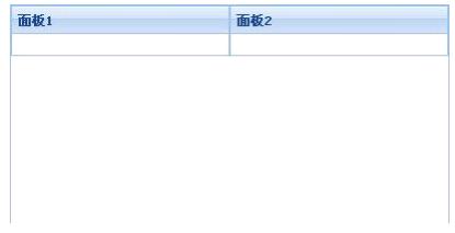
Ext.onReady(function(){
new Ext.Panel({
renderTo:"hello",
400,
height:200,
layout:"column",
items:[{columnWidth:.5,
title:" 面板 1"},
{columnWidth:.5,
title:" 面板 2"}]
});
});
上面的代码我们创建了一个面板 Panel , Panle 是一个容器组件,我们使用 layout 指定 该
面板使用 Column 布局。该面板的子元素是两个面板,这两个面板都包含了一个与列布局 相
关的配置参数属性 columnWidth ,他们的值都是 0.5 ,也就是每一个面板占一半的宽度。执
行上面的程序生成如下图所示的结果:
Ext 中的一些容器组件都已经指定所使用的布局,比如 TabPanel 使用 card 布局、
FormPanel 使用 form 布局, GridPanel 中的表格使用 column 布局等,我们在使用这些组件 的
时候,不能给这些容器组件再指定另外的布局。
ExtJS2.0 一共包含十种布局,常用的布局有 border 、 column 、 fit 、 form 、 card 、 tabel
等布局,下面我们分别对这几种布局作简单的介绍。
6.2 、 Border Border Border 区域布局
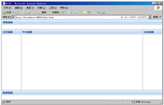
Border 布局由类 Ext.layout.BorderLayout 定义,布局名称为 border 。该布局把容器分成东南西北中五个区 域 ,
分别由 east , south, west , north, cente 来表示,在往容器中添加子元素的时候,我们只需要指定这些子元素
所在的位置, Border 布局会自动把子元素放到布局指定的位置。看下面的代码:
Ext.onReady(function(){
new Ext.Viewport({
layout:"border",
items:[{region:"north",
height:50,
title:" 顶部面板 "},
{region:"south",
height:50,
title:" 底部面板 "},
{region:"center",
title:" 中央面板 "},
{region:"west",
100,
title:" 左边面板 "},
{region:"east",
100,
title:" 右边面板 "}
]
});
});
执行上面的代码将会在页面中输出包含上下左右中五个区域的面板,如下图所示:
6.2 、 Column列布局
Column 列布局由 Ext.layout.ColumnLayout 类定义,名称为 column 。列布局把整个容 器
组件看成一列,然后往里面放入子元素的时候,可以通过在子元素中指定使用 columnWidt h
或 width 来指定子元素所占的列宽度。 columnWidth 表示使用百分比的形式指定列宽度,而
width 则是使用绝对象素的方式指定列宽度,在实际应用中可以混合使用两种方式。看下面
的代码:
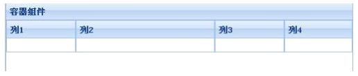
Ext.onReady(function(){
new Ext.Panel({
renderTo:"hello",
title:" 容器组件 ",
layout:"column",
500,
height:100,
items:[{title:" 列 1",100},
{title:" 列 2",200},
{title:" 列 3",100},
{title:" 列 4"}
]
}
) ;
});
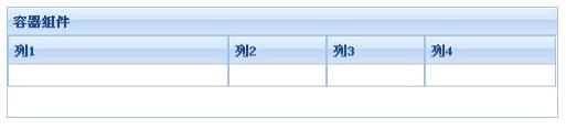
上面的代码在容器组件中放入了四个元素,在容器组件中形成 4 列,列的宽度分别为
100,200,100 及剩余宽度,执行结果如下图所示。
也可使用 columnWidth 来定义子元素所占的列宽度,看下面的代码:
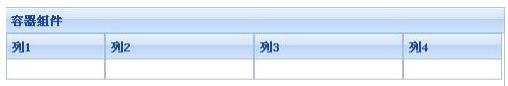
Ext.onReady(function(){
new Ext.Panel({
renderTo:"hello",
title:" 容器组件 ",
layout:"column",
500,
height:100,
items:[{title:" 列 1",columnWidth:.2},
{title:" 列 2",columnWidth:.3},
{title:" 列 3",columnWidth:.3},
{title:" 列 4",columnWidth:.2}
]
}
);
});
注意 columnWidth 的总和应该为 1 ,执行代码将生成如下图所示的内容:
在实际应用中还可以混合使用,看下面的代码:
Ext.onReady(function(){
new Ext.Panel({
renderTo:"hello",
title:" 容器组件 ",
layout:"column",
500,
height:100,
items:[{title:" 列 1",200},
ExtJS 实用简明教程
{title:" 列 2",columnWidth:.3},
{title:" 列 3",columnWidth:.3},
title:" 列 4",columnWidth:.4}
] }
);
});
执行上面的代码将会生成如下图所示的结果:
6.3 、 Fit 布局
C olumn 列布局由 Ext.layout.ColumnLayout 类定义,名称为 column 。列布局把整个容 器
组件看成一列,然后往里面放入子元素的时候,可以通过在子元素中指定使用 columnWidt h
或 width 来指定子元素所占的列宽度。 columnWidth 表示使用百分比的形式指定列宽度,而
width 则是使用绝对象素的方式指定列宽度,在实际应用中可以混合使用两种方式。看下面
的代码:
Ext.onReady(function(){
new Ext.Panel({
renderTo:"hello",
title:" 容器组件 ",
layout:"column",
500,
height:100,
items:[{title:" 列 1",100},
{title:" 列 2",200},
{title:" 列 3",100},
{title:" 列 4"}
]
}
);
});
上面的代码在容器组件中放入了四个元素,在容器组件中形成 4 列,列的宽度分别为
100,200,100 及剩余宽度,执行结果如下图所示。
再看使用 Fit 布局后的代码,如下:
Ext.onReady(function(){
new Ext.Panel({
renderTo:"hello",
title:" 容器组件 ",
layout:"fit",
500,
height:100,
items:[{title:" 子元素 ",html:" 这是子元素中的内容 "}
] }
);
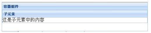
});
上面的代码指定父容器使用 Fit 布局,因此子将自动填满整个父容器。输出的图形如 下 :
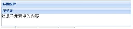
如果容器组件中有多个子元素,则只会显示一个元素,如下面的代码:
Ext.onReady(function(){
new Ext.Panel({
renderTo:"hello",
title:" 容器组件 ",
layout:"fit",
500,
height:100,
items:[{title:" 子元素 1",html:" 这是子元素 1 中的内容 "},
{title:" 子元素 2",html:" 这是子元素 2 中的内容 "}
] }
);
});
输出的结果如下:
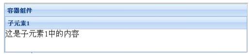
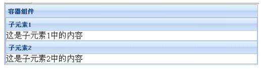
如果不使用布局 Fit ,代码如下:
Ext.onReady(function(){
new Ext.Panel({
renderTo:"hello",
title:" 容器组件 ",
500,
height:120,
items:[{title:" 子元素 1",html:" 这是子元素 1 中的内容 "},
{title:" 子元素 2",html:" 这是子元素 2 中的内容 "}
] }
);
});
输出的结果如下图所示:
6.4 、 Form布局
F orm 布局由类 Ext.layout.FormLayout 定义,名称为 form ,是一种专门用于管理表单中
输入字段的布局,这种布局主要用于在程序中创建表单字段或表单元素等使用。看下面的 代
码:
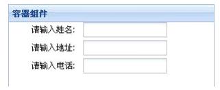
Ext.onReady(function(){
new Ext.Panel({
renderTo:"hello",
title:" 容器组件 ",
300,
layout:"form",
hideLabels:false,
labelAlign:"right",
height:120,
defaultType: 'textfield',
items:[
{fieldLabel:" 请输入姓名 ",name:"name"},
{fieldLabel:" 请输入地址 ",name:"address"},
{fieldLabel:" 请输入电话 ",name:"tel"}
] }
);
});
上面的代码创建了一个面板,面板使用 Form 布局,面板中包含三个子元素,这些子 元
素都是文本框字段,在父容器中还通过 hideLabels 、 labelAlign 等配置属性来定义了是否隐
藏标签、标签对齐方式等。上面代码的输出结果如下图所示:
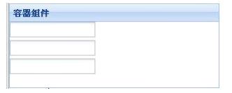
可以在容器组件中把 hideLabels 设置为 true ,这样将不会显示容器中字段的标签了, 如
下图所示:
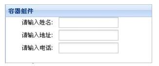
在实际应用中, Ext.form.FormPanel 这个类默认布局使用的是 Form 布局,而且 FormP anel
还会创建与 <form> 标签相关的组件,因此一般情况下我们直接使用 FormPanel 即可。上 面
的例子可改写成如下的形式:
Ext.onReady(function(){
new Ext.form.FormPanel({
renderTo:"hello",
title:" 容器组件 ",
300,
labelAlign:"right",
height:120,
defaultType: 'textfield',
items:[
{fieldLabel:" 请输入姓名 ",name:"name"},
{fieldLabel:" 请输入地址 ",name:"address"},
{fieldLabel:" 请输入电话 ",name:"tel"}
] }
);
});
程序结果与前面使用 Ext.Panel 并指定 form 布局的一样,如下图所示:
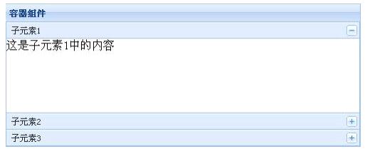
6.5 、 Accordion布局
A ccordion 布局由类 Ext.layout.Accordion 定义,名称为 accordion ,表示可折叠的布局,也 就
是说使用该布局的容器组件中的子元素是可折叠的形式。来看下面的代码 :
Ext.onReady(function(){
new Ext.Panel({
renderTo:"hello",
title:" 容器组件 ",
500,
height:200,
layout:"accordion",
layoutConfig: {
animate: true
},
items:[{title:" 子元素 1",html:" 这是子元素 1 中的内容 "},
{title:" 子元素 2",html:" 这是子元素 2 中的内容 "},
{title:" 子元素 3",html:" 这是子元素 3 中的内容 "}
] }
);
});
上面的代码定义了一个容器组件,指定使用 Accordion 布局,该容器组件中包含三个 子
元素,在 layoutConfig 中指定布局配置参数 animate 为 true ,表示在执行展开折叠时是否应
用动画效果。执行结果将生成如下图所示的界面:
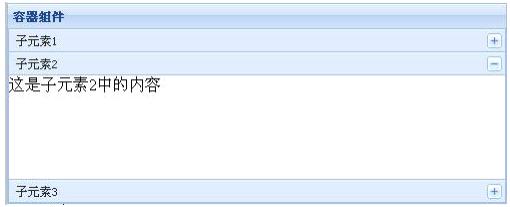
点击每一个子元素的头部名称或右边的按钮,则会展开该面板,并收缩其它已经展
开的面板,如下图:
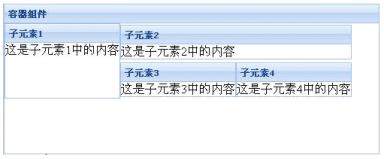
6.6、 Table布局及其它布局
T able 布局由类 Ext.layout.TableLayout 定义,名称为 table ,该布局负责把容器中的子 元
素按照类似普通 html 标签
Ext.onReady(function(){
var panel=new Ext.Panel({
renderTo:"hello",
title:" 容器组件 ",
500,
height:200,
layout:"table",
layoutConfig: {
columns: 3
},
items:[{title:" 子元素 1",html:" 这是子元素 1 中的内容 ",rowspan:2,height:100},
{title:" 子元素 2",html:" 这是子元素 2 中的内容 ",colspan:2},
{title:" 子元素 3",html:" 这是子元素 3 中的内容 "},
{title:" 子元素 4",html:" 这是子元素 4 中的内容 "}
] }
);
});
上面的代码创建了一个父容器组件,指定使用 Table 布局, layoutConfig 使用 columns
指定父容器分成 3 列,子元素中使用 rowspan 或 colspan 来指定子元素所横跨的单元格数。
程序的运行效果如下图所示:
除了前面介绍的几种布局以外, Ext2.0 中还包含其它的 Ext.layout.AbsoluteLayout 、
Ext.layout.AnchorLayout 等布局类,这些布局主要作为其它布局的基类使用,一般情况下我
们不会在应用中直接使用。另外,我们也可以继承 10 种布局类的一种,来实现自定义的布
局。
关于 ExtJS 布局的详细说明,请参考 wlr.easyjf.com 中的 VIP 文档《 ExtJS 布局 Layout 详解( 1 )、 (2) 、 (3) 》。