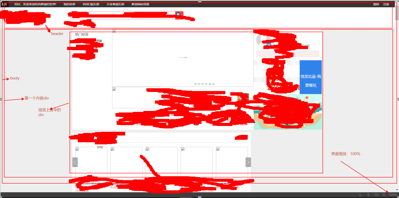
1,body——》width:100%
body {
    background-color: rgb(238, 238, 238);
    color: rgb(51, 51, 51);
    display: block;
    font-family: Helvetica, "Hiragino Sans GB", "Microsoft Yahei",
        sans-serif;
    font-size: 14px;
    height: 11229.7px;
    line-height: 16.8px;
    margin-bottom: 0px;
    margin-left: 0px;
    margin-right: 0px;
    margin-top: 0px;
    outline-color: rgb(51, 51, 51);
    outline-style: none;
    outline-width: 0px;
    text-size-adjust: 100%;
    width: 100%;/* 缩放:设置为百分比*/
}
2,第一个内容div的width:100%
#content {
    background-position-x: center;
    background-position-y: top;
    background-repeat-x:no-repeat;
    background-repeat-y:no-repeat;
    color: rgb(51, 51, 51);
    display: block;
    font-family: Helvetica, "Hiragino Sans GB", "Microsoft Yahei",
        sans-serif;
    font-size: 14px;
    height: 10685px;
    line-height: 16.8px;
    outline-color: rgb(51, 51, 51);
    outline-style: none;
    outline-width: 0px;
    text-size-adjust: 100%;
    /*  1899px; */
    width: 100%;/* 缩放:设置为百分比*/
}
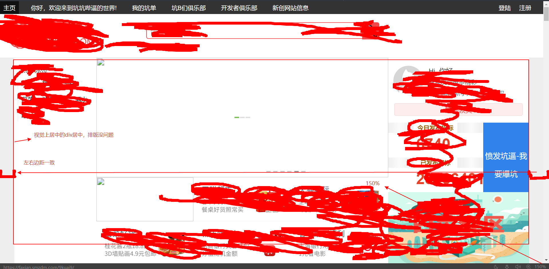
3,第一个内容div中的视觉上居中内容div的margin-left和margin-right都设为auto,这个视觉上居中的div的width设为固定值
#content-inner {
    color: rgb(51, 51, 51);
    display: block;
    font-family: Helvetica, "Hiragino Sans GB", "Microsoft Yahei",
        sans-serif;
    font-size: 14px;
    height: 10685px;
    line-height: 16.8px;
    margin-bottom: 0px;
    /* margin-left: 349.5px;
    margin-right: 349.5px; */
    margin-left: auto;/* 缩放:设置为auto */
    margin-right: auto;/* 缩放:设置为auto */
    margin-top: 0px;
    outline-color: rgb(51, 51, 51);
    outline-style: none;
    outline-width: 0px;
    text-size-adjust: 100%;
    width: 1200px;/* 缩放:设置为固定值 */
}
4,为什么要这样设置?
body的width:100%,第一个内容div的:width保证了界面的伸缩性,视觉上居中的内容div设置固定值保证了界面不具有伸缩性,其左右边距的auto却帮助其在界面上自动控制。
5,解释图如下: