1.基础表单 :对于基础表单,Bootstrap并未对其做太多的定制性效果设计,仅仅对表单内的fieldset、legend、label标签进行了定制。


fieldset {
min- 0;
padding: 0;
margin: 0;
border: 0;
}
legend {
display: block;
 100%;
padding: 0;
margin-bottom: 20px;
font-size: 21px;
line-height: inherit;
color: #333;
border: 0;
border-bottom: 1px solid #e5e5e5;
}

label {
display: inline-block;
margin-bottom: 5px;
font-weight: bold;
}
2.水平表单 类名“form-horizontal”

.form-horizontal .control-label,
.form-horizontal .radio,
.form-horizontal .checkbox,
.form-horizontal .radio-inline,
.form-horizontal .checkbox-inline {
padding-top: 7px;
margin-top: 0;
margin-bottom: 0;
}
.form-horizontal .radio,
.form-horizontal .checkbox {
min-height: 27px;
}
.form-horizontal .form-group {
margin-right: -15px;
margin-left: -15px;
}
.form-horizontal .form-control-static {
padding-top: 7px;
}
@media (min- 768px) {
.form-horizontal .control-label {
text-align: right;
  }
}
.form-horizontal .has-feedback .form-control-feedback {
top: 0;
right: 15px;
}
3.内联表单 类名“form-inline”
<form class="form-inline" role="form">
<div class="form-group">
  <label class="sr-only" for="exampleInputEmail2">邮箱</label>
  <input type="email" class="form-control" id="exampleInputEmail2" placeholder="请输入你的邮箱地址">
</div>
<div class="form-group">
  <label class="sr-only" for="exampleInputPassword2">密码</label>
  <input type="password" class="form-control" id="exampleInputPassword2" placeholder="请输入你的邮箱密码">
</div>
<div class="checkbox">
<label>
   <input type="checkbox">记住密码
</label>
</div>
<button type="submit" class="btnbtn-default">进入邮箱</button>
</form>


<--  .sr-only:给残障人员用的 -->
<-- .sr-only {
position: absolute;
 1px;
height: 1px;
padding: 0;
margin: -1px;
overflow: hidden;
clip: rect(0, 0, 0, 0);
border: 0;
}  -->
表单控件
1.输入框input: 为了让控件在各种表单风格中样式不出错,需要添加类名“form-control”,下面各个表单控件都能加。
<!doctype html>
<html lang="en">
<head>
    <meta charset="UTF-8">
    <title>表单控件——输入框input</title>
    <link rel="stylesheet" href="//netdna.bootstrapcdn.com/bootstrap/3.1.1/css/bootstrap.min.css">
</head>
<body>
<form role="form">
  <div class="form-group">
    <input type="email" class="form-control" placeholder="Enter email">
    <input type="text" class="form-control" placeholder="Enter Username">
  </div>
</form>
</body>
</html>
type类型:text button checkbox date datetime datetime-local img file hidden month number password radio range reset search submit tel time url week hidden
2.下拉选择框select:多行选择设置multiple属性的值为multiple
<form>
  <div class="form-group">
      <select multiple class="form-control">  //如果是下拉框就不要加multiple
          <option>踢足球</option>
          <option>游泳</option>
          <option>慢跑</option>
          <option>跳舞</option>
      </select>
  </div>
</form>
3.内联表单 类名“form-inline”
<form class="form-inline" role="form">
<div class="form-group">
  <label class="sr-only" for="exampleInputEmail2">邮箱</label>
  <input type="email" class="form-control" id="exampleInputEmail2" placeholder="请输入你的邮箱地址">
</div>
<div class="form-group">
  <label class="sr-only" for="exampleInputPassword2">密码</label>
  <input type="password" class="form-control" id="exampleInputPassword2" placeholder="请输入你的邮箱密码">
</div>
<div class="checkbox">
<label>
   <input type="checkbox">记住密码
</label>
</div>
<button type="submit" class="btnbtn-default">进入邮箱</button>
</form>


<--  .sr-only:给残障人员用的 -->
<-- .sr-only {
position: absolute;
 1px;
height: 1px;
padding: 0;
margin: -1px;
overflow: hidden;
clip: rect(0, 0, 0, 0);
border: 0;
}  -->
ea:添加了类名“form-control”类名,则无需设置cols属性。
<form role="form">
  <div class="form-group">
    <textarea class="form-control" rows="3"></textarea>
  </div>
</form>
示例
4.复选框checkbox和单选择按钮radio:水平排列加类名“checkbox-inline”||类名“radio-inline”
<form role="form">
  <div class="form-group">
    <textarea class="form-control" rows="3"></textarea>
  </div>
</form>
4.复选框checkbox和单选择按钮radio:水平排列加类名“checkbox-inline”||类名“radio-inline”
<!doctype html>
<html lang="en">
<head>
    <meta charset="UTF-8">
    <title>表单控件——表单控件大小</title>
    <link rel="stylesheet" href="//netdna.bootstrapcdn.com/bootstrap/3.1.1/css/bootstrap.min.css">
</head>
<body>
<form role="form">
  <h3>案例1</h3>
  <div class="checkbox">
    <label>
      <input type="checkbox" value="">
      记住密码
    </label>
  </div>
  <div class="radio">           //如果要水平class=“radio-inline”
    <label>
      <input type="radio" name="optionsRadios" id="optionsRadios1" value="love" checked>
      喜欢
    </label>
  </div>
    <div class="radio">         //如果要水平class=“radio-inline”
    <label>
      <input type="radio" name="optionsRadios" id="optionsRadios2" value="hate">
      不喜欢
    </label>
  </div>


</form>
</body>
</html>
.radio,
.checkbox {
display: block;
min-height: 20px;
padding-left: 20px;
margin-top: 10px;
margin-bottom: 10px;
}
.radio label,
.checkbox label {
display: inline;
font-weight: normal;
cursor: pointer;
}
.radio input[type="radio"],
.radio-inline input[type="radio"],
.checkbox input[type="checkbox"],
.checkbox-inline input[type="checkbox"] {
float: left;
margin-left: -20px;
}
.radio + .radio,
.checkbox + .checkbox {
margin-top: -5px;
}
.radio-inline,
.checkbox-inline {
display: inline-block;
padding-left: 20px;
margin-bottom: 0;
font-weight: normal;
vertical-align: middle;
cursor: pointer;
}
.radio-inline + .radio-inline,
.checkbox-inline + .checkbox-inline {
margin-top: 0;
margin-left: 10px;
}
5.控件大小:类名input-sm:让控件比正常大小更小;类名input-lg:让控件比正常大小更大;宽度配合Bootstrap的网格系统
.input-sm {
height: 30px;
padding: 5px 10px;
font-size: 12px;
line-height: 1.5;
border-radius: 3px;
}
select.input-sm {
height: 30px;
line-height: 30px;
}
textarea.input-sm,
select[multiple].input-sm {
height: auto;
}
.input-lg {
height: 46px;
padding: 10px 16px;
font-size: 18px;
line-height: 1.33;
border-radius: 6px;
}
select.input-lg {
height: 46px;
line-height: 46px;
}
textarea.input-lg,
select[multiple].input-lg {
height: auto;
}
6.表单控件状态(焦点状态):类名form-control
.form-control:focus {
border-color: #66afe9;
outline: 0;
  -webkit-box-shadow: inset 0 1px 1pxrgba(0,0,0,.075), 0 0 8px rgba(102, 175, 233, .6);
box-shadow: inset 0 1px 1pxrgba(0,0,0,.075), 0 0 8px rgba(102, 175, 233, .6);
}
7.表单控件状态(禁用状态):form-control别忘记加①在需要禁用的表单控件上加上“disabled”;②fieldset设置了disabled属性,整个域都将处于被禁用状态。
.form-control[disabled],
.form-control[readonly],
fieldset[disabled] .form-control {
cursor: not-allowed;
background-color: #eee;
opacity: 1;
}
8.表单控件状态(验证状态):1、.has-warning:警告状态(黄色) 2、.has-error:错误状态(红色) 3、.has-success:成功状态(绿色)
 :需要类名has-feedback + <span class="glyphicon glyphicon-remove form-control-feedback"></span>
9.表单提示信息:"help-block" 
.help-block {
display: block;
margin-top: 5px;
margin-bottom: 10px;
color: #737373;
}
按钮
建议使用button或a标签来制作按钮
1.基本按钮:类名“btn”
.btn {
display: inline-block;
padding: 6px 12px;
margin-bottom: 0;
font-size: 14px;
font-weight: normal;
line-height: 1.42857143;
text-align: center;
white-space: nowrap;
vertical-align: middle;
cursor: pointer;
  -webkit-user-select: none;
     -moz-user-select: none;
      -ms-user-select: none;
user-select: none;
background-image: none;
border: 1px solid transparent;
border-radius: 4px;
}
2.默认按钮: 类名“btn” + 类名“btn-default” 
.btn-default {
color: #333;
background-color: #fff;
border-color: #ccc;
}
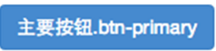
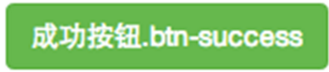
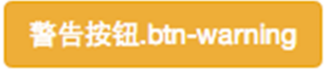
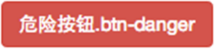
4.按钮大小: .btn-lg:大型按钮 .btn-sm:小型按钮 .btn-cs:超小型按钮
.btn-lg,
.btn-group-lg> .btn {
padding: 10px 16px;
font-size: 18px;
line-height: 1.33;
border-radius: 6px;
}
.btn-sm,
.btn-group-sm> .btn {
padding: 5px 10px;
font-size: 12px;
line-height: 1.5;
border-radius: 3px;
}
.btn-xs,
.btn-group-xs> .btn {
padding: 1px 5px;
font-size: 12px;
line-height: 1.5;
border-radius: 3px;
}
5.块状按钮: 类名“btn-block”
6.禁用状态: 使用disabled类或disabled属性
图像 1.img-responsive:响应式图片,主要针对于响应式设计 2.img-rounded:圆角图片 3.img-circle:圆形图片 4.img-thumbnail:缩略图片
img {
vertical-align: middle;
}
.img-responsive,
.thumbnail>img,
.thumbnail a >img,
.carousel-inner > .item >img,
.carousel-inner > .item > a >img {
display: block;
max- 100%;
height: auto;
}
.img-rounded {
border-radius: 6px;
}
.img-thumbnail {
display: inline-block;
max- 100%;
height: auto;
padding: 4px;
line-height: 1.42857143;
background-color: #fff;
border: 1px solid #ddd;
border-radius: 4px;
  -webkit-transition: all .2s ease-in-out;
transition: all .2s ease-in-out;
}
.img-circle {
border-radius: 50%;
}
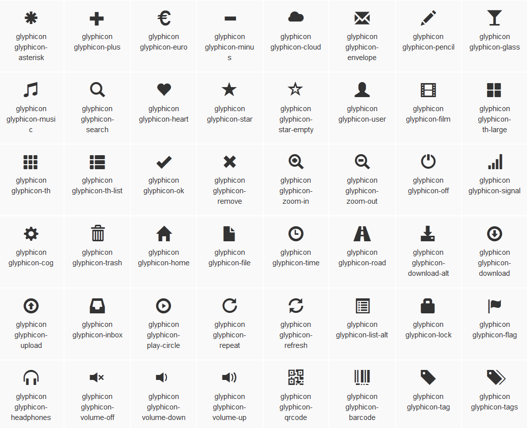
图标
http://getbootstrap.com/components/#glyphicons :查看全部图标
@font-face {
font-family: 'Glyphicons Halflings';
src: url('../fonts/glyphicons-halflings-regular.eot');
src: url('../fonts/glyphicons-halflings-regular.eot?#iefix') format('embedded-opentype'), url('../fonts/glyphicons-halflings-regular.woff') format('woff'), url('../fonts/glyphicons-halflings-regular.ttf') format('truetype'), url('../fonts/glyphicons-halflings-regular.svg#glyphicons_halflingsregular') format('svg');
}

<!--使用-->
.glyphicon {
position: relative;
top: 1px;
display: inline-block;
font-family: 'Glyphicons Halflings';
font-style: normal;
font-weight: normal;
line-height: 1;
  -webkit-font-smoothing: antialiased;
  -moz-osx-font-smoothing: grayscale;
}
.glyphicon-asterisk:before {
content: "2a";
}