CSS3动画相关的属性:transform,transition,animation.
变形Transform
语法:
transform: rotate | scale | skew | translate |matrix;
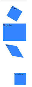
rotate:旋转,通过指定一个角度对原元素进行2D旋转,正值表示顺时针旋转,负值表示逆时针。默认原点是其中心位置,可以设置transform-origin.
scale:缩放,通过指定X和Y方向上的缩放倍数对原元素进行2D缩放。
skew:扭曲,通过指定X和Y方向上的斜切角度,对原元素进行斜切变换。
translate:移动,通过指定X和Y方向的移动长度对元素进行移动,正值是向右下移动的。
matrix:矩阵变换
例子:
<!DOCTYPE html>
<html>
<head>
    <meta charset="utf-8">
    <title>CSS3</title>
    <style  type="text/css">
        div{
            width:100px;
            height:100px;
            background:#3385ff;
            margin: 60px;
        }
        #rotate{
            transform:rotate(30deg);
        }
        #scale{
           transform:scale(2,1.5);
        }
        #skew{
           transform:skew(30deg,10deg);
        }
        #translate{
           transform:translate(50%,80%);
        }
    </style>
</head>
<body>
    <div id="rotate">Rotate</div>
    <div id="scale">Scale</div>
    <div id="skew">Skew</div>
    <div id="translate">Translate</div>
</body>
</html>
图:
过渡Transition
transition主要包含四个属性值:执行过渡的属性:transition-property,变换延续的时间:transition-duration,在延续时间段,变换的速率变化transition-timing-function,变换延迟时间transition-delay。
例子:
<!DOCTYPE html>
<html>
<head>
    <meta charset="utf-8">
    <title>CSS3</title>
    <style  type="text/css">
        div{
            width:100px;
            height:100px;
            background:#3385ff;
            margin: 60px;
        }
        #transition{
            transition:width 2s,height 2s;
        }
        div:hover{
            width:200px;
            height:200px;
            transform:rotate(180deg);
        }
</style>
</head>
<body>
    <div id="transition">Transition</div>
</body>
</html>
图1

图2(鼠标放上去)

动画Animation
animation类似transition,不同的是animation可以定义每个关键帧的效果,可以实现更为复杂的动画。
常用属性:
@keyframe:关键帧动画。
animation-name:定义@keyframes的动画名称。
animation-duration:定义动画一个周期的秒或毫秒数。
animation-timing-function:定义动画的速度变化。
animation-delay:定义动画何时开始。
animation-iteration-count:定义动画被播放的次数,可定义为循环播放。
animation-direction:定义动画是否在下一个周期循环播放。
例子
<!DOCTYPE html>
<html>
<head>
<style type="text/css">
@-webkit-keyframes move {
    0% {
        padding: 0;
    }
    50% {
        padding: 0 20px;
        background-color:rgba(190, 206, 235, 0.2);
    }
    100% {
        padding: 0 100px;
        background-color:rgba(190, 206, 235, 0.9);
    }
}
.anim_box:hover {
    -webkit-animation-name: move;
    -webkit-animation-duration: 1.5s;
    -webkit-animation-iteration-count: 4;
    -webkit-animation-direction: alternate;
    -webkit-animation-timing-function: ease-in-out;
}
</style>

</head>
<body>
<div class="anim_box">Animation</div>
</body>
</html>
可以用animation做简单的幻灯片效果,把背景色换成要轮播的图片就可以了
<!DOCTYPE html>
<html>
<head>
<style type="text/css">
@-webkit-keyframes loop {
    0% {
        background:blue;
    }
    25% {

        background:pink;
    }
    50% {

        background:yellow;
    }
    75% {

        background:purple;
    }
    100% {

        background:red;
    }
}
.anim {
    width:100px;
    height:100px;
    -webkit-animation-name: loop;
    -webkit-animation-duration: 10s;
    -webkit-animation-iteration-count: infinite;
    -webkit-animation-timing-function: linear;
}
</style>

</head>
<body>
<div class="anim">Animation</div>
</body>
</html>