(1)margin在块元素、内联元素中的区别
HTML(这里说的是html标准,而不是xhtml)里分两种基本元素,即block和inline。顾名思义,block元素就是以”块”表现的元素(block-like elements),inline元素即是以”行”表现的元素(character level elements and text strings)。二者表现的主要差别在于,在页面文档中block元素另起一行开始,并独占一行。inline元素则同其他inline元素共处一行。
block元素(块元素)大致有:P|H1|H2|H3|H4|H5|H6|UL|OL|PRE| DL | DIV | NOSCRIPT | BLOCKQUOTE | FORM | HR | TABLE | FIELDSET | ADDRESS(随着html5标准的推进,一些元素将被废除,而一些新的元素将被引入)注意的是并非所有的block元素的默认display属性都是block,像table这种display:table的元素也是block元素。
inline元素(内联元素)大致有:| TT | I | B | BIG | SMALL|EM | STRONG | DFN | CODE |SAMP | KBD | VAR | CITE | ABBR | ACRONYM|A | IMG | OBJECT | BR | SCRIPT | MAP | Q | SUB | SUP | SPAN | BDO|INPUT | SELECT | TEXTAREA | LABEL | BUTTON
其中有类特殊的元素:如img|input|select|textarea|button|label等,他们被称为可置换元素(Replaced element)。他们区别一般inline元素(相对而言,称non-replaced element)是:这些元素拥有内在尺寸(intrinsic dimensions),他们可以设置width/height属性。他们的性质同设置了display:inline-block的元素一致。
margin在块级元素下,他的性能可以完全体现,上下左右任你设定。且记住块级元素的margin的参照基准是前一个元素即相对于自身之前的元素有margin距离。如果元素是第一个元素,则就是相对于父元素的margin距离(但第一个元素相对于父元素margin-top而父元素又没有设定padding-top/border-top的话要需要印证上面的垂直外边距合并的知识)。
margin也能用于内联元素,这是规范所允许的,但是margin-top和margin-bottom对内联元素(对行)的高度没有影响,并且由于边界效果(margin效果)是透明的,他也没有任何的视觉影响。这是因为边界应用于内联元素时不改变元素的行高度,如果你要改变内联元素的行高即类似文本的行间距,那么你只能使用这三个属性:line-height,fong-size,vertical-align。请记住,这个影响内联元素高度的是line-height而不是height,因为内联元素是一行行的,定一个height的话,那这到底是整段inline元素的高呢?还是inline元素一行的高呢?这都说不准,所以统一都给每行定一个高,只能是line-height了。margin-top/margin-bottom对内联元素没有多大实际效果,不过margin-left/margin-right还是能够对内联元素产生影响的。应用margin:10px 20px 30px 40px;,左边这个css如果写在inline元素上,他的效果大致是,上下无效果,左边离他相邻元素或者文本距离为40px,右边离他相邻元素或者文本距离为20px。你可以自行尝试一番。
最后在内联元素中还有上文我们提到的非可置换inline元素(non-replaced element),这些个元素img|input|select|textarea|button|label虽然是内联元素,但margin依旧可以影响到他的上下左右!
总结下来margin 属性可以应用于几乎所有的元素,除了表格显示类型(不包括 table-caption, table and inline-table)的元素,而且垂直外边距对非置换内联元素(non-replaced inline element)不起作用。
(2)padding在块元素、内联元素中的区别
先上demo:
样式表
|
1
2
3
4
5
6
7
8
9
10
|
<style type="text/css"> *{ padding: 0; margin: 0; } .inline{ border: 1px solid red; padding: 20px; }</style> |
html代码1:
|
1
2
3
4
5
|
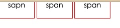
<body> <span class="inline">span</span> <span class="inline">span</span> <span class="inline">span</span></body> |
html代码2
|
1
2
3
4
5
|
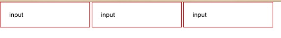
<body> <input type="text" class="inline" value="input" /> <input type="text" class="inline" value="input" /> <input type="text" class="inline" value="input" /></body> |
请大家分别用同样的样式表运行上面两段代码,会发现一个问题:span的padding-top虽然设置了,但是在浏览器中并没有展现出来,wtf !
那么问题来了,有人说行内元素不能设置padding-top,但是
1 . span和input 都为行内元素,为什么对input设置的padding-top值有效呢?
2. 祭出w3c文档 http://www.w3.org/TR/2011/REC-CSS2-20110607/box.html#padding-properties
'padding-top', 'padding-right', 'padding-bottom', 'padding-left'
| Value: | <padding-width> | inherit |
| Initial: | 0 |
| Applies to: | all elements except table-row-group, table-header-group, table-footer-group, table-row, table-column-group and table-column |
| Inherited: | no |
| Percentages: | refer to width of containing block |
| Media: | visual |
| Computed value: | the percentage as specified or the absolute length |
padding适用于全部元素。
当给这两个元素设置margin-top时,两者的表现又完全不同。
span对于margin-top无效,而input对于margin-top的设置是完全OK的?为什么?看文档
- 'margin-top', 'margin-bottom'
-
Value: <margin-width> | inherit Initial: 0 Applies to: all elements except elements with table display types other than table-caption, table and inline-table Inherited: no Percentages: refer to width of containing block Media: visual Computed value: the percentage as specified or the absolute length
These properties have no effect on non-replaced inline elements.
那么这是为什么呢?重点来了,
span是行内不可替换元素,而input是行内替换元素,第一次听说,哭瞎。
先上文档:
10.6.1 Inline, non-replaced elements
The 'height' property does not apply. The height of the content area should be based on the font, but this specification does not specify how. A UA may, e.g., use the em-box or the maximum ascender and descender of the font. (The latter would ensure that glyphs with parts above or below the em-box still fall within the content area, but leads to differently sized boxes for different fonts; the former would ensure authors can control background styling relative to the 'line-height', but leads to glyphs painting outside their content area.)
Note: level 3 of CSS will probably include a property to select which measure of the font is used for the content height.
The vertical padding, border and margin of an inline, non-replaced box start at the top and bottom of the content area, and has nothing to do with the 'line-height'. But only the 'line-height' is used when calculating the height of the line box.
If more than one font is used (this could happen when glyphs are found in different fonts), the height of the content area is not defined by this specification. However, we suggest that the height is chosen such that the content area is just high enough for either (1) the em-boxes, or (2) the maximum ascenders and descenders, of all the fonts in the element. Note that this may be larger than any of the font sizes involved, depending on the baseline alignment of the fonts.
10.3.2 Inline, replaced elements
A computed value of 'auto' for 'margin-left' or 'margin-right' becomes a used value of '0'.
If 'height' and 'width' both have computed values of 'auto' and the element also has an intrinsic width, then that intrinsic width is the used value of 'width'.
If 'height' and 'width' both have computed values of 'auto' and the element has no intrinsic width, but does have an intrinsic height and intrinsic ratio; or if 'width' has a computed value of 'auto', 'height' has some other computed value, and the element does have an intrinsic ratio; then the used value of 'width' is:
(used height) * (intrinsic ratio)
If 'height' and 'width' both have computed values of 'auto' and the element has an intrinsic ratio but no intrinsic height or width, then the used value of 'width' is undefined in CSS 2.1. However, it is suggested that, if the containing block's width does not itself depend on the replaced element's width, then the used value of 'width' is calculated from the constraint equation used for block-level, non-replaced elements in normal flow.
Otherwise, if 'width' has a computed value of 'auto', and the element has an intrinsic width, then that intrinsic width is the used value of 'width'.
Otherwise, if 'width' has a computed value of 'auto', but none of the conditions above are met, then the used value of 'width' becomes 300px. If 300px is too wide to fit the device, UAs should use the width of the largest rectangle that has a 2:1 ratio and fits the device instead.
注意加粗的内容,可替换元素是具有内部的宽,高,或者宽高比的。
总结:
对于input这种替换元素,margin和padding各方向均有作用,
对于span,a等这些不可替换元素,
padding-left,padding-right均有效果,padding-top,padding-bottom无效果。
margin-right,margin-left均有效果,margin-top,margin-bottom无效果。
最近在看css权威指南的时候,书上写:非替换元素的内边距,边框和外边距对行内元素及其生成框没有垂直效果;也就是说,他们不会影响行内框的高度。(还是得多看书啊)