针对justifyContent、alignItems、alignSelf、alignContent这几个属性,
我们经常使用的是justifyContent、alignItems,我们可以了解下alignSelf、alignContent
flexDirection
谈到布局我们从原生讲起,在iOS的世界里我们是有X轴、Y轴的,
那么在React Native的世界里对应的就是flexDirection属性,
flexDirection?: "row" | "column" | "row-reverse" | "column-reverse";
它是有row(行,我们可以和X轴对应,水平方向)、column(列,我们可以和Y轴对应,垂直方向),
flexDirection决定了子控件的排列方向,也就决定了主次轴,
如果是row那么X轴就是主轴,Y轴就是次轴(侧轴),如果是column那么Y轴就是主轴,X轴就是次轴(侧轴)。
我们的justifyContent和alignItems就是参照于主次轴的,justifyContent参照主轴,alignItems参照次轴。
换言之justifyContent和alignItems依赖于flexDirection,离开了flexDirection,两者也就没有了意义。
justifyContent
我们经常使用justifyContent来调整子控件,这个值主要是控制主轴的,简单通过示例来了解下它的几个属性
justifyContent?: "flex-start" | "flex-end" | "center" | "space-between" | "space-around" | "space-evenly";
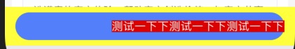
默认是flex-start,效果如图:

flex-end
center

space-between(两端对齐平分,空白两等分)
space-around(单个元素左右间距相同,空白六等分)

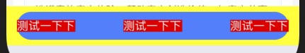
space-evenly(从左向右等间距平分,空白四等分)

代码如下:
                <View style={style.btn_bg}>
                    <TouchableOpacity onPress={() => {


                    }}>
                        <View style={style.btn_blue}>
                            <Text style={style.btn}>测试一下下</Text>
                            <Text style={style.btn}>测试一下下</Text>
                            <Text style={style.btn}>测试一下下</Text>
                        </View>
                    </TouchableOpacity>
                </View>


    btn_bg: {
        backgroundColor: 'yellow',
        paddingHorizontal: 15,
        paddingVertical: 8,
    },

    btn_blue: {
        backgroundColor: '#3480FF',
        height: 40,
        borderRadius: 20,
        justifyContent: 'space-evenly',
        flexDirection:'row',
        alignItems:'center',
    },

    btn: {
        fontSize: DeviceHelp.fontSize(16),
        color: '#FFFFFF',
        backgroundColor: 'red',
    },
综上所述:
space-between、space-around、space-evenly对于两个以上组件才有意义。
我们也可以通过space-between来实现左右两端布局。
设置不同的属性值时,子控件的填充大小是不一样的
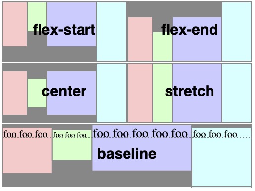
type FlexAlignType = "flex-start" | "flex-end" | "center" | "stretch" | "baseline";
alignItems?: FlexAlignType;
下面通过示例看下几个属性
alignContent(使用较少)
alignContent?: "flex-start" | "flex-end" | "center" | "stretch" | "space-between" | "space-around";
alignContent的布局效果和alignIems相似,
alignContent只对多行的item才有效果,而alignIems对单行、多行都有效,
一般我们使用较少,使用alignIems较多
alignSelf(使用较少)
type FlexAlignType = "flex-start" | "flex-end" | "center" | "stretch" | "baseline";
alignSelf?: "auto" | FlexAlignType;
alignSelf区别于alignItems的是,
alignSelf是在item内部定义的,它的默认取值是auto,向上取父类alignItems的值,
如果对alignSelf属性的值进行自定义则会覆盖父类的效果
参考资料:https://blog.csdn.net/qq_28978893/article/details/78855709