项目中我们经常会遇到组件左右两端展示的需求,实现的方法有很多种,
今天简述下以下两种方法:
A:子组件使用flex:1(自动填充)
优势:
设置flex:1的组件会优先展示兄弟组件,然后自己才会填充父组件剩余部分。
假如设置左端组件flex:1,那么会优先展示右端组件,然后左端组件才会填充父组件剩余部分。
劣势:
需要设置子组件
子组件:
设置flex:1的子组件会拉伸填充满父组件剩余部分
适用场景:
全场景通用
一端优先展示,另一端动态变化的(文字过长且单行展示的)亦可正常展示
B:父组件使用justifyContent:'space-between'(两端对齐)
优势:
使用简单,不需要操纵子组件
劣势:
子组件优先级是一样的,不能满足一端优先显示的场景
假如一端文本过长且一行展示时,另一端会被挤出父组件,导致显示异常,
假如没有限制行数,是不会出现展示问题的
子组件:
按实际内容展示不会拉伸填充父组件剩余部分
适用场景:
左右两端有限显示,
不涉及一端文本过长且要单行显示的。
综上所述:
两种方法各有千秋,具体场景,具体使用,flex:1更具备通用性
下面是简单的示例:
A:子组件使用flex:1
效果图:
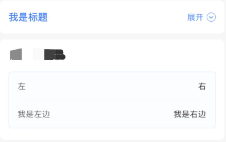
通过视图结构层次,我们发现组件完全按照我们的意图显示。
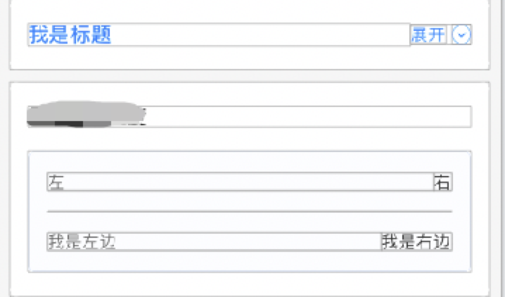
视图结构:
话不多说,直接上代码:
左边文本右端组件
<View style={style.item_top_bg}>
         <Text style={style.item_tab}>我是标题</Text>
                    {/* 展开收起 */}
            <TouchableOpacity style={style.item_top_btn} onPress={() => {
                        let open = this.state.openflag
                        this.setState({ openflag: !open })
             }}>
                        <Text style={style.item_top_right_title}>{this.showTitle()}</Text>
                        {this.showImg()}
             </TouchableOpacity>
 </View>
  item_top_bg: {
        borderRadius: 8,
        marginHorizontal: 10,
        marginBottom: 10,
        paddingHorizontal: 15,
        paddingVertical: 20,
        flexDirection: 'row',
        alignItems: 'center',
        backgroundColor: '#FFFFFF',
    },

    item_tab: {
        flex: 1,
        fontSize: DeviceHelp.fontSize(17),
        fontWeight: DeviceHelp.fontBold,
        color: '#3480FF',
    },

    item_top_btn: {
        alignItems: 'center',
        flexDirection: 'row',
    },
左边文本右边文本
                <View style={style.item_sub_bg}>
                    {/* 左右 */}
                    <View style={style.item_title_bg}>
                        <Text style={style.item_left}>左</Text>
                        <Text style={style.item_right}>右</Text>
                    </View>
                    {/* 分割线 */}
                    <View style={style.item_line}></View>
                    {/* 左右 */}
                    <View style={style.item_title_bg}>
                        <Text style={style.item_left}>我是左边</Text>
                        <Text style={style.item_right}>我是右边</Text>
                    </View>

                </View>
   item_sub_bg: {
        borderRadius: 5,
        borderWidth: 1,
        borderColor: '#B8D2FF5C',
        backgroundColor: '#FCFDFF',
        paddingHorizontal: 15,
        paddingVertical: 17,
    },

    item_title_bg: {
        alignItems: 'center',
        flexDirection: 'row',
    },

    item_left: {
        fontSize: DeviceHelp.fontSize(14),
        color: '#666666',
        flex: 1,
    },

    item_right: {
        fontSize: DeviceHelp.fontSize(14),
        color: '#333333',
    },

    item_line: {
        marginVertical: 17,
        height: 0.5,
        backgroundColor: '#EBEBEB',
    },
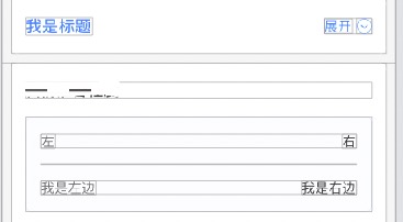
B:父组件使用justifyContent:'space-between'
结构图:
代码变动如下:
两者都是子组件注释// flex:1,父组件增加justifyContent:'space-between',
左边文本右边组件:
item_top_bg: {
        borderRadius: 8,
        marginHorizontal: 10,
        marginBottom: 10,
        paddingHorizontal: 15,
        paddingVertical: 20,
        flexDirection: 'row',
        alignItems: 'center',
        backgroundColor: '#FFFFFF',
        justifyContent:'space-between',
    },

    item_tab: {
        // flex:1,
        fontSize: DeviceHelp.fontSize(17),
        fontWeight: DeviceHelp.fontBold,
        color: '#3480FF',
    },
左边文本右边文本
item_title_bg: {
        alignItems: 'center',
        flexDirection: 'row',
        justifyContent:'space-between',
    },

    item_left: {
        // flex:1,
        fontSize: DeviceHelp.fontSize(14),
        color: '#666666',
    },