Visualizations
https://scikit-learn.org/stable/visualizations.html
提供了分析机器学习性能的可视化工具。
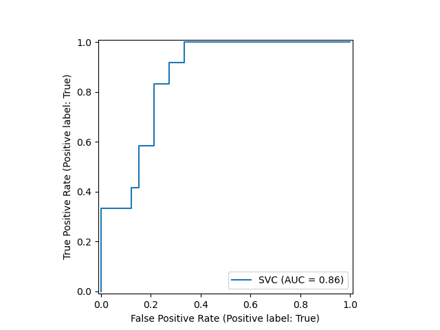
Scikit-learn defines a simple API for creating visualizations for machine learning. The key feature of this API is to allow for quick plotting and visual adjustments without recalculation. In the following example, we plot a ROC curve for a fitted support vector machine:
from sklearn.model_selection import train_test_split
from sklearn.svm import SVC
from sklearn.metrics import plot_roc_curve
from sklearn.datasets import load_wine

X_train, X_test, y_train, y_test = train_test_split(X, y, random_state=42)
svc = SVC(random_state=42)
svc.fit(X_train, y_train)

svc_disp = plot_roc_curve(svc, X_test, y_test)
例如 ROC 曲线。
The returned
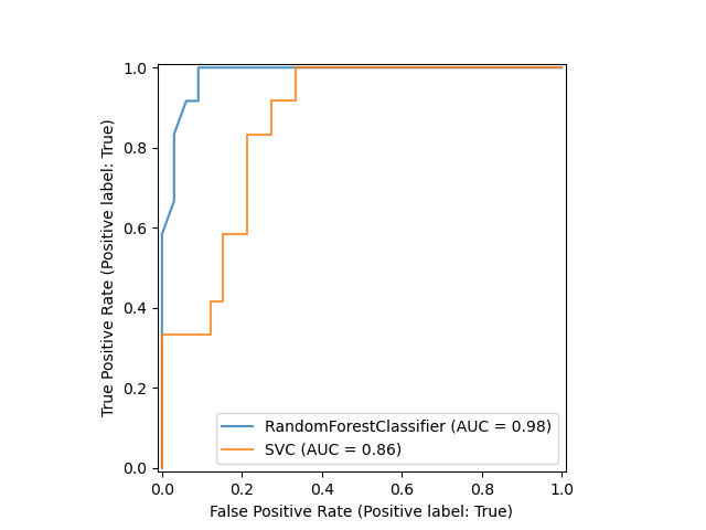
svc_dispobject allows us to continue using the already computed ROC curve for SVC in future plots. In this case, thesvc_dispis aRocCurveDisplaythat stores the computed values as attributes calledroc_auc,fpr, andtpr. Next, we train a random forest classifier and plot the previously computed roc curve again by using theplotmethod of theDisplayobject.
比较两个模型的 ROC 曲线高低。
import matplotlib.pyplot as plt
from sklearn.ensemble import RandomForestClassifier

rfc = RandomForestClassifier(random_state=42)
rfc.fit(X_train, y_train)

ax = plt.gca()
rfc_disp = plot_roc_curve(rfc, X_test, y_test, ax=ax, alpha=0.8)
svc_disp.plot(ax=ax, alpha=0.8)
Notice that we pass
alpha=0.8to the plot functions to adjust the alpha values of the curves.
Available Plotting Utilities
一些API接口。
5.1.1. Functions
Partial dependence (PD) and individual conditional expectation (ICE) plots.
metrics.plot_confusion_matrix(estimator, X, …)Plot Confusion Matrix.
metrics.plot_det_curve(estimator, X, y, *[, …])Plot detection error tradeoff (DET) curve.
Plot Precision Recall Curve for binary classifiers.
metrics.plot_roc_curve(estimator, X, y, *[, …])Plot Receiver operating characteristic (ROC) curve.
5.1.2. Display Objects
Partial Dependence Plot (PDP).
metrics.ConfusionMatrixDisplay(…[, …])Confusion Matrix visualization.
metrics.DetCurveDisplay(*, fpr, fnr[, …])DET curve visualization.
metrics.PrecisionRecallDisplay(precision, …)Precision Recall visualization.
metrics.RocCurveDisplay(*, fpr, tpr[, …])ROC Curve visualization.
What is ROC curve?
https://en.wikipedia.org/wiki/Receiver_operating_characteristic
描述二值分类系统的诊断能力, 当区分阈值变化的情况下。
最初是用于诊断雷达接收器,所以命名中有 receiver operating characteristic 。
A receiver operating characteristic curve, or ROC curve, is a graphical plot that illustrates the diagnostic ability of a binary classifier system as its discrimination threshold is varied. The method was originally developed for operators of military radar receivers, which is why it is so named.
The ROC curve was first developed by electrical engineers and radar engineers during World War II for detecting enemy objects in battlefields and was soon introduced to psychology to account for perceptual detection of stimuli. ROC analysis since then has been used in medicine, radiology, biometrics, forecasting of natural hazards,[8] meteorology,[9] model performance assessment,[10] and other areas for many decades and is increasingly used in machine learning and data mining research.
为什么使用ROC曲线
https://www.jianshu.com/p/c61ae11cc5f6
测试样本不均性,需要引入ROC。
既然已经这么多评价标准,为什么还要使用ROC和AUC呢?因为ROC曲线有个很好的特性:当测试集中的正负样本的分布变化的时候,ROC曲线能够保持不变。在实际的数据集中经常会出现类不平衡(class imbalance)现象,即负样本比正样本多很多(或者相反),而且测试数据中的正负样本的分布也可能随着时间变化。下图是ROC曲线和Precision-Recall曲线的对比:
在上图中,(a)和(c)为ROC曲线,(b)和(d)为Precision-Recall曲线。(a)和(b)展示的是分类其在原始测试集(正负样本分布平衡)的结果,(c)和(d)是将测试集中负样本的数量增加到原来的10倍后,分类器的结果。可以明显的看出,ROC曲线基本保持原貌,而Precision-Recall曲线则变化较大。

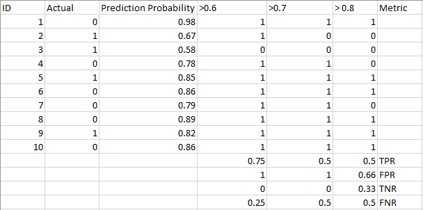
Probability of Predictions
https://www.analyticsvidhya.com/blog/2020/06/auc-roc-curve-machine-learning/
一般二值分类问题,评价使用 precision recall 和 F1-score
这种评价是基于 预测目标 和 真实的目标值 进行对比获得。
实际上, 对于分类问题, 每个实例的预测都有另外一个概率的参数产生, 这就是score,概率值。
虽然有可能一个 实例被判别到一个类别中, 但是有可能它的得分 score 很低。
从概率的角度进行评判预测结果, 这种思想产生了 ROC 曲线。
A machine learning classification model can be used to predict the actual class of the data point directly or predict its probability of belonging to different classes. The latter gives us more control over the result. We can determine our own threshold to interpret the result of the classifier. This is sometimes more prudent than just building a completely new model!
Setting different thresholds for classifying positive class for data points will inadvertently change the Sensitivity and Specificity of the model. And one of these thresholds will probably give a better result than the others, depending on whether we are aiming to lower the number of False Negatives or False Positives.
Have a look at the table below:
The metrics change with the changing threshold values. We can generate different confusion matrices and compare the various metrics that we discussed in the previous section. But that would not be a prudent thing to do. Instead, what we can do is generate a plot between some of these metrics so that we can easily visualize which threshold is giving us a better result.
The AUC-ROC curve solves just that problem!
ROC Curve with Visualization API
https://scikit-learn.org/stable/auto_examples/miscellaneous/plot_roc_curve_visualization_api.html#sphx-glr-auto-examples-miscellaneous-plot-roc-curve-visualization-api-py
"""
================================
ROC Curve with Visualization API
================================
Scikit-learn defines a simple API for creating visualizations for machine
learning. The key features of this API is to allow for quick plotting and
visual adjustments without recalculation. In this example, we will demonstrate
how to use the visualization API by comparing ROC curves.
"""
print(__doc__)

# %%
# Load Data and Train a SVC
# -------------------------
# First, we load the wine dataset and convert it to a binary classification
# problem. Then, we train a support vector classifier on a training dataset.
import matplotlib.pyplot as plt
from sklearn.svm import SVC
from sklearn.ensemble import RandomForestClassifier
from sklearn.metrics import plot_roc_curve
from sklearn.datasets import load_wine
from sklearn.model_selection import train_test_split

X, y = load_wine(return_X_y=True)
y = y == 2

X_train, X_test, y_train, y_test = train_test_split(X, y, random_state=42)
svc = SVC(random_state=42)
svc.fit(X_train, y_train)

# %%
# Plotting the ROC Curve
# ----------------------
# Next, we plot the ROC curve with a single call to
# :func:`sklearn.metrics.plot_roc_curve`. The returned `svc_disp` object allows
# us to continue using the already computed ROC curve for the SVC in future
# plots.
svc_disp = plot_roc_curve(svc, X_test, y_test)
plt.show()

# %%
# Training a Random Forest and Plotting the ROC Curve
# --------------------------------------------------------
# We train a random forest classifier and create a plot comparing it to the SVC
# ROC curve. Notice how `svc_disp` uses
# :func:`~sklearn.metrics.RocCurveDisplay.plot` to plot the SVC ROC curve
# without recomputing the values of the roc curve itself. Furthermore, we
# pass `alpha=0.8` to the plot functions to adjust the alpha values of the
# curves.
rfc = RandomForestClassifier(n_estimators=10, random_state=42)
rfc.fit(X_train, y_train)
ax = plt.gca()
rfc_disp = plot_roc_curve(rfc, X_test, y_test, ax=ax, alpha=0.8)
svc_disp.plot(ax=ax, alpha=0.8)
plt.show()
比较随机森林 和 SVC 分类器的ROC 标准性能, 说明 随机随机森林更加稳定可靠。

Receiver Operating Characteristic (ROC)
https://scikit-learn.org/stable/auto_examples/model_selection/plot_roc.html#sphx-glr-auto-examples-model-selection-plot-roc-py
ROC评估分类输出质量。
ROC曲线最好的情况是, 左上角, TPR是1, FPR是0, 这只是理想情况。
这意味着, ROC曲线下面的面积(AUC)越大越好。
ROC曲线的陡峭度也是重要的, 因为极大化TPR,和最小化FPR。
Example of Receiver Operating Characteristic (ROC) metric to evaluate classifier output quality.
ROC curves typically feature true positive rate on the Y axis, and false positive rate on the X axis. This means that the top left corner of the plot is the “ideal” point - a false positive rate of zero, and a true positive rate of one. This is not very realistic, but it does mean that a larger area under the curve (AUC) is usually better.
The “steepness” of ROC curves is also important, since it is ideal to maximize the true positive rate while minimizing the false positive rate.
ROC curves are typically used in binary classification to study the output of a classifier. In order to extend ROC curve and ROC area to multi-label classification, it is necessary to binarize the output. One ROC curve can be drawn per label, but one can also draw a ROC curve by considering each element of the label indicator matrix as a binary prediction (micro-averaging).
Another evaluation measure for multi-label classification is macro-averaging, which gives equal weight to the classification of each label.
"""
=======================================
Receiver Operating Characteristic (ROC)
=======================================

Example of Receiver Operating Characteristic (ROC) metric to evaluate
classifier output quality.

ROC curves typically feature true positive rate on the Y axis, and false
positive rate on the X axis. This means that the top left corner of the plot is
the "ideal" point - a false positive rate of zero, and a true positive rate of
one. This is not very realistic, but it does mean that a larger area under the
curve (AUC) is usually better.

The "steepness" of ROC curves is also important, since it is ideal to maximize
the true positive rate while minimizing the false positive rate.

ROC curves are typically used in binary classification to study the output of
a classifier. In order to extend ROC curve and ROC area to multi-label
classification, it is necessary to binarize the output. One ROC
curve can be drawn per label, but one can also draw a ROC curve by considering
each element of the label indicator matrix as a binary prediction
(micro-averaging).

Another evaluation measure for multi-label classification is
macro-averaging, which gives equal weight to the classification of each
label.

.. note::

    See also :func:`sklearn.metrics.roc_auc_score`,
             :ref:`sphx_glr_auto_examples_model_selection_plot_roc_crossval.py`

"""
print(__doc__)

import numpy as np
import matplotlib.pyplot as plt
from itertools import cycle

from sklearn import svm, datasets
from sklearn.metrics import roc_curve, auc
from sklearn.model_selection import train_test_split
from sklearn.preprocessing import label_binarize
from sklearn.multiclass import OneVsRestClassifier
from scipy import interp
from sklearn.metrics import roc_auc_score

# Import some data to play with
iris = datasets.load_iris()
X = iris.data
y = iris.target

# Binarize the output
y = label_binarize(y, classes=[0, 1, 2])
n_classes = y.shape[1]

# Add noisy features to make the problem harder
random_state = np.random.RandomState(0)
n_samples, n_features = X.shape
X = np.c_[X, random_state.randn(n_samples, 200 * n_features)]

# shuffle and split training and test sets
X_train, X_test, y_train, y_test = train_test_split(X, y, test_size=.5,
                                                    random_state=0)

# Learn to predict each class against the other
classifier = OneVsRestClassifier(svm.SVC(kernel='linear', probability=True,
                                 random_state=random_state))
y_score = classifier.fit(X_train, y_train).decision_function(X_test)

# Compute ROC curve and ROC area for each class
fpr = dict()
tpr = dict()
roc_auc = dict()
for i in range(n_classes):
    fpr[i], tpr[i], _ = roc_curve(y_test[:, i], y_score[:, i])
    roc_auc[i] = auc(fpr[i], tpr[i])

# Compute micro-average ROC curve and ROC area
fpr["micro"], tpr["micro"], _ = roc_curve(y_test.ravel(), y_score.ravel())
roc_auc["micro"] = auc(fpr["micro"], tpr["micro"])


# %%
# Plot of a ROC curve for a specific class
plt.figure()
lw = 2
plt.plot(fpr[2], tpr[2], color='darkorange',
         lw=lw, label='ROC curve (area = %0.2f)' % roc_auc[2])
plt.plot([0, 1], [0, 1], color='navy', lw=lw, linestyle='--')
plt.xlim([0.0, 1.0])
plt.ylim([0.0, 1.05])
plt.xlabel('False Positive Rate')
plt.ylabel('True Positive Rate')
plt.title('Receiver operating characteristic example')
plt.legend(loc="lower right")
plt.show()


# %%
# Plot ROC curves for the multilabel problem
# ..........................................
# Compute macro-average ROC curve and ROC area

# First aggregate all false positive rates
all_fpr = np.unique(np.concatenate([fpr[i] for i in range(n_classes)]))

# Then interpolate all ROC curves at this points
mean_tpr = np.zeros_like(all_fpr)
for i in range(n_classes):
    mean_tpr += interp(all_fpr, fpr[i], tpr[i])

# Finally average it and compute AUC
mean_tpr /= n_classes

fpr["macro"] = all_fpr
tpr["macro"] = mean_tpr
roc_auc["macro"] = auc(fpr["macro"], tpr["macro"])

# Plot all ROC curves
plt.figure()
plt.plot(fpr["micro"], tpr["micro"],
         label='micro-average ROC curve (area = {0:0.2f})'
               ''.format(roc_auc["micro"]),
         color='deeppink', linestyle=':', linewidth=4)

plt.plot(fpr["macro"], tpr["macro"],
         label='macro-average ROC curve (area = {0:0.2f})'
               ''.format(roc_auc["macro"]),
         color='navy', linestyle=':', linewidth=4)

colors = cycle(['aqua', 'darkorange', 'cornflowerblue'])
for i, color in zip(range(n_classes), colors):
    plt.plot(fpr[i], tpr[i], color=color, lw=lw,
             label='ROC curve of class {0} (area = {1:0.2f})'
             ''.format(i, roc_auc[i]))

plt.plot([0, 1], [0, 1], 'k--', lw=lw)
plt.xlim([0.0, 1.0])
plt.ylim([0.0, 1.05])
plt.xlabel('False Positive Rate')
plt.ylabel('True Positive Rate')
plt.title('Some extension of Receiver operating characteristic to multi-class')
plt.legend(loc="lower right")
plt.show()


# %%
# Area under ROC for the multiclass problem
# .........................................
# The :func:`sklearn.metrics.roc_auc_score` function can be used for
# multi-class classification. The multi-class One-vs-One scheme compares every
# unique pairwise combination of classes. In this section, we calculate the AUC
# using the OvR and OvO schemes. We report a macro average, and a
# prevalence-weighted average.
y_prob = classifier.predict_proba(X_test)

macro_roc_auc_ovo = roc_auc_score(y_test, y_prob, multi_class="ovo",
                                  average="macro")
weighted_roc_auc_ovo = roc_auc_score(y_test, y_prob, multi_class="ovo",
                                     average="weighted")
macro_roc_auc_ovr = roc_auc_score(y_test, y_prob, multi_class="ovr",
                                  average="macro")
weighted_roc_auc_ovr = roc_auc_score(y_test, y_prob, multi_class="ovr",
                                     average="weighted")
print("One-vs-One ROC AUC scores:
{:.6f} (macro),
{:.6f} "
      "(weighted by prevalence)"
      .format(macro_roc_auc_ovo, weighted_roc_auc_ovo))
print("One-vs-Rest ROC AUC scores:
{:.6f} (macro),
{:.6f} "
      "(weighted by prevalence)"
      .format(macro_roc_auc_ovr, weighted_roc_auc_ovr))

