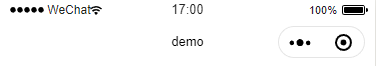
前言:小程序的顶部一般是原生控制的,类似下图
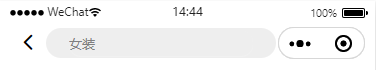
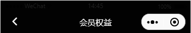
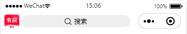
但类似电商,游戏类等小程序为求更加美观,往往会自定义头部展示,比如
功能实现:要自定义头部样式,得先配置全局属性>>"navigationStyle": "custom",

头部组件:小程序自定义头部的高度=状态栏高度+导航栏高度,其中状态栏高度不同手机规格会不同,需要适配,导航栏高度则是统一的44px,代码如下


  1 <template>
  2     <view class="bar-sticky">
  3         <view class="status-line" :style="{height: lineHeight, background: navigationBarStyle.background || normal.background}"></view>
  4         <view class="bar-line" :style="{background: navigationBarStyle.background || normal.background}">
  5             <view class="bar-line container-in" :style="{background: navigationBarStyle.background || normal.background}">
  6                 <view class="bar-font bar-content" v-if="!custom">
  7                     <view class="icon-fanhui bar-back" :style="{color: navigationBarStyle.iconColor || normal.iconColor}" @click="$turnPage('1', 'navigateBack')"
  8                      v-if="showBack">
  9                     </view>
 10                     <view class="bar-title" :style="{color: navigationBarStyle.fontColor || normal.fontColor}">{{navigationBarStyle.iconText}}</view>
 11                 </view>
 12                 <view class="bar-font container-in" v-else>
 13                     <slot></slot>
 14                 </view>
 15             </view>
 16         </view>
 17     </view>
 18 </template>
 19
 20 <script>
 21     export default {
 22         props: {
 23             custom: {
 24                 type: Boolean,
 25                 default: false
 26             }, //自定义头部,否则沿用原生的头部样式
 27             navigationBarStyle: {
 28                 type: Object,
 29                 default: function() {
 30                     return {
 31                         background: '#FFFFFF',
 32                         fontColor: '#000000',
 33                         iconColor: '#000000',
 34                         iconText: '一米一粉' //导航栏文字
 35                     }
 36                 }
 37             }, //原生头部自定义样式
 38             showBack: {
 39                 type: Boolean,
 40                 default: true
 41             }, //是否显示回退图标,默认显示
 42         },
 43         data() {
 44             return {
 45                 normal: {
 46                     background: '#FFFFFF',
 47                     fontColor: '#000000',
 48                     iconColor: '#000000',
 49                 }, //公用样式,个性化样式可通过传值实现
 50                 lineHeight: '' //状态栏高度
 51             };
 52         },
 53         mounted() {
 54             const systemInfo = uni.getSystemInfoSync();
 55             // px转换到rpx的比例
 56             let pxToRpxScale = 750 / systemInfo.windowWidth;
 57             let systems = {
 58                 ktxStatusHeight: systemInfo.statusBarHeight * pxToRpxScale, // 状态栏的高度
 59                 navigationHeight: 44 * pxToRpxScale, // 导航栏的高度
 60                 ktxWindowWidth: systemInfo.windowWidth * pxToRpxScale, // window的宽度
 61                 ktxWindowHeight: systemInfo.windowHeight * pxToRpxScale, // window的高度
 62                 ktxScreentHeight: systemInfo.screenHeight * pxToRpxScale, // 屏幕的高度
 63             }
 64             // 底部tabBar的高度
 65             systems.tabBarHeight = systems.ktxScreentHeight - systems.ktxStatusHeight - systems.navigationHeight - systems.ktxWindowHeight // 底部tabBar的高度
 66             this.lineHeight = systems.ktxStatusHeight + 'rpx';
 67             this.$emit('getHeight', systems)
 68         }
 69     }
 70 </script>
 71
 72 <style lang="scss">
 73     /*正中*/
 74     .bar-content {
 75          100%;
 76         display: flex;
 77         flex-direction: column;
 78         align-items: center;
 79         justify-content: center;
 80     }
 81
 82     //导航栏吸顶效果
 83     .bar-sticky {
 84         position: sticky;
 85         position: -webkit-sticky;
 86         top: 0;
 87         z-index: 101;
 88     }
 89
 90     /*垂直居中*/
 91     .container-in {
 92         display: flex;
 93         -webkit-align-items: center;
 94         align-items: center;
 95          100%;
 96         height: 44px;
 97     }
 98
 99     .bar-line {
100         height: 44px; //导航栏高度
101
102         .bar-back {
103             font-size: 52rpx !important;
104             position: absolute;
105             left: 30rpx;
106         }
107
108         .bar-title {
109             font-size: 32rpx;
110         }
111     }
112 </style>
组件引用,如果想实现自定义的样式,可以在规定高度内写点自己的代码
<view class="bar-sticky">
<navigationBar custom="true">
//自己的代码
</navigationBar>
</view>
如果还是跟原来的样式一样,就写

<view class="bar-sticky">
     <navigationBar :navigationBarStyle="navigationBarStyle" :showBack="false"></navigationBar>
</view>
//设置导航栏样式
navigationBarStyle: {
iconText: '类目' //导航栏文字
},
注意:自定义的头部组件需要固定在顶部,所以需要全局样式,sticky的妙用有兴趣可以留意一下
.bar-sticky {
    position: sticky;
    position: -webkit-sticky;
    top: 0;
    z-index: 101;
}