1.版本介绍(已上传至群里)
版本说明:
- 添加登录界面、
- UDP校验登录、
- 皮肤更换、
- 3D旋转(主界面和登录界面之间切换) 、
效果图如下所示:
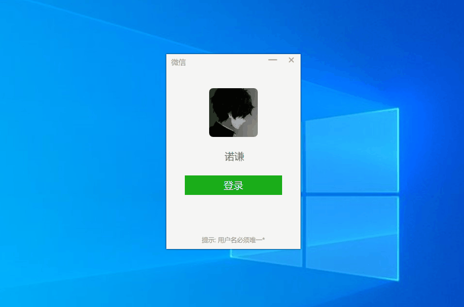
如果效果图加载失败,可以去哔哩哔哩 https://www.bilibili.com/video/BV1ow411R7Dg浏览
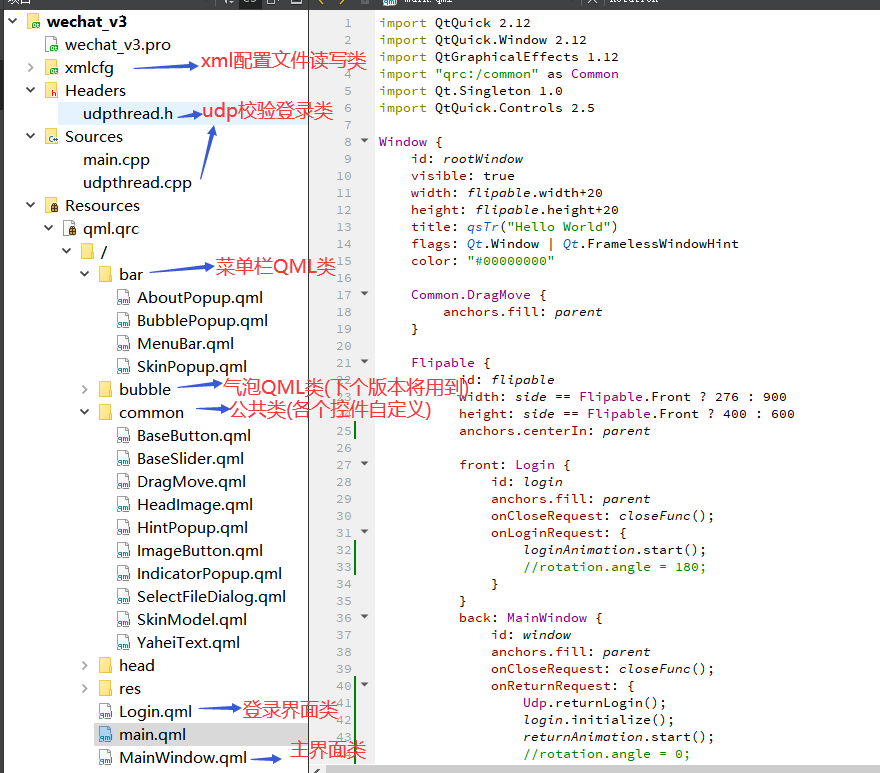
项目文件结构如下所示:
下个版本实现:
- 添加获取好友列表及头像、
- 好友聊天和表情包收发、
- 文件收发、
2.核心代码
Login.qml如下所示:
import QtQuick 2.0
import QtGraphicalEffects 1.12
import QtQuick.Controls 2.5
import QtQuick.Layouts 1.12
import Qt.Singleton 1.0
import "qrc:/common"
Rectangle {
    id: container
    color: "#F5F5F5"
    signal closeRequest();
    signal loginRequest();
    SelectFileDialog {
        id: _file
        nameFilters: ["image files (*.png *.jpg)"]
        folder: XmlCfg.fileOpenUrl
        onAccepted: {
            console.log("选择了:  "+files[0])
            if (!XmlCfg.updateHeadImage(files[0])) {
                popup.hint = "图片格式读取失败!"
                popup.open();

            } else {

            }
        }
    }

    Row {
        anchors.right: container.right
        ImageButton {
            imageSrc: "qrc:/res/minimize.png"
            backHoverColor: "#E3E3E3"

            ToolTip.delay: 1000              // 徘徊在按钮上超过500ms则显示,则默认为直接显示
            ToolTip.visible: hovered       // 当鼠标徘徊在按钮上时,则显示ToolTip
            ToolTip.text: qsTr("最小化")
            onClicked: {
               showMinimized()
            }
        }
        ImageButton {
            imageSrc: "qrc:/res/close.png"
            hoverimageSrc:"qrc:/res/close_hover.png"
            backHoverColor: "#FA5151"
            ToolTip.delay: 1000              // 徘徊在按钮上超过500ms则显示,则默认为直接显示
            ToolTip.visible: hovered       // 当鼠标徘徊在按钮上时,则显示ToolTip
            ToolTip.text: qsTr("关闭")
            onClicked: closeRequest();
        }
    }

    layer.enabled: true
    layer.effect: DropShadow {
    }

    YaheiText {
        text: "微信"
        font.pixelSize: 15
        x: 10
        y: 6
        color: "#8E8E8E"
    }

    ColumnLayout {
        id: _center
        spacing: 20
        anchors.centerIn: parent
        opacity: 0.0
        HeadImage {
            id: _head
            radius: 8
            width : 100
            height : 100
            headUrl: XmlCfg.headImage
            Layout.alignment: Qt.AlignCenter
            Button {
                id: _headBtn
                anchors.fill: parent
                contentItem: Rectangle {
                    color: "transparent"
                }
                background: Rectangle {
                    id: _headBtnBack
                    color: "transparent"
                    border.  2
                    border.color: _headBtn.hovered||_loginAnimation.running ? SkinSingleton.skins[XmlCfg.skinIndex].loginColor :  "transparent"
                    radius: _head.radius
                }
                onClicked: {
                    _file.open();
                }
            }

        }
        TextField {
            id: _name
            placeholderText : "请输入你的昵称"
            text: XmlCfg.currentUser
            font.family: "Microsoft Yahei"
            font.pixelSize: 20
            horizontalAlignment: TextField.AlignHCenter
            color: "#666"
            selectedTextColor: "#fff"
            background: Rectangle {
                 border. 0
                 color: "transparent"
             }
            Layout.fillWidth: false
            Layout.alignment: Qt.AlignCenter
            Layout.preferredWidth: 200
            onTextChanged: {
                XmlCfg.currentUser = _name.text;
            }

        }

        BaseButton {
            id: _login
            btnText: "登录"
            Layout.fillWidth: true
            Layout.alignment: Qt.AlignCenter
            bckcolor: SkinSingleton.skins[XmlCfg.skinIndex].loginColor
            onClicked: {
                _loginAnimation.restart();
                XmlCfg.SkinIndex = "2";
                Udp.login();
            }
        }
        YaheiText {
            id: _loginHint
            Layout.alignment: Qt.AlignCenter
            text: ""
            font.pixelSize: 15
            color: SkinSingleton.skins[XmlCfg.skinIndex].loginColor
        }

    }

    YaheiText {
        anchors.horizontalCenter: container.horizontalCenter
        anchors.bottom: container.bottom
        anchors.bottomMargin: 10
        text: "提示: 用户名必须唯一*"
        font.pixelSize: 13
        color: "#8E8E8E"
    }


    HintPopup {
        id: popup
        width : 180
        height: 120
        anchors.centerIn: container
        hint: "用户名已被注册!"
    }

    SequentialAnimation {
      running: true
      NumberAnimation { target: container;
          properties: "scale"; from: 0.3; to: 1.0; easing.type: Easing.InOutQuad; duration: 200 }
      NumberAnimation { target: _center;
          properties: "opacity"; from: 0; to: 1.0; easing.type: Easing.InOutQuad; duration: 300 }
    }


    SequentialAnimation {
        id: _loginAnimation
        SequentialAnimation {
            loops: 4

            ScriptAction {
                script: _loginHint.text = "登录中."
            }
            NumberAnimation {
                target: _headBtnBack;
                property: "opacity";
                from: 1.0; to: 0.0; duration: 200
            }
            ScriptAction {
                script: _loginHint.text = "登录中.."
            }
            NumberAnimation {
                target: _headBtnBack;
                property: "opacity";
                from: 0.0; to: 1.0; duration: 200
            }
            ScriptAction {
                script: {
                    _loginHint.text = "登录中..."
                }
            }
            PauseAnimation { duration: 100 }
        }

        ScriptAction {
            script: {
                _loginHint.text = "登录成功!"
            }
        }
        PauseAnimation { duration: 1000 }

    }
    Connections {
        target: Udp;
        onLoginResult:{
            if (result) {
                _loginAnimation.stop();
                _loginHint.text = "用户名已被注册!"
                popup.hint = "用户名已被注册!"
                popup.open();
            }
        }
    }

    Connections {
        target: _loginAnimation;
        onFinished:{
            console.log(" OK ");
            loginRequest();
        }
    }

    function initialize() {
        _loginHint.text = "";
    }

}
MainWindow.qml如下所示:
import QtQuick 2.12
import QtGraphicalEffects 1.12
import QtQuick.Controls 2.5
import QtQuick.Layouts 1.12
import Qt.Singleton 1.0
import "qrc:/common"
import "qrc:/bar"
Rectangle {
    id: container

    signal closeRequest();
    signal returnRequest();

    gradient:  SkinSingleton.skins[XmlCfg.skinIndex]

    RowLayout {

        anchors.fill: parent
        spacing: 0
        MenuBar {
            Layout.preferredWidth: 60
            Layout.fillHeight: true
            onReturnRequest: container.returnRequest();

        }
        Rectangle {
            color: Qt.rgba(1,1,1, 0.5 + XmlCfg.skinOpacity * 0.3 )
            Layout.preferredWidth: 200
            Layout.fillHeight: true
        }
        Rectangle {
            id: rct
            color: Qt.rgba(1,1,1,0.5 + XmlCfg.skinOpacity * 0.5)
            Layout.fillWidth: true
            Layout.fillHeight: true

            Row {
                anchors.right: rct.right
                ImageButton {
                    imageSrc: "qrc:/res/minimize.png"
                    backHoverColor: "#E3E3E3"

                    ToolTip.delay: 1000              // 徘徊在按钮上超过500ms则显示,则默认为直接显示
                    ToolTip.visible: hovered       // 当鼠标徘徊在按钮上时,则显示ToolTip
                    ToolTip.text: qsTr("最小化")
                    onClicked: {
                       showMinimized()
                    }
                }
                ImageButton {
                    imageSrc: "qrc:/res/close.png"
                    hoverimageSrc:"qrc:/res/close_hover.png"
                    backHoverColor: "#FA5151"
                    ToolTip.delay: 1000              // 徘徊在按钮上超过500ms则显示,则默认为直接显示
                    ToolTip.visible: hovered       // 当鼠标徘徊在按钮上时,则显示ToolTip
                    ToolTip.text: qsTr("关闭")
                    onClicked: closeRequest();
                }
            }
        }
    }


    layer.enabled: true
    layer.effect: DropShadow {
    }

}
未完待续~