原文链接:http://www.cnblogs.com/LY-leo/p/5765598.html
对于 :before 和 :after 选择器,大家并不陌生,但是很少有人会主动去用它们。先解释下它们的定义和用法:
:before 选择器在被选元素的内容前面插入内容,:after 选择器在被选元素的内容后面插入内容,都会使用 content 属性来指定要插入的内容。
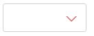
有时候,项目中或多或少需要一些箭头,如果用图片来做,感觉就有点 low 了,而上面这两个选择器是最好的选择。效果如下:
html 代码如下:
<div class="test"></div>
css 代码如下:

.test {
    position: relative;
     120px;
    height: 40px;
    border: 1px solid #d2d2d2;
    border-radius: 3px;
}
.test:after {
    position: absolute;
    right: 15px;
    top: 18px;
     0;
    height: 0;
    content: "";
    border- 6px 6px 0 6px;     /*border- 6px 6px 6px 6px;*/
    border-style: solid;
    border-color: #fff transparent;    /*red transparent transparent transparent;*/
    -webkit-transition: all .25s;
       -moz-transition: all .25s;
        -ms-transition: all .25s;
         -o-transition: all .25s;
            transition: all .25s;
}

.test:before {
    position: absolute;
    right: 13px;
    top: 18px;
     0;
    height: 0;
    content: "";
    border- 8px 8px 0 8px;
    border-style: solid;
    border-color: #d36969 transparent;
    -webkit-transition: transform .25s;
       -moz-transition: transform .25s;
        -ms-transition: transform .25s;
         -o-transition: transform .25s;
            transition: transform .25s;
}
.test.active:after{
    top: 20px;
    -webkit-transform: rotate(180deg);
       -moz-transform: rotate(180deg);
        -ms-transform: rotate(180deg);
         -o-transform: rotate(180deg);
            transform: rotate(180deg);
}
.test.active:before{
    -webkit-transform: rotate(180deg);
       -moz-transform: rotate(180deg);
        -ms-transform: rotate(180deg);
         -o-transform: rotate(180deg);
            transform: rotate(180deg);
}
通过 :before 和 :after 两个伪元素,设置 content 为空,宽高为零,边框和颜色,生成两个等边三角形,一个是红色的三角,其边长稍大,一个是白色的三角。会有人问为什么白色三角是通过 :after 生成的,因为 :after 生成的白色三角才能覆盖在 :before 生成的红色三角,而形成一个箭头(一定要设置好定位的 top 值,使两个三角的底边重合)。
js 代码如下:
$('.test').on('click',function(){
      $(this).toggleClass('active');
})
点击的时候箭头会旋转180度,效果如下:

分析:
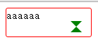
加z-index: 10前后:
<!DOCTYPE html>
<html>
<head>
<meta charset="UTF-8">
<title></title>
<style type="text/css">
.test {
position: relative;
120px;
height: 40px;
border: 1px solid red;
border-radius: 3px;
}
.test:after {
position: absolute;
right: 15px;
top: 18px;
0;
height: 0;
content: "";
border- 6px 6px 6px 6px;
border-style: solid;
border-color: red transparent transparent transparent;
transition: all .25s;
}
.test:before {
position: absolute;
right: 13px;
top: 18px;
0;
height: 0;
content: "";
border- 8px 8px 8px 8px;
border-style: solid;
border-color: green transparent;
transition: transform .25s;
/*z-index: 10;*/
}
</style>
</head>
<body>
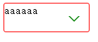
<div class="test">aaaaaa</div>
</body>
</html>
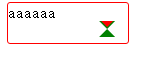
修改1:
.test:before {
				position: absolute;
				right: 13px;
				top: 18px;
				 0;
				height: 0;
				content: "";
				border- 8px 8px 8px 8px;
				border-style: solid;
				border-color: green transparent transparent transparent;
				transition: transform .25s;
				/*z-index: 10;*/
			}
 修改后的样式:
	.test:after {
				position: absolute;
				right: 15px;
				top: 18px;
				 0;
				height: 0;
				content: "";
				border- 6px 6px 6px 6px;
				border-style: solid;
				border-color: white transparent transparent transparent;
				transition: all .25s;
			}

			.test:before {
				position: absolute;
				right: 13px;
				top: 18px;
				 0;
				height: 0;
				content: "";
				border- 8px 8px 8px 8px;
				border-style: solid;
				border-color: green transparent transparent transparent;
				transition: transform .25s;
				/*z-index: 10;*/
			}
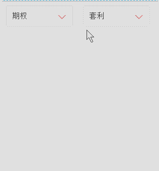
制作美化select 插件:
<!DOCTYPE html>
<html>

	<head>
		<meta charset="UTF-8">
		<title></title>
		<style type="text/css">
			ul li {
				list-style: none;
			}

			.test {
				position: relative;
				float: left;
				 120px;
				height: 40px;
				padding-left: 11px;
				font-size: 15px;
				line-height: 40px;
				cursor: pointer;
				border: 1px solid red;
				border-radius: 3px;
				margin: 0px 20px;
				outline: none;
			}

			.test:before {
				position: absolute;
				right: 13px;
				top: 18px;
				 0;
				height: 0;
				content: "";
				border- 8px 8px 0 8px;
				border-style: solid;
				border-color: red transparent;
				-webkit-transition: transform .25s;
				-moz-transition: transform .25s;
				-ms-transition: transform .25s;
				-o-transition: transform .25s;
				transition: transform .25s;
			}

			.test:after {
				position: absolute;
				right: 15px;
				top: 18px;
				 0;
				height: 0;
				content: "";
				border- 6px 6px 0 6px;
				border-style: solid;
				border-color: #fff transparent;
				-webkit-transition: all .25s;
				-moz-transition: all .25s;
				-ms-transition: all .25s;
				-o-transition: all .25s;
				transition: all .25s;
			}

			.test.active:before {
				-webkit-transform: rotate(180deg);
				-moz-transform: rotate(180deg);
				-ms-transform: rotate(180deg);
				-o-transform: rotate(180deg);
				transform: rotate(180deg);
			}

			.test.active:after {
				top: 20px;
				-webkit-transform: rotate(180deg);
				-moz-transform: rotate(180deg);
				-ms-transform: rotate(180deg);
				-o-transform: rotate(180deg);
				transform: rotate(180deg);
			}

			.test .dropdown {
				position: absolute;
				right: 0;
				left: 0;
				display: none;
				padding: 0;
				border-radius: inherit;
				border: 1px solid #d2d2d2;
				box-shadow: 2px 2px 5px rgba(0, 0, 0, .4);
			}

			.test.active .dropdown {
				display: block;
			}

			.test .dropdown:before {
				position: absolute;
				right: 13px;
				bottom: 100%;
				 0;
				height: 0;
				content: "";
				border- 0 8px 8px 8px;
				border-style: solid;
				border-color: #d2d2d2 transparent;
			}

			.test .dropdown:after {
				position: absolute;
				right: 15px;
				bottom: 100%;
				 0;
				height: 0;
				content: "";
				border- 0 6px 6px 6px;
				border-style: solid;
				border-color: #fff transparent;
			}

			.test .dropdown li {
				float: left;
				 129px;
				font-size: 14px;
				-webkit-transition: all .3s ease-out;
				-moz-transition: all .3s ease-out;
				-ms-transition: all .3s ease-out;
				-o-transition: all .3s ease-out;
				transition: all .3s ease-out;
				text-align: center;
			}

			.test .dropdown li:first-of-type {
				border-radius: 3px 3px 0 0;
			}

			.test .dropdown li:last-of-type {
				border-radius: 0 0 3px 3px;
			}

			.test .dropdown li:hover {
				color: #fff;
				background: red;
			}
		</style>
		<script src="http://libs.baidu.com/jquery/2.0.0/jquery.min.js"></script>
		<script type="text/javascript">
		$(function(){


			function DropDown(el) {
				this.dd = el;
				this.span = this.dd.children('span');
				this.li = this.dd.find('ul.dropdown li');
				this.val = '';
			}
			DropDown.prototype.initEvents = function() {
				var obj = this;
				obj.dd.on('click', function(event) {
					$(this).toggleClass('active').siblings().removeClass('active');
					event.stopPropagation();
				});
				obj.li.on('click', function() {
					var opt = $(this);
					obj.val = opt.html();
					if(obj.span.html() == obj.val) return;
					obj.span.html(obj.val);
					$(document).click(function() {
						$('.test').removeClass('active');
					});
				})
			}
			var test1 = new DropDown($('#type'));
			var test2 = new DropDown($('#kind'));
			test1.initEvents();
			test2.initEvents();
			})
		</script>
	</head>

	<body>
		<div id="type" class="test">
			<span>投资种类</span>
			<ul class="dropdown">
				<li>期货</li>
				<li>股票</li>
				<li>期权</li>
			</ul>
		</div>
		<div id="kind" class="test">
			<span>投资类型</span>
			<ul class="dropdown">
				<li>趋势</li>
				<li>震荡</li>
				<li>套利</li>
				<li>选股</li>
				<li>择时</li>
			</ul>
		</div>
	</body>

</html>