html
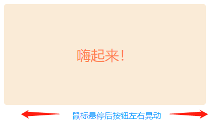
1 <body>
2      <button class="up">嗨起来!</button>
3 </body>
css
 1  .up:hover {
 2        animation: shake 0.82s cubic-bezier(.36, .07, .19, .97) both;
 3    }
 4
 5   /* .up:active{
 6        animation: shake 0.82s cubic-bezier(.36, .07, .19, .97) both;
 7         text-decoration:none;
 8    } */
 9
10    @keyframes shake {
11       10%, 90% {
12            transform: translate3d(-1px, 0, 0);
13        }
14       20%, 80% {
15           transform: translate3d(2px, 0, 0);
16       }
17       30%, 50%, 70% {
18           transform: translate3d(-4px, 0, 0);
19       }
20       40%, 60% {
21           transform: translate3d(4px, 0, 0);
22       }
23    }
24    .up{
25        border-radius: 5px;
26        background-color: antiquewhite;
27        color: coral;
28        border: #FAEBD7;
29        width: 400px;
30        height: 200px;
31        font-size: 28px;
32    }