hmtl+css实现小车轮子转动!
| <!DOCTYPE html> | |
| <html> | |
| <head lang="en"> | |
| <meta charset="UTF-8"> | |
| <title></title> | |
| <style> | |
| .car{ | |
| 200px; | |
| height: 100px; | |
| border: 1px solid #000; | |
| position: relative; | |
| -webkit-animation: moveCar linear 5s forwards; | |
| } | |
| .wheel1,.wheel2{ | |
| 50px; | |
| height: 50px; | |
| border-radius: 50%; | |
| } | |
| .wheel1{ | |
| position: absolute; | |
| left: 10px; | |
| bottom: -25px; | |
| } | |
| .wheel2{ | |
| position: absolute; | |
| right: 10px; | |
| bottom: -25px; | |
| } | |
| @keyframes moveCar { | |
| 0%{ | |
| position: relative; | |
| left: 50px; | |
| -webkit-transform: rotate(0deg); | |
| } | |
| 20%{ | |
| position: relative; | |
| left: 100px; | |
| -webkit-transform: rotate(0deg); | |
| } | |
| 40%{ | |
| position: relative; | |
| left: 150px; | |
| -webkit-transform: rotate(0deg); | |
| } | |
| 60%{ | |
| position: relative; | |
| left: 200px; | |
| -webkit-transform: rotate(0deg); | |
| } | |
| 80%{ | |
| position: relative; | |
| left: 250px; | |
| -webkit-transform: rotate(0deg); | |
| } | |
| 100%{ | |
| position: relative; | |
| left: 250px; | |
| -webkit-transform: rotate(180deg); | |
| } | |
| } | |
| /*------*/ | |
| .testWheel{ | |
| 50px; | |
| height: 50px; | |
| border-radius: 50%; | |
| border: 1px solid #000; | |
| -webkit-animation: moveWheel linear 2s 3; | |
| } | |
| .testWheel .zhou{ | |
| 100%; | |
| height: 0; | |
| border: 1px solid grey; | |
| position: absolute; | |
| top: 25px; | |
| } | |
| .testWheel .zhou:nth-child(2){ | |
| -webkit-transform: rotate(45deg); | |
| } | |
| .testWheel .zhou:nth-child(3){ | |
| -webkit-transform: rotate(90deg); | |
| } | |
| .testWheel .zhou:nth-child(4){ | |
| -webkit-transform: rotate(135deg); | |
| } | |
| @keyframes moveWheel { | |
| from{ | |
| -webkit-transform: rotate(0deg); | |
| } | |
| to{ | |
| -webkit-transform: rotate(360deg); | |
| } | |
| } | |
| </style> | |
| </head> | |
| <body> | |
| <div class="car"> | |
| 秦始皇 | |
| <div class="testWheel wheel1"> | |
| <div class="zhou"></div> | |
| <div class="zhou"></div> | |
| <div class="zhou"></div> | |
| <div class="zhou"></div> | |
| </div> | |
| <div class="testWheel wheel2"> | |
| <div class="zhou"></div> | |
| <div class="zhou"></div> | |
| <div class="zhou"></div> | |
| <div class="zhou"></div> | |
| </div> | |
| </div> | |
| </body> | |
</html>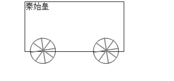 |