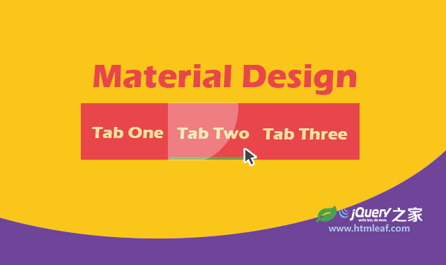
分享一款效果非常炫酷的谷歌 Material Design 风格jQuery和CSS3滑动选项卡特效。该选项卡特效集合了扁平风格设计和按钮点击波特效。是一款设计的非常不错的Material Design 风格作品。效果图如下:
实现的代码。
hmtl代码:
 <div class="htmleaf-container">
        <br />
        <br />
        <br />
        <div class="htmleaf-content bgcolor-3">
            <ul>
                <li>Tab One</li>
                <li>Tab Two</li>
                <li>Tab Three</li>
                <li class="slider"></li>
            </ul>
        </div>
        <script src="/scripts/2bc/_gg_980_90.js" type="text/javascript"></script>
    </div>
    <script src="http://libs.useso.com/js/jquery/1.11.0/jquery.min.js"></script>
    <script>
        $("ul li").click(function (e) {

            // make sure we cannot click the slider
            if ($(this).hasClass('slider')) {
                return;
            }

            /* Add the slider movement */

            // what tab was pressed
            var whatTab = $(this).index();

            // Work out how far the slider needs to go
            var howFar = 160 * whatTab;

            $(".slider").css({
                left: howFar + "px"
            });

            /* Add the ripple */

            // Remove olds ones
            $(".ripple").remove();

            // Setup
            var posX = $(this).offset().left,
          posY = $(this).offset().top,
          buttonWidth = $(this).width(),
          buttonHeight = $(this).height();

            // Add the element
            $(this).prepend("<span class='ripple'></span>");

            // Make it round!
            if (buttonWidth >= buttonHeight) {
                buttonHeight = buttonWidth;
            } else {
                buttonWidth = buttonHeight;
            }

            // Get the center of the element
            var x = e.pageX - posX - buttonWidth / 2;
            var y = e.pageY - posY - buttonHeight / 2;

            // Add the ripples CSS and start the animation
            $(".ripple").css({
                 buttonWidth,
                height: buttonHeight,
                top: y + 'px',
                left: x + 'px'
            }).addClass("rippleEffect");
        });
    </script>
css代码:
body {
      font-family: 'Raleway', sans-serif;
      /*background: #2C3E50;*/
    }

    ul {
      font-size: 0;
      position: relative;
      padding: 0;
      width: 480px;
      margin: 40px auto;
      -webkit-user-select: none;
      -moz-user-select: none;
      -ms-user-select: none;
      user-select: none;
    }

    li {
      display: inline-block;
      width: 160px;
      height: 60px;
      background: #DA4453;
      font-size: 16px;
      text-align: center;
      line-height: 60px;
      color: #fff;
      text-transform: uppercase;
      position: relative;
      overflow: hidden;
      cursor: pointer;
    }

    .slider {
      display: block;
      position: absolute;
      bottom: 0;
      left: 0;
      height: 4px;
      background: #46CFB0;
      -webkit-transition: all 0.5s;
      transition: all 0.5s;
    }

    /*  Ripple */


    .ripple {
      width: 0;
      height: 0;
      border-radius: 50%;
      background: rgba(255, 255, 255, 0.4);
      -webkit-transform: scale(0);
      -ms-transform: scale(0);
      transform: scale(0);
      position: absolute;
      opacity: 1;
    }

    .rippleEffect {
      -webkit-animation: rippleDrop .6s linear;
      animation: rippleDrop .6s linear;
    }
     @-webkit-keyframes
    rippleDrop {  100% {
     -webkit-transform: scale(2);
     transform: scale(2);
     opacity: 0;
    }
    }
     @keyframes
    rippleDrop {  100% {
     -webkit-transform: scale(2);
     transform: scale(2);
     opacity: 0;
    }
    }