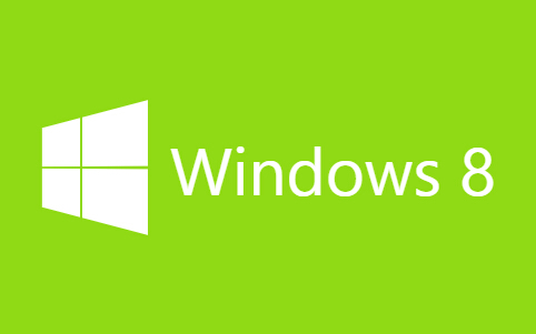
今天给大家分享一款纯css3实现的win8加载动画。在这款实例中动画效果完全由css3实现。一起看下效果图:
实现的代码。
html代码:
  <div class="wrapp">
        <div class="text">
            <h1>
                Windows 8</h1>
        </div>
        <div class="logo">
            <span class="top-left"></span><span class="bottom-right"></span>
        </div>
    </div>
css3代码:
body{
    margin: 0;
    padding: 0;
    background-color: #90da15;
}
.wrapp{
    position: absolute;
    top: 50%;
    left: 50%;
    width: 600px;
    height: 300px;
    margin: -150px 0 0 -300px;
    -webkit-perspective: 30px;
    -webkit-transform: translateX(0px);
    -webkit-animation: wrapp 400ms 800ms ease-in forwards;

    -moz-perspective: 30px;
    -moz-transform: translateX(0px);
    -moz-animation: wrapp 400ms 800ms ease-in forwards;

    -ms-perspective: 30px;
    -ms-transform: translateX(0px);
    -ms-animation: wrapp 400ms 800ms ease-in forwards;

    perspective: 30px;
    transform: translateX(0px);
    animation: wrapp 400ms 800ms ease-in forwards;
}
.text{
    position: absolute;
    top: 50%;
    left: 50%;
    width: 0px;
    height: 60px;
    margin: -30px 0 0 -160px;
    overflow: hidden;
    -webkit-transform: translateX(0px);
    -webkit-animation: text 400ms 800ms linear forwards;

    -moz-transform: translateX(0px);
    -moz-animation: text 400ms 800ms linear forwards;

    -ms-transform: translateX(0px);
    -ms-animation: text 400ms 800ms linear forwards;

    transform: translateX(0px);
    animation: text 400ms 800ms linear forwards;
}
h1{
    float: right;
    font-family: "Segoe UI", Frutiger, "Frutiger Linotype", "Dejavu Sans", "Helvetica Neue", Arial, sans-serif;
    font-weight: normal;
    color: #fff;
    padding: 0;
    margin: 0;
    width: 320px;
    height: 60px;
    font-size: 60px;
    line-height: 60px;
}
.logo{
    position: absolute;
    top: 50%;
    left: 50%;
    width: 90px;
    height: 90px;
    margin: -45px 0 0 -45px;
    background-color: #fff;
    -webkit-transform: translateX(0px) rotateY(10deg);
    -webkit-animation: logo 500ms 300ms ease-out forwards;

    -moz-transform: translateX(0px) rotateY(10deg);
    -moz-animation: logo 500ms 300ms ease-out forwards;

    -ms-transform: translateX(0px) rotateY(10deg);
    -ms-animation: logo 500ms 300ms ease-out forwards;

    transform: translateX(0px) rotateY(10deg);
    animation: logo 500ms 300ms ease-out forwards;
}
.logo .top-left{
    position: absolute;
    top: 0;
    left: 0;
    width: 44px;
    height: 44px;
    border-right: solid 2px #90da15;
    border-bottom: solid 2px #90da15;
}
.logo .bottom-right{
    position: absolute;
    bottom: 0;
    right: 0;
    width: 44px;
    height: 44px;
    border-left: solid 2px #90da15;
    border-top: solid 2px #90da15;
}

@-webkit-keyframes logo {
    from {
        -webkit-transform:  translateX(0px) rotateY(10deg);
    }
    to {
        -webkit-transform:  translateX(0px) rotateY(-10deg);
    }
}
@-webkit-keyframes text {
    from {
        width: 0px;
        -webkit-transform: translateX(0px);
    }
    60%{
        width: 0px;
    }
    to {
        width: 320px;
        -webkit-transform: translateX(240px);
    }
}
@-webkit-keyframes wrapp {
    from {
        -webkit-transform: translateX(0px);
    }
    to {
        -webkit-transform: translateX(-200px);
    }
}
@-moz-keyframes logo {
    from {
        -moz-transform:  translateX(0px) rotateY(10deg);
    }
    to {
        -moz-transform:  translateX(0px) rotateY(-10deg);
    }
}
@-moz-keyframes text {
    from {
        width: 0px;
        -moz-transform: translateX(0px);
    }
    60%{
        width: 0px;
    }
    to {
        width: 320px;
        -moz-transform: translateX(240px);
    }
}
@-moz-keyframes wrapp {
    from {
        -moz-transform: translateX(0px);
    }
    to {
        -moz-transform: translateX(-200px);
    }
}

@-ms-keyframes logo {
    from {
        -ms-transform:  translateX(0px) rotateY(10deg);
    }
    to {
        -ms-transform:  translateX(0px) rotateY(-10deg);
    }
}
@-ms-keyframes text {
    from {
        width: 0px;
        -ms-transform: translateX(0px);
    }
    60%{
        width: 0px;
    }
    to {
        width: 320px;
        -ms-transform: translateX(240px);
    }
}
@-ms-keyframes wrapp {
    from {
        -ms-transform: translateX(0px);
    }
    to {
        -ms-transform: translateX(-200px);
    }
}
@keyframes logo {
    from {
        transform:  translateX(0px) rotateY(10deg);
    }
    to {
        transform:  translateX(0px) rotateY(-10deg);
    }
}
@keyframes text {
    from {
        width: 0px;
        transform: translateX(0px);
    }
    60%{
        width: 0px;
    }
    to {
        width: 320px;
        transform: translateX(240px);
    }
}
@keyframes wrapp {
    from {
        transform: translateX(0px);
    }
    to {
        transform: translateX(-200px);
    }
}
本文爱编程原创文章,转载请注明原文地址:http://www.w2bc.com/Article/12203