Flex布局
一、什么是Flex布局?
Flex是Flexible Box的缩写,顾名思义为“弹性布局”,用来为盒装模型提供最大的灵活性。
任何一个容器都可以指定为Flex 布局。
|
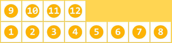
1
2
3
|
.box{ display:flex;} |
行内元素也可以使用Flex布局。
|
1
2
3
|
.box{ display:inline-flex;} |
webkit内核的浏览器,必需加上-webkit前缀
|
1
2
3
4
|
.box{ display:-webkit-flex; display:flex;} |
需要注意的是,设为flex布局以后,子元素的float、clear和vertical-align属性将失效
二、基本概念
采用Flex布局的元素,称为Flex容器(flex container),简称“容器”。它的所有子元素自动成为容器成员,成为flex项目(flex item),简称“项目”。
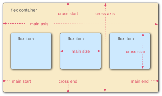
容器默认存在两根轴:水平的主轴(main axis)和垂直的交叉轴(cross axis)。主轴的开始位置(与边框 的交叉点)叫做main start,结束位置叫做main end;交叉轴的开始位置叫做cross start,结束位置叫做cross end。
项目默认沿主轴排列。单个项目占据的主轴空间叫做main size,占据的交叉轴空间叫做cross size。
三、容器的属性
以下6个属性设置在容器上。
- flex-direction
- flex-wrap
- flex-flow
- justify-content
- align-items
- align-content
3.1flex-direction属性
flex-direction属性决定主轴的方向(即项目的排列方向)。
.box{
     flex-direction:row | row-reverse |  column | column-reverse;
}
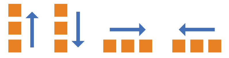
它可能有四个值
- row(默认值):主轴为水平方向,起点在左端
- row-reverse:主轴为水平方向,起点在右端
- column:主轴为垂直方向,起点在上沿
- column-reverse:主轴为垂直方向,起点在下沿
3.2flex-wrap属性
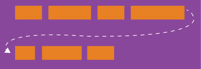
默认情况下,项目都排在一条线(又称“轴线”)上。flex-wrap属性定义,如果一条轴线 排不下,如何换行?
.box{
  flex-wrap: nowrap | wrap | wrap-reverse;
}
它可能去三个值。
(1)nowrap(默认):不换行
(2)wrap:换行,第一行在上方

(3)wrap-reverse:换行,在第一行的下方
3.3 flex-flow
flex-flow属性是flex-direction属性和flex-wrap属性的简写形式,默认 row nowrap。
.box{
    flex-flow:<flex-direction> || <flex-wrap>;
}
3.4 justify-content属性
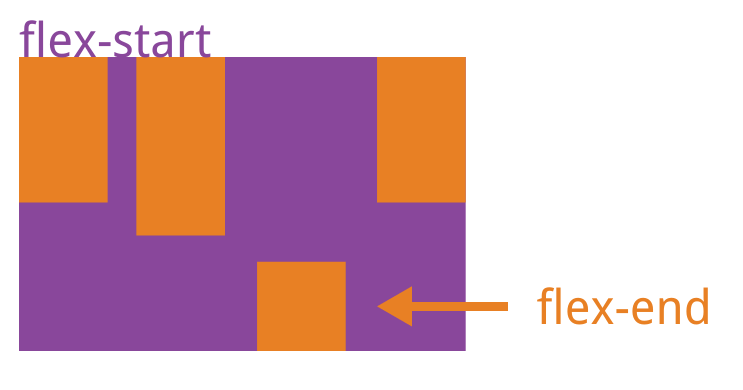
justify-content属性定义了项目在主轴上的对齐方式
.box{
    justify-content:flex-start | flex-end | center | space-between |space-around;
}
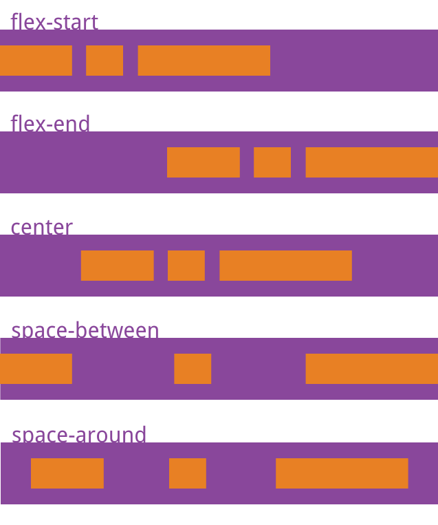
它可能取5个值,具体对齐方式与轴的方向有关。下面假设主轴为从左到右。
- flex-start(默认值):左对齐
- flex-end:右对齐
- center:居中
- space-between:两端对齐,项目之间的间隔都相等
- space-around:每个项目两侧的间隔相等。所以,项目之间的间隔比项目与边框的间隔大一倍。
3.5 align-items属性
align-items属性定义项目在交叉轴上如何对齐。
.box{
    align-items:flex-start | flex-end | center |baseline | stretch;
}
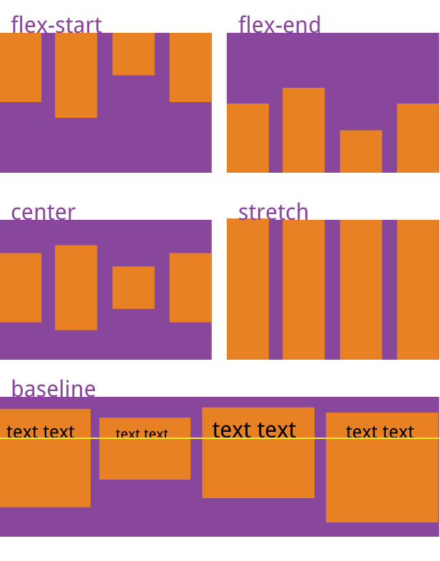
它可能取5个值。具体的对齐方式与交叉轴的方向有关,下面假设交叉轴从上之下。
- flex-start:交叉轴的起点对齐
- flex-end:交叉轴的终点对齐
- center:交叉轴的中点对齐
- baseline:项目的第一行文字的基线对齐。
- stretch(默认值):如果项目未设置高度或设为auto,将占满整个容器的高度。
3.6 align-content属性
align-content属性定义了多根轴线的对齐方式。如果项目只有一根轴线,该属性不起作用。
.box{
    align-content:flex-start | flex-end | center | spance-between | space-around |stretch;
}
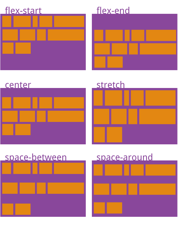
该属性可能取6个值。
- flex-start:与交叉轴的起点对齐。
- flex-end:与交叉轴的终点对齐。
- center:与交叉轴的中点对齐。
- space-between:与交叉轴两端对齐,轴线之间的间隔平均分布。
- space-around:每根轴线两侧的间隔都相等。所以,轴线之间的间隔比轴线与边框的间隔大一倍。
- stretch(默认值):轴线占满整个交叉轴。
四、项目的属性
一下6个属性设置在项目上。
- order
- flex-grow
- flex-shrink
- flex-basis
- flex
- align-self
4.1 order属性
order属性定义项目的排列顺序。数值越小,排列越靠前,默认为0.
.item{
    order:<integer>;
}
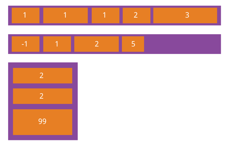
4.2 flex-grow属性
flex-grow属性定义项目的放大比例,默认值为0,即如果存在剩余空间,也不放大。
.item{
    flex-grow:<number>;/* default 0*/
}
如果所有项目的flex-grow属性都为1,则它们将等分剩余空间(如果有的话)。如果一个项目的flex-grow属性为2,其他项目为1,则牵着占据的剩余空间将比其他项多一倍
4.3 flex-shrink属性
flex-shrink属性定义了项目的缩小比例,默认为1,即如果空间不足,改项目将缩小。
.item{
    flex-shrink:<number>;/* default 1 */
}

如果所有项目的flex-shrink属性都为1,当空间不足时,都将等比例缩小。如果一个项目的flex-shrink属性为0,其他项目都为1,则空间不足时,前者不缩小。
负值对该属性无效。
4.4 flex-basis属性
flex-basis属性定义了在分配多余空间之前,项目占据的主轴空间(main size)。浏览器根据这个属性,计算主轴是否有多余空间。它的默认值为auto,即项目的本来大小。
.item{
    flex-basis:<length> | auto ; /*default auto*/
}
它可以设为跟width或height属性一样的值(比如350px),则项目将占据固定空间。
4.5 flex属性
flex属性是flex-grow,flex-shrink和flex-basis的简写,默认值为0 1 auto。后面两个属性可选
.item {
  flex: none | [ <'flex-grow'> <'flex-shrink'>? || <'flex-basis'> ]
}
改属性有两个快捷值:auto(1 1 auto)和none(0 0 auto).
建议优先使用这个属性,而不是单独写三个分离的属性,因为浏览器会推算相关值
4.6 align-self属性
align-self属性允许单个项目有与其他项目不一样的对齐方式,可覆盖align-items属性。默认值为auto,表示继承父元素的align-items属性,如果没有父元素,等同于stretch。
.item {
  align-self: auto | flex-start | flex-end | center | baseline | stretch;
}
该属性可能取6个值,除了auto,其他都与align-items属性完全一致。
几个案例:
<!DOCTYPE html>
<html lang="en">
<head>
    <meta charset="UTF-8">
    <meta name="viewport" content="width=device-width, initial-scale=1.0">
    <meta http-equiv="X-UA-Compatible" content="ie=edge">
    <title>flex布局</title>
</head>
<body>
  <p>flex布局1-适合导航栏(可任意添加个数,不需要改变css代码)</p>
  <div class="ul">
      <div class="li"><a href="" class="t">衣服</a></div>
      <div class="li"><a href="" class="t">裤子</a></div>
      <div class="li"><a href="" class="t">内衣</a></div>
      <div class="li"><a href="" class="t">帽子</a></div>
  </div>
  <style>
  .ul{ display: flex;}
  .li{flex:1;text-align: center; background: #666;color:#fff; margin:1px;}
  .li2{flex:2;text-align: center;color:#fff;}
  .t{border-radius: 50%;background: #cc9999; height:40px;width:40px;display: inline-block;line-height: 40px;}
  </style>

  <p>flex布局2-左图右文字的样式</p>
  <div class="demo1">
          <div class="left"></div>
          <div class="right">
              <p>Iphone7 PLUS XXXXXXXXXX</p>
              <span>总人数99</span>
              <span>剩余人数33</span>
              <div class="btn">立即参与</div>
          </div>
        </div>
  <style>
      .demo1{display: flex;/*设置为flex布局*/justify-content: space-around;}
      .demo1 > div{ flex: none;}
      .left{width: 200px;height: 200px;background: #d4cdcd;}
      .right{width: 380px;height: 200px;}
  </style>

  <p>flex布局3-垂直居中对齐</p>
  <div class="demo2">
          <div class="inner">
            <p>这是一个测试这是一个测试这是一个测试这是一个测试这是一个测试</p>
          </div>
        </div>
  <style>
      .demo2{ width: 100%;height: 300px;border: 1px solid purple;display: flex;/*设置为flex布局*/justify-content: center;  /*水平居中*/
      align-items: center;    /*垂直居中*/}
      .inner{ width: 160px;font-size: 26px;border: 1px solid red;}
  </style>

  <p>flex布局4-多列</p>
  <div class="demo4">
      <div class="left4" style="40px;height:40px;background: darkgoldenrod"></div>
      <div class="center4">
          <p>description</p>
          <p>description</p>
          <p>description</p>
          <span>description</span>
      </div>
      <div class="btn4">确认</div>
      <div class="btn4">取消</div>
  </div>
    <style>
    .demo4{width: 100%;height: 150px; border: 1px solid #b7b2b7;margin: 30px auto;padding-top: 17px;display: flex;/*设置为flex布局*/
      justify-content: space-around;}
    .demo4 > div{ flex: none;}
  </style>

  <p>flex布局5-多列</p>
  <div class="demo5">
      <div class="item item1">1/4</div>
      <div class="item item2">auto</div>
      <div class="item item3">1/4</div>
      <div class="item item4">1/4</div>
  </div>
    <style>
    .demo5{display: flex;}
    .item{flex: 1;background: #ccffcc;margin: 2px;height:30px;text-align: center;line-height: 30px;}
    .item2{flex: 0 0 50%;}.item4{flex: 0 0 20%;}
    </style>

    <p>flex布局6-圣杯布局</p>
    <div class="demo6">
      <div class="header" style="height:40px;line-height: 40px;text-align: center;background: cyan;">头部</div>
      <div class="body">
          <div class="left" style="height:200px;line-height: 200px;text-align: center;background: red; color:#fff;">left</div>
          <div class="center" style="height:200px;line-height: 200px;text-align: center;background: #999; color:#fff;">center</div>
          <div class="right" style="height:200px;line-height: 200px;text-align: center;background: red; color:#fff;">right</div>
      </div>
      <div class="footer" style="height:40px;line-height: 40px;text-align: center;background: #ccff99;">底部</div>
    </div>
    <style>
    .demo6{display: flex; flex-direction: column;}
    .demo6 div{flex: 1;}.body{ display: flex;}
    .header,.footer,.left,.right{flex: 0 0 20%!important;}
    </style>

    <p>flex布局7-底部布局</p>
    <div class="demo7" style="height:300px;border:1px solid #666;">
      <div class="main7" style="text-align: center;">这是主要内容</div>
      <div class="footer7" style="height:40px;text-align: center;background: chartreuse;line-height: 40px;">这是底部</div>
    </div>
    <style>
    .demo7{display: flex;flex-direction: column;}.main7{flex: 1;}
    .footer7{width: 100%;height: 120px;}
    </style>

<p>flex布局8-流式布局</p>
<div class="demo8">
  <div class="item8"></div>
  <div class="item8"></div>
  <div class="item8"></div>
  <div class="item8"></div>
  <div class="item8"></div>
  <div class="item8"></div>
  <div class="item8"></div>
  <div class="item8"></div>
</div>
<style>
.demo8{width: 258px;height: 300px;display: flex;flex-wrap: wrap;align-content: flex-start;background: #cc9999;}
.item8{flex: 0 0 33.333333%;height: 80px;border:1px solid #514c81;box-sizing: border-box;background: #ccff99;}
</style>
<style>
.table .box {position: relative; width: 120px; height: 90px; text-align: center; line-height: 90px; background: #2F4056; font-size: 14px; color: #fff;}
.table .box::before { content: ""; position: absolute; }
.table .arr-l::before { top: 30px; left: -10px; border-top: 10px solid transparent; border-bottom: 10px solid transparent; border-right: 10px solid #2F4056; }
.table .arr-l2::before { top: 30px; left: -10px; border-bottom: 10px solid transparent; border-right: 10px solid #2F4056; }
.table .arr-r::before { top: 30px; left: 120px; border-top: 10px solid transparent; border-bottom: 10px solid transparent; border-left: 10px solid #2F4056; }
.table .arr-r2::before { top: 30px; left: 120px; border-top: 3px solid transparent; border-bottom: 12px solid transparent; border-left: 12px solid #2F4056; }
.table .arr-b::before { top: 90px; left: 60px; border-left: 10px solid transparent; border-right: 10px solid transparent; border-top: 10px solid #2F4056; }
.table .arr-t::before { top: -10px; left: 50px; border-left: 10px solid transparent; border-right: 10px solid transparent; border-bottom: 10px solid #2F4056; }
</style>
<table class="table table-bordered">
    <tr>
        <td><div class="box arr-l">arr-l</div></td>
        <td><div class="box arr-l2">arr-l2</div></td>
        <td><div class="box arr-r">arr-r</div></td>
        <td><div class="box arr-r2">arr-r2</div></td>
        <td><div class="box arr-t">arr-t</div></td>
        <td><div class="box arr-b">arr-b</div></td>
    </tr>
</table>

</body>
</html>