效果:
在线运行
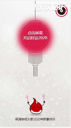
http://oa.hopenchina.com:8086/project/newyear/index.html(建议用手机查看)
知识点:
1、box-sizing:border-box
2、:before
3、first-of-type
4、设置box背景渐变、阴影、边框
background-image: linear-gradient(135deg, #FFFFFB,#FFE38A );
box-shadow: 8px 8px 20px #FFFFFB;
border: 5px ridge #B92929;/*ridge边框凸起*/
完整代码:
html
<!DOCTYPE html>
<html>
    <head>
        <meta charset="UTF-8">
        <meta name="viewport" content="initial-scale=1.0, maximum-scale=1.0, user-scalable=no" />
        <title>恭贺新春</title>
        <link rel="stylesheet" href="css/index.css" />
    </head>

    <body>
        <div id="music">
            <img class="play" id="playdisk" src="img/music_disc.png" alt="" />
            <img src="img/music_pointer.png" alt="" />
        </div>
        <div class="page" id="page1">
            <div class="bg"></div>
            <div class="p1_lantern">点击屏幕<br/>开启好运2020</div>
            <div class="p1_logo"></div>
            <div class="p1_words">梁涛恭祝大家2020年新春快乐</div>
        </div>
        <div class="page" id="page2">
            <div class="bg"></div>
            <div class="p2_circle"></div>
            <div class="p2_2020"></div>
        </div>
        <div class="page" id="page3">
            <div class="bg"></div>
            <div class="p3_logo">吉星高照</div>
            <div class="p3_title"></div>
            <div class="p3_second"></div>
            <div class="p3_first"></div>
            <div class="p3_blessing"></div>
        </div>
        <audio autoplay="true" loop="loop">
            <source src="audio/happynewyear.mp3"></source>
        </audio>
    </body>
    <script type="text/javascript" src="js/index.js" ></script>
</html>
css
/*all tag*/
*{
    margin: 0;
    padding:0;
}
body,html{
    width:100%;
    height:100%;
    overflow: hidden;
}
/*music*/
#music{
    width:56px;
    height:56px;
    border:4px solid #ef1639;
    position: fixed;
    top:20px;
    right: 15px;
    z-index:5;
    border-radius: 50%;
    background:#fff;

}
/* 区别:
 :first-child 匹配的是某父元素的第一个子元素,可以说是结构上的第一个子元素。
 :first-of-type 匹配的是该类型的第一个
*/
#music>img:first-of-type{/*选择器匹配属于其父元素的特定类型的首个子元素的每个元素。*/
    position: absolute;
    margin: 6px;
    width:44px;
    cursor: pointer;
}
#music>img:last-of-type{
    position: absolute;
    top:13px;
    right:1px;
    width:16px;
}
#music>img.play{
    animation: music_disc 4s linear infinite;
}
@keyframes music_disc{
    0%{
        transform: rotate(0deg);
    }
    100%{
        transform: rotate(360deg);
    }
}

/*page bg*/
.page{
    position: absolute;
    width:100%;
    height:100%;
}
.page>.bg{
    position: absolute;
    width:100%;
    height: 100%;
}
#page1{
    display: block;
}
#page2{
    display: none;
}
#page3{
    display: none;
}
/*page1*/
#page1>.bg{
    z-index: -1;
    background: url(../img/p1_bg.jpg) no-repeat;
    background-size:100%;
}
#page1>.p1_lantern{
    position: absolute;
    z-index:0;
    width:150px;
    height: 400px;
    left:0;
    right:0;
    margin: auto;
    background: url('../img/p1_lantern.png') no-repeat center center;
    background-size: 100% ;
    padding-top:155px;
    box-sizing: border-box;
    font-size:20px;
    text-align: center;
    color:#fff;
}
#page1>.p1_lantern:before{  /*:before 在.p1_lantern元素的内容之前插入新内容*/
    position: absolute;
    top:125px;
    right: 0;
    left:0;
    margin: auto;
    z-index:-1;
    width:130px;
    height:130px;
    opacity: 0.5;
    box-shadow:0 0 30px 30px #d60b3b;
    background:#d60b3b;
    border-radius: 50%;
    content:'';/*重要的属性,不然伪类无法起作用*/
    animation:p1_lantern 0.5s infinite alternate;/*alternate正向播放后反向播放*/
}
@keyframes p1_lantern{
    0%{
        opacity: 0.5;
        transform: scale(0.8,0.8);/*缩放*/
    }
    100%{
        opacity: 1;
    }
}
#page1>.p1_logo{
    position: absolute;
    right:0;
    left:0;
    bottom: 50px;
    margin:auto;
    background: url(../img/p1_imooc.png) no-repeat;
    background-size:100%;
    width:104px;
    height:124px;
}
#page1>.p1_words{
    font-size:16px;
    position: absolute;
    right:0;
    left:0;
    bottom: 30px;
    text-align: center;
    margin:auto;
}
/*page2*/
#page2>.bg{
    z-index: -1;
    background: url(../img/p2_bg.jpg) no-repeat;
    background-size:100%;
}
#page2{
    transition:0.5s;
}
#page2.fadeout{
    opacity: 0.3;
    transform: translateY(-100%);
}
#page2>.p2_circle{
    position: absolute;
    top:0;
    right: 0;
    bottom: 0;
    left:0;
    margin: auto;
    border-radius: 50%;
    background: url(../img/p2_circle_outer.png) no-repeat;
    background-size:100%;
    width:210px;
    height: 210px;
    animation:p2_circle_outer 1s 3s linear infinite;
}
#page2>.p2_circle:before{
    position: absolute;
    top:0;
    right: 0;
    bottom: 0;
    left:0;
    margin: auto;
    content: "";
    border-radius: 50%;
    background: url(../img/p2_circle_middle.png) no-repeat;
    background-size:100%;
    width:170px;
    height: 170px;
    animation:p2_circle_middle 1s 2s linear infinite;
}
#page2>.p2_circle:after{
    position: absolute;
    top:0;
    right: 0;
    bottom: 0;
    left:0;
    margin: auto;
    content: "";
    border-radius: 50%;
    background: url(../img/p2_circle_inner.png) no-repeat;
    background-size:100%;
    width:130px;
    height: 130px;
    animation:p2_circle_inner 1s 1s linear infinite;
}
#page2>.p2_2020{
    position: absolute;
    top:0;
    right: 0;
    bottom: 0;
    left:0;
    margin: auto;
    background: url(../img/p2_2020.png) no-repeat;
    background-size:100%;
    width:120px;
    height: 50px;
}
@keyframes p2_circle_inner{
    0% {
        transform: rotate(0deg);
    }
    100%{
        transform: rotate(-1080deg);
    }
}
@keyframes p2_circle_middle{
    0% {
        transform: rotate(0deg);
    }
    100%{
        transform: rotate(720deg);
    }
}
@keyframes p2_circle_outer{
    0% {
        transform: rotate(0deg);
    }
    100%{
        transform: rotate(-360deg);
    }
}

/*page3*/
#page3{
    transition: 0.5s;
}
#page3.fadein{
    transform: translateY(-100%);
}
#page3>.bg{
    z-index: -1;
    background: url(../img/p3_bg.jpg) no-repeat;
    background-size:100%;
}
#page3>.p3_logo{
    width:180px;
    height:38px;
    line-height: 38px;
    position: absolute;
    top:50px;
    right:0;
    left:0;
    margin: auto;
    z-index: 1;
    font-size: 28px;
    letter-spacing:5px;
    text-align: center;
    color:#D12727;
    font-weight: bolder;
    background-image: linear-gradient(135deg, #FFFFFB,#FFE38A );
    box-shadow: 8px 8px 20px #FFFFFB;
    border: 5px ridge #B92929;/*ridge边框凸起*/
}
#page3>.p3_title{
    width:160px;
    height:290px;
    position: absolute;
    top:130px;
    right:0;
    left:0;
    margin: auto;
    background: url(../img/p3_title.png) no-repeat;
    background-size:100%;
}
#page3>.p3_second{
    width:86px;
    height:278px;
    position: absolute;
    top:160px;
    left:15px;
    margin: auto;
    background: url(../img/p3_couplet_second.png) no-repeat;
    background-size:100%;
}
#page3>.p3_first{
    width:86px;
    height:278px;
    position: absolute;
    top:160px;
    right:15px;
    margin: auto;
    background: url(../img/p3_couplet_first.png) no-repeat;
    background-size:100%;
}
#page3>.p3_blessing{
    width:100px;
    height:100px;
    position: absolute;
    bottom:30px;
    right:0;
    left:0;
    margin: auto;
    z-index:1;
    background: url(../img/p3_blessing.png) no-repeat;
    background-size:100%;
    animation:p3_blessing 3s linear infinite;
}
@keyframes p3_blessing{
    100%{
        transform: rotate(360deg);
    }
}
js
var playdisk=document.getElementById("playdisk");
var audio=document.getElementsByTagName("audio")[0];
var page1=document.getElementById("page1");
var page2=document.getElementById("page2");
var page3=document.getElementById("page3")
playdisk.onclick=function(){
    if(audio.paused)
    {
        audio.play();
//        this.setAttribute("class","play");
        this.style.animationPlayState="running";//动画播放
    }
    else{
        audio.pause();
//        this.setAttribute("class","");
        this.style.animationPlayState="paused";//动画暂停
    }
};
page1.addEventListener('click',function(){
    page1.style.display="none";
    page2.style.display="block";
    page3.style.display="block";
    page3.style.top="100%";
    setTimeout(function(){
        page2.setAttribute("class","page fadeout");
        page3.setAttribute("class","page fadein");
    },5500);
})