这篇文章主要分析css3新特性的典型应用,都是干活,没得水分。
1.动画属性:animation。
利用animation可以实现元素的动画效果,他是一个简写属性,用于设置6个动画属性:amination-name(名字)/duration(持续时间)/delay(延迟时间)/timing-function(速度曲线)/iteration-count(播放次数)/direction(是否轮流反向播放动画)。
animation: name duration timing-function delay iteration-count direction;
-
animation-delay - 设置延时,也即从元素加载完成之后到动画序列开始执行的时间。
-
animation-direction - 设置动画在每次运行完后是反向运行还是重新回到开始位置重复运行。
允许值:normal(正常顺序), alternate, reverse(反向播放), alternate-reverse
默认值:normal
normal:动画循环播放时,从结束状态跳回到起始状态
浏览器对其他值的支持情况不佳,应该慎用。
-
animation-duration - 设置动画一个周期的时长。
-
animation-iteration-count - 设置动画重复次数(可以指定infinite无限次重复动画),默认为一次
-
animation-name 指定动画名称,即由 @keyframes 描述的关键帧名称。
-
animation-play-state - 允许暂停和恢复动画。
允许值:paused, running
running:动画停止后停止动画,动画开始时重新开始
paused:当动画突然停止时,保持暂停状态,当动画开始时继续播放动画
-
animation-timing-function - 设置动画速度, 即通过建立加速度曲线,设置动画在关键帧之间是如何变化。
允许值:ease(默认,低速开始,然后加快,结束前减慢), ease-out, ease-in, ease-in-out, linear(从头到尾速度都是相同的), cubic-bezier(x1, y1, x2, y2).不同效果可点击
-
animation-fill-mode - 指定动画执行前后如何为目标元素应用样式。
允许值:forwards, backwards, both, none
默认值:none
none:回到动画还未开始前的状态
backwards:动画回到第一帧的状态
forwards:动画停留在结束时的状态
both: 根据 animation-direction 轮流应用 forwards 和 backwards 规则。
使用animation需要利用@keyframes将animation绑定到选择器上:实际效果点击
<!DOCTYPE html>
<html>
<head>
<style>
div
{
width:100px;
height:100px;
background:red;
position:relative;
animation:mymove 5s infinite;
-webkit-animation:mymove 5s infinite; /*Safari and Chrome*/
}

@keyframes mymove
{
from {left:0px;}
to {left:200px;}
}

@-webkit-keyframes mymove /*Safari and Chrome*/
{
from {left:0px;}
to {left:200px;}
}
</style>
</head>
<body>

<p><strong>注释:</strong>Internet Explorer 9 以及更早的版本不支持 animation 属性。</p>

<div></div>

</body>
</html>
结合:hover可以实现鼠标的特效效果:实际效果点击
<!DOCTYPE html>
<html lang="en">
<head>
    <meta charset="UTF-8">
    <title>Document</title>
    <style>
    .wrapper:hover {
  animation: 2s jumping;
}

.wrapper {
  background: red;
  width: 100px;
  height: 100px;
}

@keyframes jumping {
  0% {
    background: red;
    height: 100px;
  }
  37.5% {
    background: orange;
    height: 250px;
  }
  75% {
    background: red;
    height: 50px;
  }
  87.5% {
    background: yellow;
    height: 125px;
  }
  100% {
    background: red;
    height: 100px;
  }
}
    </style>
</head>
<body>
     <div calss="wrapper"></div>
</body>
</html>
2.background-clip:规定背景的绘制区域:border-box/padding-box/content-box。
border-box:背景被裁减到边框盒。 padding-box:背景被裁减到内边距框。 content-box:背景被裁减到内容盒。 实际效果点击
3.background-origin:background-origin 属性规定 background-position 属性相对于什么位置来定位。
padding-box:背景图片相对于内边距框定位;content-box:背景图片相对于内容框定位;border-box:背景图片相对于边框定位。实际效果点击
4.background-size:规定背景图片的大小。实际效果点击
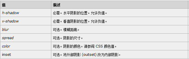
5.box-shadow:为边框添加阴影。语法:box-shadow: h-shadow(正值在下部,负值在顶部) v-shadow(正值在右,负值在左) blur spread color inset; 实际效果点击(多效果对比)
box-shadow在实际应用中有很大的用武之地:
(1).导航栏的制作:导航栏可以用border来设置,也可以用box-shadow来设置:原理较简单,只需要为底部添加阴影即可。

(2).二级下拉菜单的美化,为左、下、右添加阴影即可:box-shadow: 0px 2px 7px rgba(0,0,0,0.25);

更多效果就不在这里大篇幅的赘述了,有兴趣的可以点击这里看看。
6.box-align: start|end|center|baseline|stretch(拉伸,占满);
目前没有浏览器支持 box-align 属性。Firefox 支持替代的 -moz-box-align 属性。Safari、Opera 以及 Chrome 支持替代的 -webkit-box-align 属性。
7.transform(2D/3D转换属性),语法:transform: none|transform-functions;

8.appearance 属性,允许您使元素看上去像标准的用户界面元素。appearance的功能较少,但是一般在设计过程中都会利用“appearance:none;”来屏蔽浏览器的默认样式。
本文系作者原创,如需转载请注明出处:http://www.cnblogs.com/lflj/
相关文章:http://www.cnblogs.com/lflj/p/6439837.html
http://www.cnblogs.com/lflj/p/6293716.html
参考网站:设计达人