 Continuing my series on using matplotlib and python to generate figures, I’d like to get now to the meat of the topic: actually making a figure or two. I’ll be starting with the simplest kind of figure: a line plot, with points plotted on an X-Y Cartesian plane.
What Kind of Data are we talking about?
Obviously, different kinds of data require different kinds of plots. The X-Y plane is excellent for plotting relations between two different variables, (an example from my work would be the total brightness of a galaxy versus its polarized intensity). It can also be useful for looking at the distribution of data points that are themselves distributed in a 2D plane (I’ve plotted points on a graph showing the sky positions of objects in an astrophysical catalog to get an idea of what fraction of the sky was covered by the survey). If your data is just a pair of values for each point, a simple X-Y plane plot is perfect for you!
Getting Started with a simple example
Let’s dive right in, and start with plotting some example data. First, I will need to import the parts of matplotlib I will be using (I import pyplot as plt because I am lazy and don’t want to type 4 extra characters repeatedly):
1 | import matplotlib.pyplot as plt |
Next, I’m going to make two python lists that contain the radius and area of a circle, respectively.
1 | radius = [1.0, 2.0, 3.0, 4.0, 5.0, 6.0] |
2 | area = [3.14159, 12.56636, 28.27431, 50.26544, 78.53975, 113.09724] |
It is important to make sure that the two arrays you use for plotting have the same dimensions, or matplotlib will raise an exception when you try to plot them.
Now that I have matplotlib loaded, and have some data to plot, I can start putting some code down for the figure. If I want to plot the radius of the circle on the horizontal axis, and the area on the vertical, I can simply use the following bit of code:
The final thing I need to do to actually have matplotlib display my figure is to use the show() method from pyplot, which will pop up a nice interactive X11 window showing my figure.
So our example script is now these 5 lines:
1 | import matplotlib.pyplot as plt |
2 | radius = [1.0, 2.0, 3.0, 4.0, 5.0, 6.0] |
3 | area = [3.14159, 12.56636, 28.27431, 50.26544, 78.53975, 113.09724] |
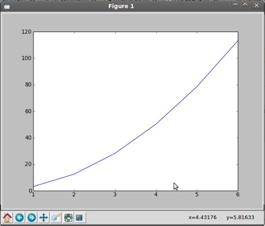
Once we run this script, we will be shown a window that looks like this:
 This is nice, it shows our data, but it is a bit spartan. Let’s tidy it up a bit, and make a better figure out of our data.
Formatting your figures
A figure without axis labels is useless to anyone other than the person who created it. Let’s add some to our plot. Our x-axis (horizontal) shows the radius of our circle, and the y-axis (vertical) shows the area. Let’s indicate that in the figure.
Let’s add a title to the figure as well.
1 | plt.title('Area of a Circle') |
Our new code looks like this:
1 | import matplotlib.pyplot as plt |
2 | radius = [1.0, 2.0, 3.0, 4.0, 5.0, 6.0] |
3 | area = [3.14159, 12.56636, 28.27431, 50.26544, 78.53975, 113.09724] |
7 | plt.title('Area of a Circle') |
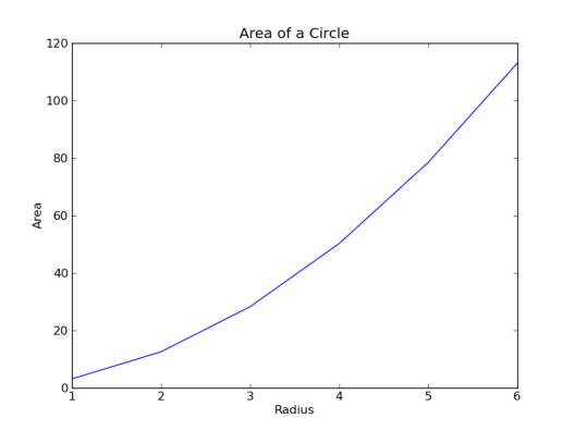
Our figure is going to look like this:
 Looks much better!
Legends & Formatting
Our plot looks pretty good so far, but it really doesn’t show much. Why don’t we compare the area of a circle vs. radius to the area of a square vs. it’s side. We should start by defining another set of data for the area of the square:
1 | square = [1.0, 4.0, 9.0, 16.0, 25.0, 36.0] |
We can then add a plotting command for the square. This time though, let’s plot it in red, with dots for each point, and a dashed line connecting them:
1 | plt.plot(radius, square, marker='o', linestyle='--', color='r') |
Matplotlib offers a variety of options for color, linestyle, and marker. Here are a few of the most common:
| Color Code | Color Displayed |
| r | Red |
| b | Blue |
| g | Green |
| c | Cyan |
| m | Magenta |
| y | Yellow |
| k | Black |
| w | White |
| Marker Code> | Marker Displayed |
| + | Plus Sign |
| . | Dot |
| o | Circle |
| * | Star |
| p | Pentagon |
| s | Square |
| x | X Character |
| D | Diamond |
| h | Hexagon |
| ^ | Triangle |
| Linestyle Code | Line style Displayed |
| - | Solid Line |
| – | Dashed Line |
| : | Dotted Line |
| -. | Dash-Dotted Line |
| None | No Connecting Lines |
We should probably add a legend as well, to let the viewer know which curve is which. To do this, we can simply modify the two plot method calls by adding a label argument, and add a call to pyplot.legend() to draw the legend box. Once we do this, our plotting code will look like this:
01 | import matplotlib.pyplot as plt |
02 | radius = [1.0, 2.0, 3.0, 4.0, 5.0, 6.0] |
03 | area = [3.14159, 12.56636, 28.27431, 50.26544, 78.53975, 113.09724] |
04 | square = [1.0, 4.0, 9.0, 16.0, 25.0, 36.0] |
05 | plt.plot(radius, area, label='Circle') |
06 | plt.plot(radius, square, marker='o', linestyle='--', color='r', label='Square') |
07 | plt.xlabel('Radius/Side') |
09 | plt.title('Area of Shapes') |
This will give us a nifty little plot like this:
 Well, now you should be able to make some pretty looking plots of linear data! In the next installment, I will be showing you how to make another common type of plot: a histogram. Feel free to leave me comments on what topics I should cover in future posts.
Basic Data Plotting With Matplotlib
Part 1: Introduction
Part 3: Histograms
Part 4: Multiple Plots (Coming Soon)
Continuing my series on using matplotlib and python to generate figures, I’d like to get now to the meat of the topic: actually making a figure or two. I’ll be starting with the simplest kind of figure: a line plot, with points plotted on an X-Y Cartesian plane.
This is nice, it shows our data, but it is a bit spartan. Let’s tidy it up a bit, and make a better figure out of our data.
Looks much better!
Well, now you should be able to make some pretty looking plots of linear data! In the next installment, I will be showing you how to make another common type of plot: a histogram. Feel free to leave me comments on what topics I should cover in future posts.