某天突然遇到一个有趣的面试题,需用CSS实现一个宝马的Logo,第一反应就是这不是老生常谈的八卦图的小变形吗,只需用伪元素就可轻易的实现啦,但是细看要求说只能在一个标签里写样式,所以呜呜呜。。。请教下大神,还是有多种方法的,下面简单分享一下哈!
实现如下效果:
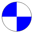
第一种:利用伪元素实现
#box{
    width: 100px;
    height: 100px;
    border-radius: 100%;
    background-color: #fff;
    position: relative;
    border: 1px solid #000;
    overflow: hidden;
}
#box:before {
    position: absolute;
    content: '';
    top: 0;
    left: 0;
    width: 50px;
    height: 50px;
    background-color: blue;
}
#box:after {
    position: absolute;
    content: '';
    right: 0;
    bottom: 0;
    width: 50px;
    height: 50px;
    background-color: blue;
}
第二种:利用border实现
#boxs{
    width:0;
    height:0;
    border-radius:100%;
    border-width:50px;
    border-style:solid;
    border-color: #fff blue #fff blue;
    transform: rotateZ(45deg);
    box-shadow: 0 0 1px #000;
}
第三种:利用CSS3新属性conic-gradient实现(兼容性很大呦)
#box1{
    width: 100px;
    height: 100px;
    background: conic-gradient(blue 0% 25%, white 25% 50%, blue 50% 75%, white 75% 100%);
    border-radius: 100%;
    border: 1px solid #000;
}
CSS真的是博大精深,千万别轻易说自己对CSS还挺在行的,其实你只要看看张鑫旭大神的博客你就觉得自己掌握的真的是冰山一角,以后要多多积累,厚积薄发!