css3实现图片旋转效果
近期实现一个消息提醒(醒目)的需求页面.想到了css3的旋转动画,故使用。
===============
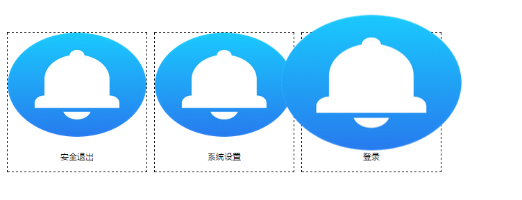
鼠标悬浮时候,图片可以旋转,放大
rotate(360deg) scale(1.3);如需翻转,添加 translate(50%, 50%)即可。
为了减少html结构,使用了:before伪类元素实现图片。使用:before元素时候,需要添加
content: '';
display: block;这样方可实现。如果没有文字,也可以使用:after伪类元素,实现图片。
================
.header-nav .message:before {
30px;
height: 30px;
content: '';
display: block;
margin: 0 auto;
background: url(../images/lingdang.png) no-repeat;
background-size: 30px 30px;
-webkit-box-shadow: inset 0 -1px 0 #3333sf;
-webkit-transition: 0.4s;
-webkit-transition: -webkit-transform 0.4s ease-out;
-moz-transition: -moz-transform 0.4s ease-out;
transition: transform 0.4s ease-out; /*如果要实现下面的悬浮动画效果,添加这句是必须的*/
}
/*:hover没有伪类元素属性,所以应该是.message:hover:before,而不是message:before:hover*/
.header-nav .message:hover:before {
inset 0 0 20px rgba(255, 255, 255, 1);
/*图像旋转360度*/
transform: rotate(360deg) scale(1.5);
-webkit-transform: rotate(360deg) scale(1.5);
-moz-transform: rotate(360deg) scale(1.5);
}
====================
.header-nav li a {
color: #FFFFFF;
display: inline-block;
80px;
height: 55px;
box-sizing: border-box;
-webkit-box-sizing: border-box;
-moz-box-sizing: border-box;
padding-top: 30px;
margin-top: -30px;
}
为了使得li整体有点击的地方,a设置为li的一般大小,:before实现图片效果,文字显示在底部,故,这样设置padding-top: 30px;margin-top: -30px;
============
$(function() {
setInterval(showTime, 4000);
function showTime() {
$("ul li").addClass("on");
setTimeout(hd, 1000)
}
function hd() {
$("ul li").removeClass("on");
}
});
设置一个定时器,使得图片间隔4秒钟自动翻转
==========================
链接地址:http://files.cnblogs.com/files/leshao/%E6%97%8B%E8%BD%AC.rar