什么是CSS
如何学习
- 如何学习
- CSS怎么用(快速入门)
- CSS选择器(重点+难点)
- 美化网页(文字,阴影,超链接,列表,渐变....)
- 盒子模型
- 浮动
- 定位
- 网页动画(特效效果)
1.1什么是CSS
Cascading Style Sheet层叠样式表
CSS:表现(美化网页)
字体,颜色,边距,高度,背景图片,网页定位,网页浮动...
1.2发展史
CSS1.0
CSS2.0 DIV(块)+CSS,HTML与CSS结构分离的思想,网页变简单,SEO
CSS2.1 浮动,定位
CSS3.0 圆角,阴影,动画... 浏览器兼容性
1.3快速入门
- 内容表现分离
- 网页结构表现统一
- 可以实现复用样式十分的丰富
- 建议使用独立于html的css文件利用SEO
- 利用SEO,容易被搜索引擎收录!
html
<!DOCTYPE html>
<html lang="en">
<head>
    <meta charset="UTF-8">
    <title>Title</title>
    <!--规范,<style> 可以编写css的代码
        选择器{
        }
    -->
    <link rel="stylesheet" href="css/style.css">
</head>
<body>
<h1>我是标题</h1>
</body>
</html>
css
h1{
    color: chartreuse;
}
1.4、CSS的3种导入方式
<!DOCTYPE html>
<html lang="en">
<head>
    <meta charset="UTF-8">
    <title>Title</title>
    <!--内部样式-->
    <style>
        h1{
            color: green;
        }
    </style>
    <link rel="stylesheet" href="css/style.css">
</head>
<body>
<!--优先级:就近原则-->
<!--行内样式:在标签元素中,编写一个style属性,编写样式即可-->
<h1 style="color:red;"> 我是标题</h1>
</body>
</html>
拓展:外部样式两种写法
-
链接式
<!--外部样式--> <link rel="stylesheet" href="css/style.css"> -
导入式
@import是CSS2.1特有
<!--导入式-->
<style>
	@import url("css/style.css");
</style>
2、选择器
作用:选择页面上的某一个或者某一类元素
2.1、基本选择器
-
标签选择器:选择一类标签 标签{}
<!DOCTYPE html> <html lang="en"> <head> <meta charset="UTF-8"> <title>Title</title> <!--标签选择器,会选择页面上的所有的这个标签元素--> <style> h1{ color: salmon; background: antiquewhite; border-radius:24px; } p { font-size: 80px; } </style> </head> <body> <h1>java</h1> <h1>html</h1> <p>学习</p> </body> </html> -
类选择器class:选择所有的class属性一致的标签,跨标签 .类名{ }
<!DOCTYPE html> <html lang="en"> <head> <meta charset="UTF-8"> <title>Title</title> <style> /*类选择器的格式 .class的名称{} 好处,可以多个标签归类,是同一个class,可以复用 */ .title1{ color: aqua; } .title2{ color: #7b806d; } </style> </head> <body> <h1 class="title1">标题1</h1> <h2 class="title2">标题2</h2> <h2 class="title3">标题3</h2> <p class="title1">p标签</p> </body> </html> -
Id选择器:全局唯一! #id名{}
<!DOCTYPE html>
<html lang="en">
<head>
    <meta charset="UTF-8">
    <title>Title</title>
    <style>
        /*id选择器:id必须保证全局唯一!
        #id名称{}
        优先级:
        不遵循就近原则。固定的
        id选择器>class选择器 > 标签选择器
        */
        #lemon{
            color: salmon;
        }
        .style1{
            color: chartreuse;
        }
        h1{
            color: blue;
        }
    </style>
</head>
<body>
<h1 class="style1" id="lemon">标题1</h1>
<h1 class="style1">标题2</h1>
<h1 class="style1">标题3</h1>
<h1>标题4</h1>
<h1>标题5</h1>
<h1>标题5</h1>
</body>
</html>
2.2、层次选择器
1、后代选择器:在某个元素的后面
/*后代选择器*/
body p{
    background:red;
}
2、子选择器:一代,儿子
/*子选择器*/
body>p{
    background: aqua;
}
3、相邻兄弟选择器 同辈
/*相邻兄弟选择器:只有一个、相邻(向下) */
.active+p{
    background: green;
}
4、通用选择器
/*通用选择器*/
.active~p{
    background: blueviolet;
}
2.3、结构伪类选择器
伪类:条
		 /*ul的第一个子元素*/
        ul li:first-child{
            background: blueviolet;
        }
        /*ul的最后一个元素*/
        ul li:last-child{
            background: blue;
        }
        /*选中p1:定位到父元素,选择当前的第一个元素
        选择当前p元素的父级元素,选中父级元素的第一个,并且是当前元素才生效!
        */
        p:nth-child(2) {
            background: bisque;
        }
        /*选中父元素,下的p元素的第二个,类型*/
        p:nth-of-type(1){
            background: yellow;
        }
2.4属性选择器(常用)
id+class 结合~
<!DOCTYPE html>
<html lang="en">
<head>
    <meta charset="UTF-8">
    <title>Title</title>
    <style>
        .demo a{
            float: left;
            /*display: block;设置成块元素*/
            display: block;
            height: 50px;
             50px;
            /*border-radius: 10px;圆角边框*/
            border-radius: 10px;
            background: blue;
            text-align: center;
            color: #b7b92e;
            /*text-decoration: none;去掉下划线*/
            text-decoration: none;
            /*margin-right:5px;向右偏移5px*/
            margin-right:5px;
            line-height: 50px;
            font-weight: bold;
            font-family: Arial;
        }

        /* 属性名,属性名 = 属性值(正则)
        = 绝对等于
        *= 包含这个元素
        ^= 以这个开头
        $= 以这个结尾
        */

        /*存在id属性的元素     a[]{}*/
        /*a[id]{*/
            /*background: yellow;*/
        /*}*/
        /*id=first的元素*/
        /*a[id=first]{*/
            /*background: green;*/
        /*}*/
        /*class 中有links的元素*/
        /*a[class*="links"]{*/
            /*background: yellow;*/
        /*}*/

        /*选中href中以http开头的元素*/
        /*a[href^=http]{*/
            /*background: yellow;*/
        /*}*/
        a[href$=jpg]{
            background: green;
        }
    </style>
</head>
<body>
<p class="demo">
    <a href="http://www.baidu.com" class="links item" id="first">1</a>
    <a href="http://bolg.com" class="links item" target="_blank" title="test">2</a>
    <a href="images/123.html" class="links item">3</a>
    <a href="images/123.png" class="links item">4</a>
    <a href="images/123.jpg" class="links item">5</a>
    <a href="abc">6</a>
    <a href="/a.pdf">7</a>
    <a href="abc.doc">9</a>
    <a href="abcd.doc" class="links item last">10</a>
</p>
</body>
</html>
正则表达式
<!--正则表达式-->
		= 绝对等于
        *= 包含这个元素
        ^= 以这个开头
        $= 以这个结尾
3、美化网页
3.1、span标签:重点要突出的字,使用span套起来
<!DOCTYPE html>
<html lang="en">
<head>
    <meta charset="UTF-8">
    <title>Title</title>
    <style>
        #title1 {
            font-size: 50px;
        }
    </style>
</head>
<body>
欢迎学习
<span id="title1">java</span>
</body>
</html>
3.2、字体样式
<!DOCTYPE html>
<html lang="en">
<head>
    <meta charset="UTF-8">
    <title>Title</title>
    <!--
        font-family: 字体
        font-size:   字体大小
        font-weight: 字体粗细
        color:字体颜色
        -->
    <style>

        body{
            font-family: "Arial Black",楷体;
            color: blueviolet;
        }
        h1{
            font-size: 40px;
        }
        .p1{
            font-weight: bold;
        }
    </style>

</head>
<body>
<h1>故事介绍</h1>
<p class="p1">
从前有个全国管理系统,是孙中山做的设计,老蒋做的实现,
结果老毛写了个病毒,趁着日本黑客对系统做攻击的当口,拿到了管理员权限,把原来那批程序员给隔离了。
</p>
<p>
老邓接手以后,重构代码,出了个2.0版,为了开发速度,遗留了一堆BUG没处理。
人们纷纷质疑:是不是核心构架太单一,双核会不会好点?
</p>
<p>
    If you were a teardrop;In my eye,

    For fear of losing you,I would never cry

    And if the golden sun,Should cease to shine its light,

    Just one smile from you, would
</p>
</body>
</html>
<!DOCTYPE html>
<html lang="en">
<head>
    <meta charset="UTF-8">
    <title>Title</title>
    <!--字体风格    oblique斜体-->
    <style>
        p{
            font: oblique bolder 16px "楷体";
        }
    </style>
</head>
<body>
<p>
    从前有个全国管理系统,是孙中山做的设计,老蒋做的实现,
    结果老毛写了个病毒,趁着日本黑客对系统做攻击的当口,拿到了管理员权限,把原来那批程序员给隔离了。
    老邓接手以后,重构代码,出了个2.0版,为了开发速度,遗留了一堆BUG没处理。
    人们纷纷质疑:是不是核心构架太单一,双核会不会好点?
</p>

</body>
</html>
3.3字体样式
- 颜色 color rgb rgba
- 文本对齐的方式 text-align = center
- 首行缩进 text-indent:2em;
- 行高 line-height:
- 装饰 text-decoration:
- 文本图片水平对齐:vertical-align:middle
<!DOCTYPE html>
<html lang="en">
<head>
    <meta charset="UTF-8">
    <title>Title</title>
    <!--
    颜色:单词
        RGB: 0~F
        REBA   A:0~1透明度
        color:rgba(0,255,255,0.8);
        text-align:排版,居中
        text-indent: 2em;段落首行缩进
        行高,和 块的高度一致,就可以上下居中
        行高,和 块的高度一致,就可以上下居中
        height: 300px;
        line-height: 300px;
    -->
    <style>
        h1{
            color:rgba(0,255,255,0.8);
            text-align: center;
        }
        .p1{
            text-indent: 2em;
        }
        .p3{
            background: blue;
            height: 300px;
            line-height: 300px;
        }
        /*下划线*/
        .l1{
            text-decoration: underline;
        }
        /*中划线*/
        .l2{
            text-decoration: line-through;
        }
        /*下划线*/
        .l3{
            text-decoration:overline ;
        }
        a{
            text-decoration: none;
        }
    </style>
</head>
<body>
<a href="">123</a>
<p class="l1">112131</p>
<p class="l2">112131</p>
<p class="l3">112131</p>

<h1>故事介绍</h1>
<p class="p1">
    从前有个全国管理系统,是孙中山做的设计,老蒋做的实现,
    结果老毛写了个病毒,趁着日本黑客对系统做攻击的当口,拿到了管理员权限,把原来那批程序员给隔离了。
</p>
<p>
    老邓接手以后,重构代码,出了个2.0版,为了开发速度,遗留了一堆BUG没处理。
    人们纷纷质疑:是不是核心构架太单一,双核会不会好点?
</p>
<p class="p3">
    If you were a teardrop;In my eye,

    For fear of losing you,I would never cry

    And if the golden sun,Should cease to shine its light,

    Just one smile from you, would
</p>
</body>
</html>
3.4阴影

/*text-shadow:阴影颜色,水平偏移,垂直偏移,阴影半径*/
        #price{
            text-shadow:#b7b92e 10px 10px 2px;
        }
3.5、超链接伪类
正常情况下,a,a:hover
/*默认颜色*/
 a{
      text-decoration: none;
}
/*鼠标悬浮的状态*/
 a:hover{
      color: #7b806d;
      font-size: 50px;
}
3.6、列表
/*ul li*/
/*
list-style:
    none  去掉圆点
    circle  空心圆
    decimal   数字
    square    正方形
*/
/*ul{*/
    /*background: #808080;*/
/*}*/
ul li{
    height: 30px;
    list-style: none;
    text-indent: 1em;
}
3.7背景
背景颜色
背景图片
/*
        border:1px solid red;
        1px边框的粗细
        solid 实线
        red  边框颜色
         */
        div {
             1000px;
            height: 700px;
            border: 1px solid red;
            background-image: url("images/1.jpg");
            /*默认是平铺*/
        }
        .div1{
            /*水平平铺*/
            background-repeat: repeat-x ;
        }
        .div2{
            /*垂直平铺*/
            background-repeat: repeat-y;
        }
        .div3{
            /*不平铺*/
            background-repeat: no-repeat;
        }
3.8、渐变
网址:https://www.grablent.com
径向渐变、圆形渐变
 background-color:#21D4FD;
 background-image: linear-gradient(19deg,#21D4FD 0%,#B721FF 100%);
4、盒子模型
4.1什么是盒子模型
- margin:外边距
- padding:内边距
- border:边框
4.2、边框
border:粗细 样式 颜色
- 边框的粗细
- 边框的样式
- 边框的颜色
4.3、外边距----妙用:居中
margin-left/right/top/bottom–>表示四边,可分别设置,也可以同时设置如下
margin:0 0 0 0/*分别表示上、右、下、左;从上开始顺时针*/
/*例1:居中*/
margin:0 auto /*auto表示左右自动*/
/*例2:*/
margin:4px/*表示上、右、下、左都为4px*/
/*例3*/
margin:10px 20px 30px/*表示上为10px,左右为20px,下为30px*/
1234567
盒子的计算方式:
margin+border+padding+内容的大小
总结:
body总有一个默认的外边距 margin:0
常见操作:初始化
margin:0;
padding:0;
text-decoration:none;
123
4.4、圆角边框----border-radius
border-radius有四个参数(顺时针),左上开始
圆圈:圆角=半径
4.5、盒子阴影
5、浮动
5.1标准文档流
块级元素:独占一行 h1~h6 、p、div、 列表…
行内元素:不独占一行 span、a、img、strong
注: 行内元素可以包含在块级元素中,反之则不可以。
5.2、display(重要)
- block:块元素
- inline:行内元素
- inline-block:是块元素,但是可以内联,在一行
这也是一种实现行内元素排列的方式,但是我们很多情况用float
- none:消失
<!DOCTYPE html>
<html lang="en">
<head>
    <meta charset="UTF-8">
    <title>Title</title>
    <!--block 块元素
        inline 行内元素
        inline-block 是块元素,但是可以内联 ,在一行
    -->
    <style>
        div{
             100px;
            height: 100px;
            border: 1px solid red;
            display: inline-block;
        }
        span{
             100px;
            height: 100px;
            border: 1px solid red;
            display: inline-block;
        }
    </style>
</head>
<body>
<div>div块元素</div>
<span>span行内元素</span>
</body>
</html>
1234567891011121314151617181920212223242526272829
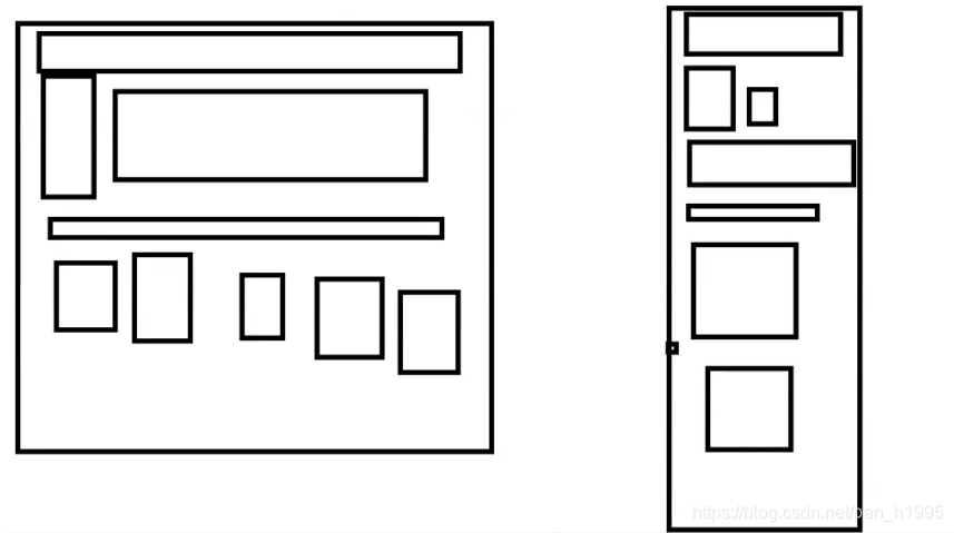
QQ会员页面导航练习

<!DOCTYPE html>
<html lang="en">
<head>
    <meta charset="UTF-8">
    <title>QQ会员</title>
    <link rel="stylesheet" href="css/style.css" />
</head>
<body>
<div class="wrap">
    <!--头部-->
    <header class="nav-header">
        <div class="head-contain">
            <a href="" class="top-logo"><img src="img/logo.png" width="145" height="90" /></a>
            <nav class="top-nav">
                <ul>
                    <li><a href="">功能特权</a> </li>
                    <li><a href="">游戏特权</a> </li>
                    <li><a href="">生活特权</a> </li>
                    <li><a href="">会员特权</a> </li>
                    <li><a href="">成长体系</a> </li>
                    <li><a href="">年费专区</a> </li>
                    <li><a href="">超级会员</a> </li>
                </ul>
            </nav>
            <div class="top-right">
                <a href="">登录</a>
                <a href="">开通超级会员</a>
            </div>
        </div>
    </header>
</div>
</body>
</html>
123456789101112131415161718192021222324252627282930313233
*{
    padding:0;
    margin: 0;
}
a{
    text-decoration: none;
}
.nav-header{
    height: 90px;
     100%;
    background: rgba(0,0,0,.6);
}
.head-contain{
     1180px;
    height: 90px;
    margin: 0 auto;
    text-align: center;
}
.top-logo,.top-nav,.top-nav li,.top-right{
    height: 90px;
    display: inline-block;
    vertical-align: top;
}
.top-nav{
    margin: 0 48px;
}
.top-nav li{
    line-height: 90px;
     90px;
}
.top-nav li a{
    display: block;
    text-align: center;
    font-size: 16px;
    color: #fff;
}
.top-nav li a:hover{
    color: blue;
}

.top-right a{
    display: inline-block;
    font-size: 16px;
    text-align: center;
    margin-top: 25px;
    border-radius: 35px;
}
.top-right a:first-of-type{
     93px;
    height: 38px;
    line-height: 38px;
    color: #fad65c;
    border: 1px #fad65c solid;
}
.top-right a:first-of-type:hover{
    color: #986b0d;
    background: #fad65c;
}
.top-right a:last-of-type{
     140px;
    height: 40px;
    font-weight: 700;
    line-height: 40px;
    background: #fad65c;
    color: #986b0d;
}
.top-right a:last-of-type:hover{
    background: #fddc6c;
}

12345678910111213141516171819202122232425262728293031323334353637383940414243444546474849505152535455565758596061626364656667686970
5.3、float:left/right左右浮动
clear:both
5.4、overflow及父级边框塌陷问题
clear:
right:右侧不允许有浮动元素
left:左侧不允许有浮动元素
both:两侧不允许有浮动元素
none:
解决塌陷问题方案:
方案一:增加父级元素的高度;
方案二:增加一个空的div标签,清除浮动
<div class = "clear"></div>
<style>
	.clear{
		clear:both;
		margin:0;
		padding:0;
}
</style>
12345678
方案三:在父级元素中增加一个overflow:hidden
overflow:hidden/*隐藏*/
overflow:scoll/*滚动*/
方案四:父类添加一个伪类:after
#father:after{
	content:'';
	display:block;
	clear:both;
}
小结:
-
浮动元素增加空div
简单、代码尽量避免空div
-
设置父元素的高度
简单,元素假设没有了固定的高度,就会超出
-
overflow
简单,下拉的一些场景避免使用
-
父类添加一个伪类:after(推荐)
写法稍微复杂,但是没有副作用,推荐使用
5.5、display与float对比
- display:方向不可以控制
- float:浮动起来的话会脱离标准文档流,所以要解决父级边框塌陷的问题。
6、定位
6.1、相对定位
相对定位:positon:relstive;
相对于原来的位置,进行指定的偏移,相对定位的话,它仍然在标准文档流中,原来的位置会被保留
top:-20px;
left:20px;
bottom:-10px;
right:20px;
练习题:连接卡
6.2、绝对定位-absolute
定位:基于xxx定位,上下左右~
1、没有父级元素定位的前提下,相对于浏览器定位
2、假设父级元素存在定位,我们通常会相对于父级元素进行偏移
3、在父级元素范围内移动
总结:相对一父级或浏览器的位置,进行指定的偏移,绝对定位的话,它不在标准文档流中,原来的位置不会被保留
<!DOCTYPE html>
<html lang="en">
<head>
    <meta charset="UTF-8">
    <title>Title</title>
    <style>
        div{
            margin: 10px;
            padding: 5px;
            font-size: 12px;
            line-height: 25px;
        }
        #father{
            border: 1px solid #666;
            padding: 0;
            position: relative;
        }
        #first{
            background-color: #a13d30;
            border: 1px dashed #b27530;

        }
        #second{
            background-color: green;
            border: 1px dashed #0ece4f;
            position: absolute;
            right:30px;
            top:30px
        }
        #third{
            background-color: red;
            border: 1px dashed #ff1b87;
        }
    </style>
</head>
<body>
<div id = "father">
    <div id="first">第一个盒子</div>
    <div id="second">第二个盒子</div>
    <div id="third">第三个盒子</div>
</div>
</body>
</html>
6.3、固定定位-fixed
<!DOCTYPE html>
<html lang="en">
<head>
    <meta charset="UTF-8">
    <title>Title</title>
    <style>
        body{
            height: 1000px;
        }
         div:nth-of-type(1){/*绝对定位:没有相对的父级元素,所以相对于浏览器*/
              100px;
             height: 100px;
             background:red;
             position: absolute;
             right: 0;
             bottom: 0;
         }
        div:nth-of-type(2){
             50px;
            height: 50px;
            background: yellow;
            position: fixed;
            right: 0;
            bottom: 0;
        }
    </style>
</head>
<body>

<div>div1</div>
<div>div2</div>
</body>
</html>
6.4、z-index
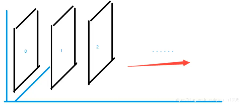
图层~
z-index:默认是0,最高无限~999
<!DOCTYPE html>
<html lang="en">
<head>
    <meta charset="UTF-8">
    <title>Title</title>
    <link rel="stylesheet" href="css/style.css">

</head>
<body>
<div id="content">
    <ul>
        <li><img src="images/bg.jpg" alt=""></li>
        <li class="tipText">学习微服务,找狂神</li>
        <li class="tipBg"></li>
        <li>时间:2099-01=01</li>
        <li>地点:月球一号基地</li>
    </ul>
</div>
</body>
</html>
#content{
     380;
    padding: 0px;
    margin: 0px;
    overflow: hidden;
    font-size: 12px;
    line-height: 25px;
    border: 1px solid yellow;
}
ul,li{
    padding: 0px;
    margin: 0px;
    list-style: none;
}
/*父级元素相对定位*/
#content ul{
    position: relative;
}
.tipText,.tipBg{
    position: absolute;
     380px;
    height: 25px;
    top:216px
}
.tipText{
    color: white;
    z-index: 999;
}
.tipBg{
    background: orange;
    opacity: 0.5;/*背景透明度*/
    filter: alpha(opacity=50);/*IE8之前的浏览器支持*/
}