在corona sdk里,创建界面交互元素widget,非常方便灵活,并且具备极强的可定制性。
我们创建按钮使用如下代码:
widget.newButton( options )
我们有多种方式来创建按钮,不管哪一种,options都可以包含的公共字段如下:
- id:(可选)一个关联到此按钮的可选的字符串标识,默认为”widget_button“
- x, y:(可选)origin坐标
- left, top:(可选)左上角坐标
- isEnable:是否启用,默认为true。通过button:setEnable()来设置,设置为false时,按钮不响应任何事件。
- OnPressonReleaseonEvent:事件
我们也可以通过object:setLabel()和object:getLabel()来设置和获取按钮文字。根据不同的需求,我们有不同的方式来创建按钮,差别主要在options额外的参数上:
1 基本视觉方式
- label:(可选)显示在按钮顶部的标题
- labelAlign:(可选)按钮标题对齐方式,可选值为left,right,center,默认为center
- labelColor:(可选)一个table,保存两个RBGA值,用于表示默认和按下时颜色。格式如:
labelColor = { default={ 1, 1, 1 }, over={ 0, 0, 0, 0.5 } } - labelXOffset, labelYOffset:(可选)按钮标题的x和y方向上的偏移。例如,labelYOffset=-8将会把标题往上移动8个像素
- font:(可选)按钮标题使用的字体,如native.systemFont
- fontSize:(可选)按钮标题的字体大小,单位是像素。默认为14
- emboss:(可选)如果设置为true,按钮标题将呈现为浮雕状(内凹)
- textOnly:(可选)如果设置为true,按钮将只能通过一个文本对象来构造 (无背景元素,貌似没有周围的空隙了),默认为false
local widget = require( "widget" )

-- Function to handle button events
local function handleButtonEvent( event )

    if ( "ended" == event.phase ) then
        print( "Button was pressed and released" )
    end
end

-- Create the widget
local button1 = widget.newButton
{
    left = 100,
    top = 200,
    id = "button1",
    label = "Default",
    onEvent = handleButtonEvent
}
只有文字的按钮,如下图:

2 2-Image方式
顾名思义,就是用两张图片来构造的按钮。这也是最简单的构造按钮的方法---只需要两张图片,一个作为默认一个作为按下状态。
width, height:(可选)图片文件的宽度和高度
baseDir:(可选)图片的基本路径。默认是你的工程文件夹(system.ResourceDirectory)
defaultFile:默认图片的文件名。(抬起状态)
overFile:按下图片的文件名。(按下状态)
local widget = require( "widget" )

-- Function to handle button events
local function handleButtonEvent( event )

    if ( "ended" == event.phase ) then
        print( "Button was pressed and released" )
    end
end

local button1 = widget.newButton
{
    width = 240,
    height = 120,
    defaultFile = "buttonDefault.png",
    overFile = "buttonOver.png",
    label = "button",
    onEvent = handleButtonEvent
}

-- Center the button
button1.x = display.contentCenterX
button1.y = display.contentCenterY

-- Change the button's label text
button1:setLabel( "2-Image" )
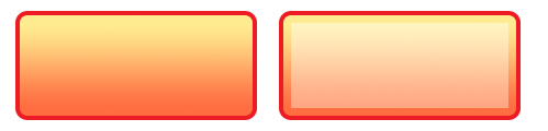
defaultFile和overFile可以制作成如下图样式:
3 2-Frame方式
这种方式是使用ImageSheet中的两帧--一帧表示默认,一帧表示抬起。在这种方式里,需要引用一个sheet参数来引用一个ImageSheet。然后分别给defaultFrame和overFrame指定帧数。
- sheet:按钮用到的ImageSheet。
- defaultFrame:默认帧位于第几帧
- overFrame:抬起帧位于第几帧
local widget = require( "widget" )

-- Function to handle button events
local function handleButtonEvent( event )

    if ( "ended" == event.phase ) then
        print( "Button was pressed and released" )
    end
end

-- Image sheet options and declaration
local options = {
    width = 240,
    height = 120,
    numFrames = 2,
    sheetContentWidth = 480,
    sheetContentHeight = 120
}
local buttonSheet = graphics.newImageSheet( "buttonSheet.png", options )

-- Create the widget
local button1 = widget.newButton
{
    sheet = buttonSheet,
    defaultFrame = 1,
    overFrame = 2,
    label = "button",
    onEvent = handleButtonEvent
}

-- Center the button
button1.x = display.contentCenterX
button1.y = display.contentCenterY

-- Change the button's label text
button1:setLabel( "2-Frame" )
4 Shape方式
这种方式允许你通过下列内建的corona形状函数来创建按钮:
- display.newRect()
- display.newRoundedRect()
- display.newCircle()
- display.newPolygon()

- shap:定义按钮外形(背景)需要的形状。有效的值为”rect“,”roundedRect“,”circle“,”polygon“
- fillColor:(可选)同前=>
fillColor = { default={ 1, 0.2, 0.5, 0.7 }, over={ 1, 0.2, 0.5, 1 } } - strokeColor:(可选)同上=>
strokeColor = { default={ 0, 0, 0 }, over={ 0.4, 0.1, 0.2 } } - strokeWidth:(可选)形状对象边框的宽度。只在strokeColor被定义时才有效。
- conerRadius:(可选)当为roundedRect形状(圆角矩形)。其他形状时会忽略这个字段。
- radius:(可选)当为circle形状(圆形)。其他形状会忽略这个字段。
- vertices:(可选)一个x,y坐标数组,用于polygon形状(多边形)。其他形状会忽略这个字段。如
vertices = { -20, -25, 40, 0, -20, 25 }
示例代码如下:
local widget = require( "widget" )

-- Function to handle button events
local function handleButtonEvent( event )

    if ( "ended" == event.phase ) then
        print( "Button was pressed and released" )
    end
end

-- Create the widget
local button1 = widget.newButton
{
    label = "button",
    onEvent = handleButtonEvent,
    emboss = false,
    --properties for a rounded rectangle button...
    shape="roundedRect",
    width = 200,
    height = 40,
    cornerRadius = 2,
    fillColor = { default={ 1, 0, 0, 1 }, over={ 1, 0.1, 0.7, 0.4 } },
    strokeColor = { default={ 1, 0.4, 0, 1 }, over={ 0.8, 0.8, 1, 1 } },
    strokeWidth = 4
}

-- Center the button
button1.x = display.contentCenterX
button1.y = display.contentCenterY

-- Change the button's label text
button1:setLabel( "Shape" )
5 9-slice方式
这种方式使用一个imageSheet里的9个切片,来组装一个大小可伸缩的按钮。如下图所示,9个切片分别是4个角(红色),2个水平的边(绿色),2个垂直的边(黄色),还有一个中间部分。根据按钮的大小,角依然保持在Imagesheet中的大小,而边和中部,将会根据按钮的宽度和高度来拉伸填充。记住要构造整个按钮,实际需要18个切片:分别用于默认状态和抬起状态。

- width,height:按钮的宽度和高度
- sheet:用于按钮的ImageSheet对象
- middleFrame,middFrameOver:默认和按下状态中部填充区域的帧序号
- topLeftFrame,topLeftOverFrame:默认和按下状态左上角填充区域的帧序号
- 。。。
详细 参数具体见API手册,就不罗列了。
local widget = require( "widget" )

-- Function to handle button events
local function handleButtonEvent( event )

    if ( "ended" == event.phase ) then
        print( "Button was pressed and released" )
    end
end

-- Image sheet options and declaration
local options = {
    frames =
    {
        { x=0, y=0, width=21, height=21 },
        { x=21, y=0, width=198, height=21 },
        { x=219, y=0, width=21, height=21 },
        { x=0, y=21, width=21, height=78 },
        { x=21, y=21, width=198, height=78 },
        { x=219, y=21, width=21, height=78 },
        { x=0, y=99, width=21, height=21 },
        { x=21, y=99, width=198, height=21 },
        { x=219, y=99, width=21, height=21 },
        { x=240, y=0, width=21, height=21 },
        { x=261, y=0, width=198, height=21 },
        { x=459, y=0, width=21, height=21 },
        { x=240, y=21, width=21, height=78 },
        { x=261, y=21, width=198, height=78 },
        { x=459, y=21, width=21, height=78 },
        { x=240, y=99, width=21, height=21 },
        { x=261, y=99, width=198, height=21 },
        { x=459, y=99, width=21, height=21 }
    },
    sheetContentWidth = 480,
    sheetContentHeight = 120
}
local buttonSheet = graphics.newImageSheet( "buttonSheet.png", options )

-- Create the widget
local button1 = widget.newButton
{
    width = 340,
    height = 100,
    sheet = buttonSheet,
    topLeftFrame = 1,
    topMiddleFrame = 2,
    topRightFrame = 3,
    middleLeftFrame = 4,
    middleFrame = 5,
    middleRightFrame = 6,
    bottomLeftFrame = 7,
    bottomMiddleFrame = 8,
    bottomRightFrame = 9,
    topLeftOverFrame = 10,
    topMiddleOverFrame = 11,
    topRightOverFrame = 12,
    middleLeftOverFrame = 13,
    middleOverFrame = 14,
    middleRightOverFrame = 15,
    bottomLeftOverFrame = 16,
    bottomMiddleOverFrame = 17,
    bottomRightOverFrame = 18,
    label = "button"
}

-- Center the button
button1.x = display.contentCenterX
button1.y = display.contentCenterY

-- Change the button's label text
button1:setLabel( "9-Slice" )