前缀
chrome: -webkit-
safari: -webkit-
friefox:-moz-
opera:-0-
书写的时候应该先用有前缀的样式,再用无前缀的样式
圆角
border-radius:20px 20px 20px 20px 左上,右上,右下,左下
阴影
box-shadow:2px 2px 3px #aaaaaa;
语法
box-shadow: h-shadow v-shadow blur spread color inset;
h-shadow 必需。水平阴影的位置。允许负值
v-shadow 必需。垂直阴影的位置。允许负值
blur 可选。模糊距离
spread 可选。阴影的尺寸
color 可选。阴影的颜色
inset 可选。将外部阴影 (outset) 改为内部阴影。
文本阴影
text-shadow:1px 1px #000; 水平 垂直 颜色
text-shadow:1px 1px .3em #000; 水平 垂直 模糊直径 颜色
径向渐变
1.语法
background: linear-gradient(direction, color-stop1, color-stop2, ...);
direction:默认为to bottom,即从上向下的渐变;
stop:颜色的分布位置,默认均匀分布,例如有3个颜色,各个颜色的stop均为33.33%。
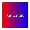
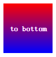
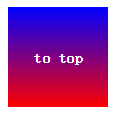
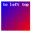
2.示例:to left、top right、to bottom、to top
div { background:linear-gradient(to left, red , blue) }
div { background:linear-gradient(to right, red , blue) }
div { background:linear-gradient(to bottom, red , blue) } /* 浏览器默认值 */
div { background:linear-gradient(to top, red , blue) }
分别产生“从右到左”、“从左到右”、“从上到下”、“从下到上”的“红色–绿色”渐变,效果如下图:

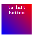
3.示例:to right bottom、top right top、top left bottom、top left top
div { background: linear-gradient(to right bottom, red , blue); }
div { background: linear-gradient(to right top, red , blue); }
div { background: linear-gradient(to left bottom, red , blue); }
div { background: linear-gradient(to left top, red , blue); }
分别产生到“右下角”、“右上角”、“左下角”、“左上角”的渐变,效果如下图:


注意:top right bottom和top bottom right是等同的
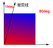
4.使用角度
div { background: linear-gradient(10deg, red, blue) }
效果如下图:
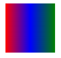
5.多个渐变点
5.1 多个渐变点默认均匀分布
div { background: linear-gradient(to right, red, blue, green) }
理论上渐变点数目不受限制,实际效果如下图:
5.2 多个渐变点不均匀分布
div { background: linear-gradient(red 5%, green 15%, blue 60%) }
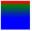
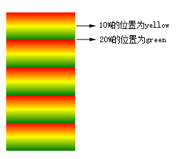
6.重复性渐变
div { background: repeating-linear-gradient(red, yellow 10%, green 20%); }
10%的位置为yellow,20%的位置为green,然后按照这20%向下重复,效果如下图:
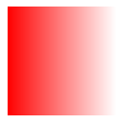
7.使用rgba
div { background:linear-gradient(to right, rgba(255, 0 ,0, 1), rgba(255, 0 ,0 , 0)) }
从红色的不透明,到全透明的渐变,效果图如下:
【参考文章:CSS3 渐变(Gradients)、CSS3 Gradient_gradient, css3属性详解】
径向渐变
语法
径向渐变不同于线性渐变,线性渐变是从“一个方向”向“另一个方向”的颜色渐变,而径向渐变是从“一个点”向四周的颜色渐变。其语法如下:
background: radial-gradient(center, shape, size, start-color, ..., last-color);
center:渐变起点的位置,可以为百分比,默认是图形的正中心。
shape:渐变的形状,ellipse表示椭圆形,circle表示圆形。默认为ellipse,如果元素形状为正方形的元素,则ellipse和circle显示一样。
size:渐变的大小,即渐变到哪里停止,它有四个值。 closest-side:最近边; farthest-side:最远边; closest-corner:最近角; farthest-corner:最远角
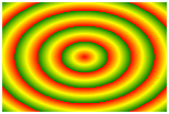
例1:多颜色点均匀分布
div { background: radial-gradient(red, green, blue); }
以中心(50% 50%)为起点,到最远角(farthest-corner),从red到green、blue的均匀渐变,效果如下图: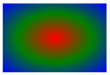
完整的代码可以写成:
div { background: -webkit-radial-gradient(50% 50%, farthest-corner, red, green, blue); }
或
div { background: -webkit-radial-gradient(center, farthest-corner, red, green, blue); }
例2:多颜色节点不均匀分布
div { background: radial-gradient(red 5%, green 15%, blue 60%); }

例3:设置渐变形状
shape 参数定义了形状。它可以是值 circle 或 ellipse。其中,circle 表示圆形,ellipse 表示椭圆形。默认值是 ellipse。
div { background: radial-gradient(circle, red, yellow, green); }
div { background: radial-gradient(ellipse, red, yellow, green); }

circle:渐变为最大的圆形; ellipse:根据元素形状渐变,元素为正方形是显示效果与circle无异。
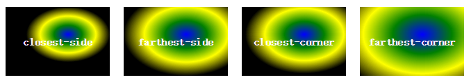
例4:不同尺寸的渐变
size指定了渐变的大小,即渐变到哪里停止,它有四个值。 closest-side:最近边; farthest-side:最远边; closest-corner:最近角; farthest-corner:最远角
div { background: radial-gradient(60% 40%, closest-side, blue, green, yellow, black); }
div { background: radial-gradient(60% 40%, farthest-side, blue, green, yellow, black); }
div { background: radial-gradient(60% 40%, closest-corner, blue, green, yellow, black); }
div { background: radial-gradient(60% 40%, farthest-corner, blue, green, yellow, black); }
效果图如下,分别用“红色”描出了不同属性指定的渐变终点:
例5:重复性渐变
repeating-radial-gradient() 函数用于重复径向渐变
div { background: repeating-radial-gradient(red, yellow 10%, green 20%); }
效果图如下:
【参考文章:CSS3 渐变(Gradients)、CSS3 Gradient_gradient, css3属性详解】
选择器
:nth-child和:nth-of-type都是CSS3中的伪类选择器
:nth-of-type 限制条件少
p:nth-child(2) 其渲染的结果就是父标签的第二个子元素。
p:nth-child(2) 表示这个元素要是p标签,且是第二个子元素,是两个必须满足的条件。
<section>
<div>我是一个普通的div标签</div>
<span>我是一个普通的span标签</span>
<p>我是第1个p标签</p>
<p>我是第2个p标签</p> <!-- 希望这个变红,虽然他是P便签,可是他并不是父元素的第二个子元素,所以不会变红-->
</section>
那么p:nth-child(2)将不会选择任何元素。
p:nth-of-type(2) 表示父标签下的第二个p元素
无论在div标签后面再插入个多少个标签,都是第二个p标签中的文字变红。
<section>
<div>我是一个普通的div标签</div>
<span>我是一个普通的span标签</span>
<p>我是第1个p标签</p>
<p>我是第2个p标签</p> <!-- 希望这个变红,他会非常坚定的变红 -->
</section>
:nth-child 基本用法
:frist-child 选中第一个圆度
:last-child 选中的最后一个元素
:only-child 选中的元素是其父元素的唯一子元素
:nth-last-child(2) 其父元素的第二个子元素的每个 p 元素,从最后一个子元素开始计数:
:nth-child(8)
选中第8个子元素
正方向范围
:nth-child(n+6)
选中从第6个开始的子元素
使用 :nth-child(n+6) ,就相当于让你选中第6个 :nth-child(6) 和其后的所有子元素
负方向范围
:nth-child(-n+9)
选中从第1个到第9个子元素
使用 :nth-child(-n+9) ,就相当让你选中第9个和其之前的所有子元素
前后限制范围
:nth-child(n+4):nth-child(-n+8)
选中第4-8个子元素
使用 nth-child(n+4):nth-child(-n+8) 选中某一范围内子元素,从第4个到第8个子元素
:nth-child(3n+1):nth-child(even) 间隔选择子元素
使用 :nth-child(3n+1) 我们可以每隔3个选中一个,也就是第 1, 4, 7 和 10 个子元素,但通过使用 :nth-child(even) 过滤掉了奇数位子元素,也就是 1 和 7,于是,剩下的子元素只有 4 和 10。
:nth-of-type 的用法
:nth-of-type(3)
可以指定相同的子元素类型,然后再选择。
正方向相同子元素类型范围
span:nth-of-type(n+3)
div:nth-of-type(2n+2)
使用 span:nth-of-type(n+3) 或 div:nth-of-type(2n+2) ,首先指定是相同的子元素类型,然后在这些类型里选择...
负方向相同子元素类型范围
span:nth-of-type(-n+4)
div:nth-of-type(-n+5)
使用 span:nth-of-type(-n+4) or div:nth-of-type(-n+5) ,首先指定是相同的子元素类型,然后在这些类型里选择...
前后范围限制相同子元素类型
span:nth-of-type(n+3):nth-of-type(-n+6)
div:nth-of-type(n+1):nth-of-type(-n+3)
使用 :nth-of-type(n+3):nth-of-type(-n+6) 和 div:nth-of-type(n+1):nth-of-type(-n+3) ,首先指定是相同的子元素类型,然后在这些类型里选择...这个例子中选中的将会是第 1-3 和 3-6 个子元素。
高级相同子类型加前后范围限制用法
span:nth-of-type(n+3):nth-of-type(odd):nth-of-type(-n+6)
div:nth-of-type(n+1):nth-of-type(even):nth-of-type(-n+3)
使用 span:nth-of-type(n+3):nth-of-type(odd):nth-of-type(-n+6) 和 div:nth-of-type(n+1):nth-of-type(even):nth-of-type(-n+3),你既能够限制是在相同类型子元素里选择,同时指定选择的起始位置和结束位置。这里同时使用了奇偶位限制。
浏览器支持
所有主流浏览器均支持 :nth-child() 选择器,除了 IE8 及更早的版本。
子代选择器和父代选择器

然后我们在<style>标签里增加一个子代选择器
.mainDiv > div{
background-color: green;
}
让子代的背景色都为绿色
修改后保存用浏览器打开如图,可见【儿子】那个div已经变为绿色

然后我们去掉子代选择器,添加一个后代选择器
.mainDiv div{
background-color: red;
}
让后代的背景色都为红色
修改后保存用浏览器打开如图,可见【儿子】和【孙子】的div已经变为红色

现在我们再看看把上面的子代和后代样式都同时应用,效果如图。
经过上面的结果展示,我们能得到结论。
子代选择器:只对应用对象的直接相应子节点有效。如实例代码中的儿子div。
后代选择器:对应用对象内的所有相应子节点都有效。如实例中的儿子div和孙子div。
