其实早都做过用css来实现小三角的箭头符号了,不过一直都没静下心来仔细研究,今天正好多看了些,都说好记性不如烂笔头,把所了解到的赶紧记录下来。
大致有两种方法:边框法和字符法。边框法就是利用盒子的边框变化组合形成的各种三角;字符法就是采用菱形的字符◆,然后决定定位把多余的部分溢出掉,该种方法只适合三角和拼接板块颜色一致。
1、边框法:
首先先了解下原理:
设置有宽高和边框的盒子都是这种形状的 ,代码为
,代码为
.box{
    width:20px;
    height:20px;
    border-width:10px;
    border-style:solid;
    border-color:#f30 #00f #333 #ff0;
}
宽高为0,四边边框大小都一样的盒子为 ,代码为
,代码为
.box1{
    width:0;
    height:0;
    overflow:hidden;  /*清除ie6下默认的宽高*/
    font-size: 0;     /*是因为, 虽然宽高度为0, 但在IE6下会具有默认的 */
    line-height: 0;  /* 字体大小和行高, 导致盒子呈现被撑开的长矩形 */
    border-width:10px;
    border-style:solid;
    border-color:orange blue gray blue;
}
宽高为0,边框大小不一样的盒子,例如
/**不等边框的盒子**/
.box3{
    width:0;
    height:0;
    overflow:hidden;
    font-size: 0;     /*是因为, 虽然宽高度为0, 但在IE6下会具有默认的 */
    line-height: 0;  /* 字体大小和行高, 导致盒子呈现被撑开的长矩形 */
    border-width:20px 10px 0 0;
    border-style:solid;
    border-color:orange blue transparent transparent;
}
4个边框大小不同可以拼合出不同形状的三角形。
由此可分别获得上右下左4个三角形,例如像下的箭头
/**向下的三角**/
.sanjiao_down{
    width:0;
    height:0;
    overflow:hidden;
    font-size: 0;     /*是因为, 虽然宽高度为0, 但在IE6下会具有默认的 */
    line-height: 0;  /* 字体大小和行高, 导致盒子呈现被撑开的长矩形 */
    border-width:10px;
    border-style:solid;  /*ie6下会出现不透明的兼容问题*/
    border-color:#f30 transparent transparent transparent;
}
但是ie6下会出现bug,透明的三条边框没达到透明的效果,图为 ,需要把透明的边框样式设置为dotted或者dashed都可解决。
最终代码为
/**向下的三角**/
.sanjiao_down{
    width:0;
    height:0;
    overflow:hidden;
    font-size: 0;     /*是因为, 虽然宽高度为0, 但在IE6下会具有默认的 */
    line-height: 0;  /* 字体大小和行高, 导致盒子呈现被撑开的长矩形 */
    border-width:10px;
    border-style:solid dashed dashed dashed;/*IE6下, 设置余下三条边的border-style为dashed,即可达到透明的效果*/
    border-color:#f30 transparent transparent transparent;
}
上面所说的都为实体无边的三角形,那么带有边框的三角形如何实现呢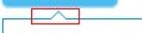 ,这种就相当于两个绝对定位的无边框三角形叠加在一起,外三角边框比里三角小1px,并且外三角定位比里三角靠外1px。
为了代码简洁在非ie6下采用:before和after伪类,ie6下用样式名来实现,代码
<div class="box sanjiao_border">
    <!--ie6下需用,非ie6无需-->
    <i class="before"></i><i class="after"></i>
</div>


.sanjiao_border:before,.sanjiao_border .before{/*.before为ie6下用到*/
    content: ''; /*伪类下的属性*/
    display:block;
    position:absolute;
    top:0px;
    left:150px;
    width:0;
    height:0;
    overflow:hidden;
    font-size: 0;     /*是因为, 虽然宽高度为0, 但在IE6下会具有默认的 */
    line-height: 0;  /* 字体大小和行高, 导致盒子呈现被撑开的长矩形 */
    border:10px;
    border-style:dashed dashed solid dashed;
    border-color:transparent transparent #f30 transparent;
}
.sanjiao_border:after,.sanjiao_border .after{/*.after为ie6下用到*/
    content: '';/*伪类下的属性*/
    display:block;
    width:0;
    height:0;
    overflow:hidden;
    font-size: 0;     /*是因为, 虽然宽高度为0, 但在IE6下会具有默认的 */
    line-height: 0;  /* 字体大小和行高, 导致盒子呈现被撑开的长矩形 */
    border:9px;
    border-style:dashed dashed solid dashed;
    border-color:transparent transparent #fff transparent;
    position:absolute;
    left:151px;
    top:2px;
}
2、字符法
原理:采用菱形的字符◆,然后决定定位把多余的部分溢出掉,该种方法只适合三角和拼接板块颜色一致。
<div class="mod_sanjiao">
    <span>◆</span>
</div>
/*字符法*/
.mod_sanjiao{width:200px; height:30px; background:#fff;margin:30px; position:relative;}
.mod_sanjiao span{
    position:absolute;
    top:-10px;
    left:45%;
    font-size:20px;/*控制该菱形的大小*/
    color:#fff;/*控制该菱形的颜色*/
}