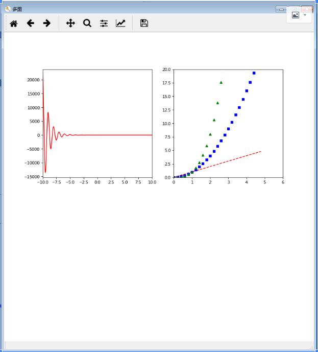
fig = plt.figure('多图', (10, 10), dpi=80) #第一个指定窗口名称,第二个指定图片大小,创建一个figure对象
plt.subplot(222) #2*2的第二个
plt.axis([0, 6, 0, 20]) #指定坐标轴范围
t = np.arange(0, 5, 0.2)
plt.plot(t, t, 'r--', t, t**2, 'bs', t, t**3, 'g^') #可以连着写多个

plt.subplot(221) #2*2第一个,这句下面直接写绘图语句和设置语句
x = np.arange(-10, 10, 0.01)
y = np.exp(-x)*np.cos(2*np.pi*x)
plt.plot(x, y, 'r')
plt.xlim([-10, 10])

plt.show()
fig.savefig('linshi.png') #保存figure
2
源自 matplotlib subplot 子图 - Claroja - CSDN博客 http://blog.csdn.net/claroja/article/details/70841382
如果不指定figure()的axes,figure(1)命令默认会被建立,同样的如果不指定subplot(numrows, numcols, fignum)的轴axes,subplot(111)也会自动建立。这里,要注意一个概念当前图和当前坐标。所有绘图操作仅对当前图和当前坐标有效
当前的图表和子图可以使用plt.gcf()和plt.gca()获得,分别表示"Get Current Figure"和"Get Current Axes"。plt.sca (ax1)可以使ax1成为当前axes对象
plt.figure('第一个')  # 创建第一个画板(figure)
plt.subplot(211)  # 第一个画板的第一个子图
plt.plot([1, 2, 3], [1, 2, 3])
plt.subplot(212)  # 第一个画板的第二个子图
plt.plot([4, 5, 6], [1, 2, 3])

plt.figure('第二个')  # 创建第二个画板
plt.plot([4, 5, 6], [1, 2, 3])  # 默认子图命令是spbplot(111)

plt.figure('第一个')  # 如果想对画板1操作,需调取画板1,此时调用中的子图是subplot(212)
plt.subplot(211)  # 将调用中的子图变为subplot(211)
plt.title('Easy as 1, 2, 3')
plt.show()
要想重新设置,必须重新调用
3
源自 matplotlib subplot 子图 - Claroja - CSDN博客 http://blog.csdn.net/claroja/article/details/70841382
subplot()是将整个figure均等分割,而axes()则可以在figure上画图。
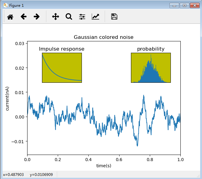
"""axes的使用"""


import matplotlib.pyplot as plt
import numpy as np

# 创建数据
dt = 0.001
t = np.arange(0.0, 10.0, dt)
r = np.exp(-t[:1000]/0.05)  # impulse response
x = np.random.randn(len(t))  # 从标准正太分布中返回len(t)个随机数
s = np.convolve(x, r)[:len(x)] * dt  # colored noise
# 默认主轴图axes是subplot(111)
plt.plot(t, s)
plt.axis([0, 1, 1.1*np.amin(s), 2*np.amax(s)])
plt.xlabel('time(s)')
plt.ylabel('current(nA)')
plt.title('Gaussian colored noise')
# 内嵌图
a = plt.axes([.65, .6, .2, .2], facecolor='y')
# Add an axes to the figure,第一个参数是指定axes的位置和高度,[距左距离,距底距离,宽,高],都是0-1之间,按比例表示
n, bins, patches = plt.hist(s, 400, normed=1)
plt.title('probability')
plt.xticks([])  # 不显示坐标轴标签
plt.yticks([])
# 另外一个内嵌图
b = plt.axes([0.2, 0.6, .2, .2], facecolor='y')
plt.plot(t[:len(r)], r)
plt.title('Impulse response')
plt.xlim(0, 0.2)
plt.xticks([])
plt.yticks([])
plt.show()
可以通过clf()清空当前的图板(figure),通过cla()来清理当前的轴(axes)。你需要特别注意的是记得使用close()关闭当前figure画板
