Vant 是有赞开发的一套基于 Vue 2.0 的 Mobile 组件库,在开发的过程中也踩了很多坑,今天我们就来聊一聊开发一个移动端 Modal 组件(在有赞该组件被称为 Popup )需要注意的一些坑。
在任何一个合格的UI组件库中,Modal 组件应该是必备的组件之一。它一般用于用户处理事物,但又不希望跳转页面时,可以使用 Modal 在当前页面中打开一个浮层,承载对应的操作。相比PC端,移动端的 Modal 组件坑会更多,比如滚动穿透问题就不像PC端在 body 上添加 overflow: hidden 那么简单。
目录
一、API定义
二、水平垂直居中的方案
三、可恶的滚动穿透
四、position: fixed 失效
一、API定义
任何一个组件开始编码前都需要首先将API先定义好,才好根据API来提供对应的功能。Modal 组件提供了以下API:
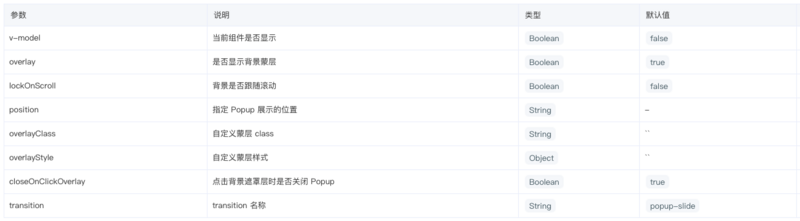
更具体的 Api 介绍可以访问该链接查看:Popup
二、水平垂直居中方案
垂直居中的方案网上谷歌一下就能找到很多种,主流的方案有:
- absolute(fixed) + 负边距
- absolute(fixed) + transform
- flex
- table + vertical-align
首先说一下我们选择的是第二种:absolute(fixed) + transform,它是以上方案中最简单最方便的方案,代码实现量也很少。实现代码如下:
.modal {
  position: fixed;
  top: 50%;
  left: 50%;
  transform: translate(-50%, -50%);
}
但是 transform 会导致一个巨大的坑,这个坑的具体细节会在下面的章节中详细讲到。
说完了我们选择的方案,再来说说为啥不选择其他的方案呢?
absolute(fixed) + 负边距
只能适合定高的场景,果断抛弃。如果要实现不定高度就要通过JS来计算了,增加了实现的复杂度。
flex
flex 布局一是在某些老版本的安卓浏览器上还不是很兼容,还有就是需要包裹一个父级才能水平垂直居中。
table + vertical-middle
在 CSS2 时代用这个方案来实现垂直居中是比较常见的方案,不足的地方就是代码实现量相对较大。
三、可恶的滚动穿透
开发过移动端UI组件的都知道,在移动端有个可恶的滚动穿透问题。这个问题可以描述为:在弹窗上滑动会导致下层的页面跟着滚动。
网上谷歌一下滚动穿透关键字其实可以发现很多种解决方案,每个方案也各有优缺点,但我们选择的解决方案是团队的一姐一篇移动端体验优化的博文中得到的启示(博文地址:花式提升移动端交互体验 | TinySymphony)。
具体的思路是:当容器可以滑动时,若已经在顶部,禁止下滑;若在底部,禁止上滑;容器无法滚动时,禁止上下滑。实现的方式就是在 document 上监听 touchstart 和 touchmove 事件,如滑动时,祖先元素并没有可滑动元素,直接阻止冒泡即可;否则判断手指滑动的方向,若向下滑动,判断是否滑动到了滑动元素的底部,若已经到达底部,阻止冒泡,向上滑动也类似。具体的代码实现可以看下面的代码:
const _ = require('src/util')
export default function (option) {
  const scrollSelector = option.scroll || '.scroller'
  const pos = {
    x: 0,
    y: 0
  }

  function stopEvent (e) {
    e.preventDefault()
    e.stopPropagation()
  }

  function recordPosition (e) {
    pos.x = e.touches[0].clientX
    pos.y = e.touches[0].clientY
  }

  function watchTouchMove (e) {
    const target = e.target
    const parents = _.parents(target, scrollSelector)
    let el = null
    if (target.classList.contains(scrollSelector)) el = target
    else if (parents.length) el = parents[0]
    else return stopEvent(e)
    const dx = e.touches[0].clientX - pos.x
    const dy = e.touches[0].clientY - pos.y
    const direction = dy > 0 ? '10' : '01'
    const scrollTop = el.scrollTop
    const scrollHeight = el.scrollHeight
    const offsetHeight = el.offsetHeight
    const isVertical = Math.abs(dx) < Math.abs(dy)
    let status = '11'
    if (scrollTop === 0) {
      status = offsetHeight >= scrollHeight ? '00' : '01'
    } else if (scrollTop + offsetHeight >= scrollHeight) {
      status = '10'
    }
    if (status !== '11' && isVertical && !(parseInt(status, 2) & parseInt(direction, 2))) return stopEvent(e)
  }
  document.addEventListener('touchstart', recordPosition, false)
  document.addEventListener('touchmove', watchTouchMove, false)
}
四、position: fixed 失效
在前端工程师的世界观里,position: fixed 一直是相对浏览器视口来定位的。有一天,你在固定定位元素的父元素上应用了 transform 属性,当你刷新浏览器想看看最新的页面效果时,你竟然发现固定定位的元素竟然相对于父元素来定位了。是不是感觉人生观都崩塌了。
这个问题,目前只在Chrome浏览器/FireFox浏览器下有。也有人给 Chrome 提bug:Fixed-position element uses transformed ancestor as the container,但至今尚未解决。
例如下面的代码:
```<style> body { padding: 50px; } .demo { background: #ccc; height: 100px; transform: scale(1); } .fixed-box { position: fixed; top: 0; left: 0; 100px; height: 100px; background: red; } </style><div class="demo">
<div class="fixed-box"></div>
</div>
<p>垂直居中方案 <code>position: fixed + transform</code> 的选择导致了 <code>Modal</code> 组件使用上的一个坑。当我们在 <code>Modal</code> 组件里面嵌套了一个 <code>Modal</code> 时,内层的<code>Modal</code> 就是相对外层的 <code>Modal</code> 来定位,而不是浏览器的 viewport。这也限制了我们 <code>Modal</code> 的使用场景,如果你想实现嵌套的 <code>Modal</code>,就要选择其他的垂直居中方案了,有舍必有得嘛。</p>
<p>关于 <code>position: fixed</code> 失效的更多细节可以参考以下几篇博文:</p>
<ul>
<li><a href="http://meyerweb.com/eric/thoughts/2011/09/12/un-fixing-fixed-elements-with-css-transforms/" rel="nofollow noreferrer">Eric’s Archived Thoughts:   Un-fixing Fixed Elements with CSS Transforms</a></li>
<li><a href="http://www.zhangxinxu.com/wordpress/2015/05/css3-transform-affect/" rel="nofollow noreferrer">CSS3 transform对普通元素的N多渲染影响</a></li>
</ul>
<h2>总结</h2>
<p>开发组件库不易,开发移动端组件库更不易。移动端组件库相对PC端会有更多的奇葩的坑。当遇到坑,肯定是要选择跨越它,而不是逃避它,因此也才有了我们这篇文章,后续我们也还会有一些介绍 <a href="https://www.youzanyun.com/zanui/vant" rel="nofollow noreferrer">Vant</a> 组件库开发过程中遇到的坑,或者一些优化相关的文章,敬请期待。</p>
<p>如果觉得这篇文章讲的还不够,完整源代码实现请移步Github:<a href="https://github.com/youzan/vant/tree/dev/packages/popup" rel="nofollow noreferrer">popup</a>。</p>


原文地址: