写在前面:网站轮播图建议使用swiper组件,非常方便快捷。vue轮播图插件之vue-awesome-swiper
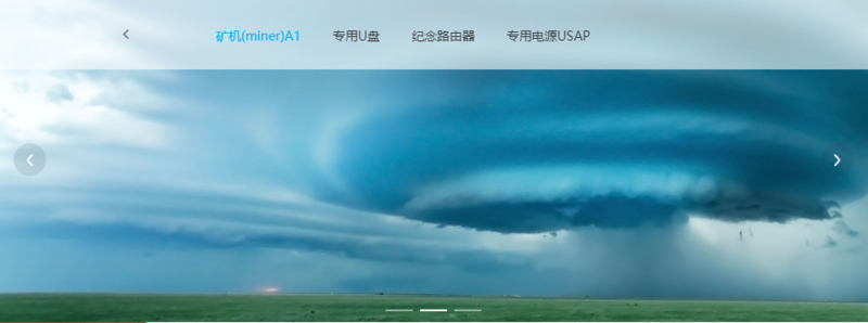
接手一个项目,轮播图是用element-ui的carousel实现的,看起来效果还不错,只是固定宽高,并未做适配,于是将就代码做下修改,以适配各种显示器屏幕。
    <el-carousel indicator-position="outside" :height="bannerHeight + 'px'">
     <el-carousel-item v-for="(item,index) in BannerImg">
       <img src="../../assets/images/banner1.jpg" v-if="index == 0" class="bannerImg" />
       <img src="../../assets/images/banner2.jpg" v-if="index == 1" class="bannerImg" />
       <img src="../../assets/images/banner3.jpg" v-if="index == 2" class="bannerImg" />
     </el-carousel-item>
   </el-carousel>
bannerHeight属性用来控制banner层的高度,计算方式:根据浏览器的宽度计算等比的图片高度:
setSize: function () {
    this.bannerHeight = 740 / 2560 * this.screenWidth
    if(this.bannerHeight > 740) this.bannerHeight = 740
    if(this.bannerHeight < 360) this.bannerHeight = 360
  }
给img加样式:
.bannerImg{
     100%;
    height: inherit;
    min-height: 360px;
    min- 1400px;
  }
大功告成!为了让改变浏览器也能适配,监听一下浏览器resize:
mounted () {
  this.setSize();
  const that = this;
  window.addEventListener('resize', function() {
    that.screenWidth = $(window).width();
    that.setSize();
  }, false);
}