前言
在移动端如何让宽度自适应来实现一个正方形,也就是宽度设置为百分比。
方法一:
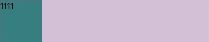
使用javascript/jquery
<style>
     .wrap {
      100%;
     background: thistle;
   }
     .child {
     background: teal;
      20%;
   }
</style>
<body>
     <div class="wrap">
           <div class="child">111</div>
     </div>
</body>
<script src="wjs/lib/jquery/jquery.min.js"></script>
<script type="text/javascript">
    $(document).ready(function(){
        $(window).on('resize', function () {
            $('child').css('height',$('li').css('width'));
        }).trigger('resize');
    })
</script>
效果图:

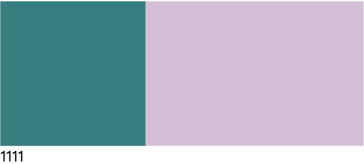
方法二:
将元素垂直方向的一个padding,也就是padding-bottom或者padding-top设置为和宽度相同的百分比,将盒子撑起来,
padding-bottom用法:
但是padding是不包含盒子内容的,所以我们把盒子高度设置为0,否则文字会溢出,导致高度大于宽度。
可以看出来在正方形中有内容的时候,内容会在正方形外面,这是因为默认文字是从左到右,从上到下的排列所以paddin-bottom以后文字会在正方形上面
<style>
     .wrap {
      100%;
     background: thistle;
   }
     .child {
     background: teal;
      20%;
     padding-bottom: 20%;
     height: 0;
   }
</style>
<div class="wrap">
     <div class="child">
          1111
     </div>
</div>
效果图:
padding-top用法:
同样需要设置height:0,可以看出来在正方形中有内容的时候,内容会在正方形外面,这是因为默认文字是从左到右,从上到下的排列所以paddin-top以后文字会在正方形下方(外面)
<style>
     .wrap {
      100%;
     background: thistle;
   }
     .child {
     background: teal;
      40%;
     padding-top: 40%;
     height: 0;
   }
</style>
<div class="wrap">
     <div class="child">
          1111
     </div>
</div>
效果图:
方法三:
利用双层嵌套来写,将外层的div的position设置relative,内层的position设置为absoult,利用绝对定位消除空间占用
分别看设置成padding-top/padding-bottom的效果
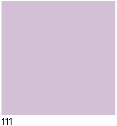
padding-bottom:
<style>
.wrap{
    padding-bottom:50%;
    height: 0;
    background:thistle;
     50%;
    position: relative;
}
.child{
    position: absolute;
     100%;
    height: 100%;
}
</style>
<div class="wrap">
    <div class="child">
        111
    </div>
</div>
效果图:

padding-top:
<style>
.wrap{
    padding-top:50%;
    height: 0;
    background:thistle;
     50%;
    position: relative;
}
.child{
    position: absolute;
     100%;
    height: 100%;
}
</style>
<div class="wrap">
    <div class="child">
        111
    </div>
</div>
效果图:
运行之后我们发现写padding-top还是不可以,我们来检查代码发现,在写内层的div时候没有给top,left的值,让我们把top,left加上再看看
.child{
    position: absolute;
     100%;
    height: 100%;
    left: 0;
    top: 0;
}
效果图:
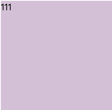
注:所以如果用padding-top的时候一定要记得添加top,left
方法四:
使用 vw/vh 单位,但是需要注意的是vw/vh单位是将当前视口的宽度/高度平均分成100份的长度,并非父级盒子,1vw = 1% viewport width。
<style>
        html,body {
             100%;
            height: 100%;
        }
        .wrap {
            background: thistle;
        }
        .child {
            background: teal;
             50%;
            height: 50vw;
        }
</style>
<body>
    <div class="wrap">
        <div class="child">
            1111
        </div>
    </div>
</body>
效果图:
注意:此时,类名为wrap的div不设宽或将宽度设置100%;因为类名为child的div宽度我们设置为百分比是相对父元素的。height我们设置为了50vw,也就是50% viewport width。