样式
1、讲到样式,先来对比一下wpf 样式和网页css:
wpf代码:


<Window
    x:Class="WpfApp1.MainWindow"
    xmlns="http://schemas.microsoft.com/winfx/2006/xaml/presentation"
    xmlns:x="http://schemas.microsoft.com/winfx/2006/xaml"
    xmlns:Themes="clr-namespace:Microsoft.Windows.Themes;assembly=PresentationFramework.Aero2"
    xmlns:d="http://schemas.microsoft.com/expression/blend/2008"
    xmlns:local="clr-namespace:WpfApp1"
    xmlns:mc="http://schemas.openxmlformats.org/markup-compatibility/2006"
    Title="MainWindow"
    Width="800"
    Height="450"
    mc:Ignorable="d">

    <Window.Resources>
        <Style x:Key="ButtonStyle" TargetType="{x:Type Button}">
            <Setter Property="Background" Value="#4CAF50"></Setter>
            <Setter Property="BorderThickness" Value="0"></Setter>
            <Setter Property="Foreground" Value="White"></Setter>
            <Setter Property="Padding" Value="32,15"></Setter>
            <Setter Property="FontSize" Value="16"></Setter>
            <Setter Property="Margin" Value="4,2"></Setter>
        </Style>

    </Window.Resources>

    <StackPanel Margin="10">
        <TextBlock Text="WPF 按钮" FontSize="24" FontWeight="Bold"></TextBlock>
        <StackPanel Orientation="Horizontal" Margin="0,20" >
            <Button  HorizontalAlignment="Left" VerticalAlignment="Center"  Content="默认按钮" />
            <Button  HorizontalAlignment="Left" VerticalAlignment="Center"  Content="按钮" Style="{StaticResource ButtonStyle}" />
        </StackPanel>
    </StackPanel>
</Window>
html css代码:
<!DOCTYPE html>
<html>
<head>
<meta charset="utf-8">
<title></title>
<style>
.button {
    background-color: #4CAF50;
    border: none;
    color: white;
    padding: 15px 32px;
    font-size: 16px;
    margin: 4px 2px;
}
</style>
</head>
<body>

<h2>CSS 按钮</h2>

<button>默认按钮</button>

<button class="button">按钮</button>
</body>
</html>
查看一下效果:
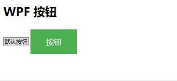
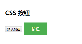
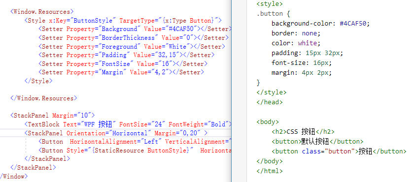
通过代码对比,可以看到WPF的Style和html的Style(CSS)相似度很高。
再来看一下:
<link href="img/divcss5.css" rel="stylesheet" type="text/css" />
<ResourceDictionary Source="MySource/MyDataTemplate.xaml"/>
都可以使用外联的方式加载样式,这样可以通过建立资源字典 统一样式。xaml的style中还有更多方便的功能。比如BasedOn、Trigger等,而css也在吸收这些优点进行改进。
2、讲到样式,必须要提到Blend
以Button为例,查看样式模板副本:
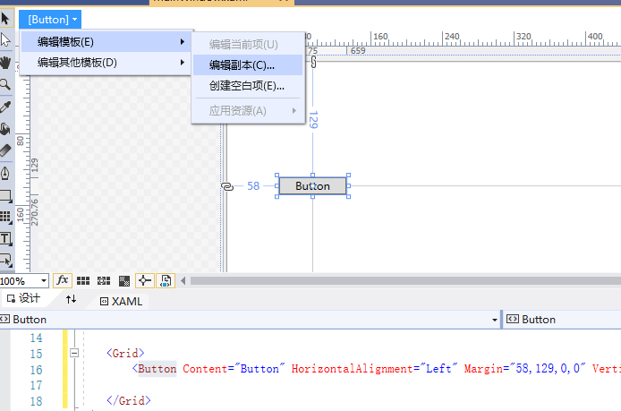
<Window
    x:Class="WpfApp1.MainWindow"
    xmlns="http://schemas.microsoft.com/winfx/2006/xaml/presentation"
    xmlns:x="http://schemas.microsoft.com/winfx/2006/xaml"
    xmlns:Themes="clr-namespace:Microsoft.Windows.Themes;assembly=PresentationFramework.Aero2"
    xmlns:d="http://schemas.microsoft.com/expression/blend/2008"
    xmlns:local="clr-namespace:WpfApp1"
    xmlns:mc="http://schemas.openxmlformats.org/markup-compatibility/2006"
    Title="MainWindow"
    Width="800"
    Height="450"
    mc:Ignorable="d">
    <Window.Resources>
        <Style x:Key="FocusVisual">
            <Setter Property="Control.Template">
                <Setter.Value>
                    <ControlTemplate>
                        <Rectangle Margin="2" SnapsToDevicePixels="true" Stroke="{DynamicResource {x:Static SystemColors.ControlTextBrushKey}}" StrokeThickness="1" StrokeDashArray="1 2"/>
                    </ControlTemplate>
                </Setter.Value>
            </Setter>
        </Style>
        <SolidColorBrush x:Key="Button.Static.Background" Color="#FFDDDDDD"/>
        <SolidColorBrush x:Key="Button.Static.Border" Color="#FF707070"/>
        <SolidColorBrush x:Key="Button.MouseOver.Background" Color="#FFBEE6FD"/>
        <SolidColorBrush x:Key="Button.MouseOver.Border" Color="#FF3C7FB1"/>
        <SolidColorBrush x:Key="Button.Pressed.Background" Color="#FFC4E5F6"/>
        <SolidColorBrush x:Key="Button.Pressed.Border" Color="#FF2C628B"/>
        <SolidColorBrush x:Key="Button.Disabled.Background" Color="#FFF4F4F4"/>
        <SolidColorBrush x:Key="Button.Disabled.Border" Color="#FFADB2B5"/>
        <SolidColorBrush x:Key="Button.Disabled.Foreground" Color="#FF838383"/>
        <Style x:Key="ButtonStyle1" TargetType="{x:Type Button}">
            <Setter Property="FocusVisualStyle" Value="{StaticResource FocusVisual}"/>
            <Setter Property="Background" Value="{StaticResource Button.Static.Background}"/>
            <Setter Property="BorderBrush" Value="{StaticResource Button.Static.Border}"/>
            <Setter Property="Foreground" Value="{DynamicResource {x:Static SystemColors.ControlTextBrushKey}}"/>
            <Setter Property="BorderThickness" Value="1"/>
            <Setter Property="HorizontalContentAlignment" Value="Center"/>
            <Setter Property="VerticalContentAlignment" Value="Center"/>
            <Setter Property="Padding" Value="1"/>
            <Setter Property="Template">
                <Setter.Value>
                    <ControlTemplate TargetType="{x:Type Button}">
                        <Border x:Name="border" BorderBrush="{TemplateBinding BorderBrush}" BorderThickness="{TemplateBinding BorderThickness}" Background="{TemplateBinding Background}" SnapsToDevicePixels="true">
                            <ContentPresenter x:Name="contentPresenter" Focusable="False" HorizontalAlignment="{TemplateBinding HorizontalContentAlignment}" Margin="{TemplateBinding Padding}" RecognizesAccessKey="True" SnapsToDevicePixels="{TemplateBinding SnapsToDevicePixels}" VerticalAlignment="{TemplateBinding VerticalContentAlignment}"/>
                        </Border>
                        <ControlTemplate.Triggers>
                            <Trigger Property="IsDefaulted" Value="true">
                                <Setter Property="BorderBrush" TargetName="border" Value="{DynamicResource {x:Static SystemColors.HighlightBrushKey}}"/>
                            </Trigger>
                            <Trigger Property="IsMouseOver" Value="true">
                                <Setter Property="Background" TargetName="border" Value="{StaticResource Button.MouseOver.Background}"/>
                                <Setter Property="BorderBrush" TargetName="border" Value="{StaticResource Button.MouseOver.Border}"/>
                            </Trigger>
                            <Trigger Property="IsPressed" Value="true">
                                <Setter Property="Background" TargetName="border" Value="{StaticResource Button.Pressed.Background}"/>
                                <Setter Property="BorderBrush" TargetName="border" Value="{StaticResource Button.Pressed.Border}"/>
                            </Trigger>
                            <Trigger Property="IsEnabled" Value="false">
                                <Setter Property="Background" TargetName="border" Value="{StaticResource Button.Disabled.Background}"/>
                                <Setter Property="BorderBrush" TargetName="border" Value="{StaticResource Button.Disabled.Border}"/>
                                <Setter Property="TextElement.Foreground" TargetName="contentPresenter" Value="{StaticResource Button.Disabled.Foreground}"/>
                            </Trigger>
                        </ControlTemplate.Triggers>
                    </ControlTemplate>
                </Setter.Value>
            </Setter>
        </Style>
    </Window.Resources>

    <Grid>
        <Button Content="Button" HorizontalAlignment="Left" Margin="58,129,0,0" VerticalAlignment="Top" Width="75" Style="{DynamicResource ButtonStyle1}"/>
    </Grid>
</Window>
可以看到button基本样式结构,可以通过修改其中属性值,查看显示效果。通过改变ControlTemplate,可以定义更多样式(自定义button)。
资源
通过样式,可以自由定义各种控件,随心所欲的修改想要的效果。但如每个控件都在使用的时候,定义Style,就会有很多冗余的代码。上面也提到,可以通过外联资源字典的方式,来统一管理样式。
看一下专业资源样式写法,MaterialDesignInXamlToolkit/Themes
使用资源字典,从几个方面定义:
1、主题、颜色(MaterialDesignTheme.Dark.xaml、MaterialDesignTheme.Light.xaml)
2、样式(MaterialDesignTheme.Shadows.xaml)
3、字体(MaterialDesignTheme.Font.xaml)
4、控件(MaterialDesignTheme.Button.xaml等)
5、自定义控件(MaterialDesignTheme.DialogHost.xaml、MaterialDesignTheme.Clock.xaml等)
6、统一调用(MaterialDesignTheme.Defaults.xaml)
通过附加属性配合资源字典,可以比较方便实现许多功能。写法参考(ShadowAssist.cs、ScrollViewerAssist.cs、ButtonProgressAssist.cs等)
学习样式资源可以参考,简单漂亮的UI框架 DMSKin