CSS Backgrounds
Color
opacity 会让整个 div 包括里面的 text 变透明, 如果不希望这样的话, 可以通过 background-color: RGBA 来完成.
div {
  background-color: green;
  opacity: 0.3;
}
Image Repeat & Position
默认是 repeat, x 和 y 都有.
repeat-x 只 repeat horizontal
repeat-y 只 repeat vertical
no-repeat 不要 repeat
默认 position 是 left top.
Attachment
scroll 的时候要跟还是定在原位, fixed or scroll.
Shorthand
body {
  background: #ffffff url("img_tree.png") no-repeat right top;
}
color, image, repeat, position.
最常见的就是 background: red; 取代 background-color:red
CSS Borders
p {
  border: 2px solid red;
  border-radius: 5px;
}
width, style (required), color, radius 是圆角
像上面写成一排叫 Shorthand Property, border 有 4 边, 也可以分开写每一个.
Border + Transparent
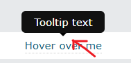
 div{
   border-width: 5px;
   border-color: red red transparent transparent;
   border-style: solid;
   width: 50px;
   height: 50px;
 }
效果: (边角是斜的)

于是它可以用来做 tooltip 的对话箭头.
div{
  border-width: 5px;
  border-color: red transparent transparent transparent;
  border-style: solid;
  width: 1px;
}
效果:

border-width 越大, 整个箭头就越大.
CSS Margins
支持的 value

Auto 可以用来居中
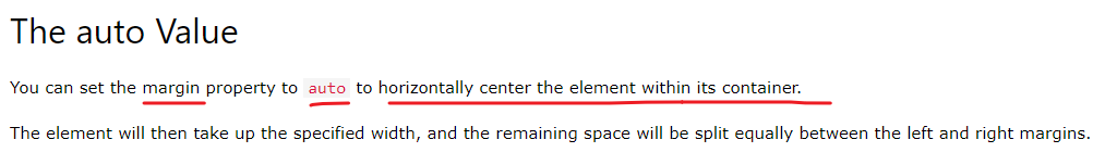
传统写法
margin: 0 auto
现代写法
margin-inline: auto;
Collapse 崩溃
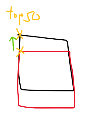
当上下 margin 重叠时, 大的那一个会胜出, 最终只剩下 1 个 margin 高度. 左右则没有 collapse 的概念.
Top vs Buttom
参考:
CSS: Margin Top vs Bottom (A Trick You Should Know)
Css margin-top vs margin-bottom (stackoverflow)
大部分情况, 2 个都适用, 文章给出极端情况, top 会比较好, 因为 CSS selector 只能 match next element, prevent 不行, 所以遇到要 override 的话, margin-top 才可以做到.
另一个我自己的想法是, 动机是想分开 2 个 element, 那么一定是第 2 个出现后才需要, 所以让第 2 个有 margin top 比较合理. 要不然用 gap 做也会比较合理一些.
CSS Height and Width
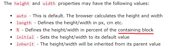
% 是依据 containing block 而不是 parent element. 那 containing block 是哪一个呢. 去 MDN 看吧.
CSS Outline
Outline 就是框线, 它和 border 有点像. 但 border 是画里面, 它是外面.
它不会把其它 element 弹开, 反而是会覆盖其它 element
Outline 不能针对性设置 top, right, buttom, left, 只能统一一起 set 同一个 pattern.
它有一个 border 没有的, 可以调 offset, 就是间隔一个距离后才开始画 outline.
CSS Text
Decoration
overline, line-through, underline

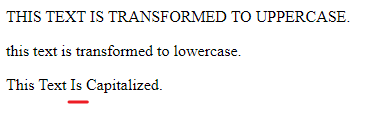
Transformation
uppercase, lowercase, capitalize (注: 并不是 title case 哦)
Text Spacing
text-indent
p {
  text-indent: 50px;
}
段落前面的空格

letter-spacing = 字母左右的间距
line-height = 字母上下的间距
word-spacing = 字 space 的距离
white-space, nowrap 不会因为 width 而往下掉
p {
  white-space: nowrap;
}
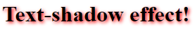
Text Shadow
h1 {
  text-shadow: 2px 2px 5px red;
}
horizontal, vertical, shadow, color
CSS Fonts
常见的 Serif, Sans-serif, Monospace, Cursive, Fantasy.
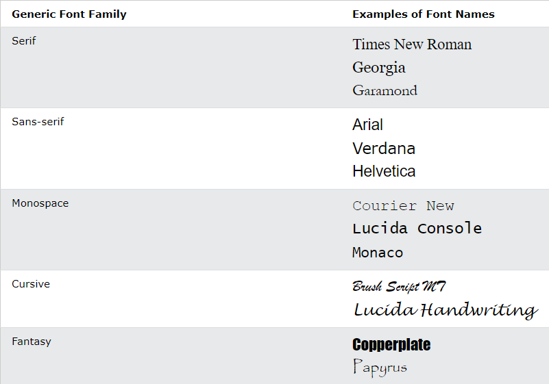
sans-serif 会比 serif 好读.
font-family
如果 font 超过一个字就要 quote 起来
.p1 {
  font-family: "Times New Roman", Times, serif;
}
Fallback Fonts
写多个就会 fallback 了
p {
    font-family: Tahoma, Verdana, sans-serif;
}
几乎肯定支持的 font 有:
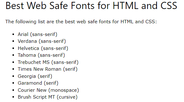
Font 特色
Arial (sans-serif) default font in Google Docs
Verdana (sans-serif) 小字体也 readable
Helvetica (sans-serif) suitable for business
Tahoma (sans-serif) less space between the characters
Times New Roman (serif) most recognizable fonts in the world
Georgia (serif) good candidate for mobile-responsive design
Garamond (serif) timeless look and good readability
Font Style
font-style: normal, italic, oblique
italic 就是斜体.
oblique 很像 italic 但是几乎不用
Font Weight
font-weight: normal, bold
Font Variant
font-variant: normal, small-caps
Font Size
px vs em
px 就是固定的, user 不能通过 browser 去调.
em 就可以, by defualt 1 em = 16px (推荐使用)
chrome setting:

旧 browser 不完全支持 em.

solution 是在 body 添加 font-size: 100%

rem 是 root em 的意思, em 是对应当前 element font-size 的

因为 font-size 是 2em = 32px, 所以 margin-bottom 的 1em 变成了 32px
如果 margin-bottom 使用 rem 则会是 16 px
那要用哪个呢? 答案是看情况, 不太能统一
如果想 override browser 的 rem 可以声明 html
html {
  font-size: 18px;
}
这样不管 user 如何改 setting 最终的 1rem 就等于 18px, 通常不会这样设计.
html {
  font-size: 1.125rem;
}
这样的设计就可能会出现. 比如默认情况下 应该是 16px, 但我希望大一些于是在 html 定义了 1.125rem = 18px. 那么我在 body 写 1rem 就等价于 18px 了. 可以用这个方式来设计手机和电脑的 RWD font size.
Responsive Font Size
font-size:10vw
1vw = 1% of viewport width
Google Fonts
加一个 link
<link rel="stylesheet" href="https://fonts.googleapis.com/css?family=Audiowide|Sofia|Trirong">
就可以用了, 记得 set fallback
{
    h1.a {font-family: "Audiowide", sans-serif;}
    h1.b {font-family: "Sofia", sans-serif;}
    h1.c {font-family: "Trirong", serif;}
}
Font Pairings
常见搭配组合: Link to W3Schools
Font Property & Shorthand
p.b {
  font: italic small-caps bold 12px/30px Georgia, serif;
}
style, variant, weight, size/line-height, family
size 和 family are required.
CSS Icons
Font Awesome Icons
放一个 script, register code from fontawesome
<script src="https://kit.fontawesome.com/yourcode.js" crossorigin="anonymous"></script>
then 用 <i> 加 class
<i class="fas fa-cloud"></i>
Google Icons
<link rel="stylesheet" href="https://fonts.googleapis.com/icon?family=Material+Icons">
一样 <i> 加 class
<i class="material-icons">cloud</i>
CSS Links
Styling Links
a:link - unvisited link
a:visited - visited link
a:hover - on user hover
a:active - on user click
写的时候要有顺序, 因为 CSS 是 override 概念. link -> visited -> hover -> active
Text Decoration
text-decoration: none, underline 默认是有 underline 的
Link Buttons
就是通过 style 去弄, 而不是 button + link 哦

Cursor style
CSS Lists
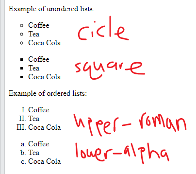
list-style-type
在 HTML Lists 有说到, List 有分 order 和没有 order 的, 还有 type.
也可以通过 CSS 来调,
list-style-image
ul {
  list-style-image: url('sqpurple.gif');
}
Shorthand property
ul {
  list-style: square inside url("sqpurple.gif");
}
type, position, image
CSS Tables
搞 border
table, th, td {
  border: 1px solid black;
}
table, th, td 3 个分别给
border-collapse
double border 不好看, 在 table 声明让它 collapse (和 margin collapse 类似)
table {
  border-collapse: collapse;
}
text-align
在 td 设置
td {
  text-align: center;
}
还有 vertical-align
td {
  height: 50px;
  vertical-align: bottom;
}
th default 是 text-align: center 哦
斑马线
其实只是用了 nth-child(even) 的技巧
tr:nth-child(even) {background-color: #f2f2f2;}
小总结
很多 style 就是 table, tr, th, td, 分开去给来. 而不是像 list 那样, 在 parent 负责.
CSS Layout - The display Property
basic 的有 display: none, block, inline, inline block
block 就是占位一整个 line
inline 就不会 start with new line 同时它的 width 就是它 element 的 width (set style width,height,padding,margin 都无效的)
inline block 对比 inline 就可以 set width,height,margin,padding, 对比 block 它不会 start with new line.
none 就是完全不见掉
visibility:hidden 也是看不见,但是它还是会占据位置.
Block Elements

Inline Elements

CSS Layout - width and max-width
width, max-width, margin: auto 玩法
之前有说过, margin: auto 可以让 div 居中
借助 div display block 的特性, 它的 width 一定是撑完整个 line 的, 于是 set 一个 max-width 就可以限制它的不要去去到完.
div 有了 width + margin auto 就居中了咯. 之所以用 max-width 而不是用 width 是因为在屏幕小的时候, max-width 依然可以正常工作.
因为它可以小, 相反 width 意味着它不能小, 就会出现 scroll bar 了. 这也是一个 max-width 的技巧
CSS Layout - The position Property
static
static 是 default, 就是按照 element flow 位置.
relative
relative 就是在原本的位置做偏移, top,right,bottom,left
比如 top:10px 那么这个 element 就会往下移动 10px, 意思是, 从灵魂到躯体 top: 10px, 它是这样理解的.
relative 的 element 本身依然占据原来的位置, 它像灵魂出窍那样, 移动后会和其它 element 重叠 (是重叠不是推掉哦)
absolute
absolute element 不占据原本位置了, 但它会飘在原本位置上面, (和其它 element 重叠). 然后它和 relative 还有一个定点的不同.
relative 是以原本的位置作为起点, absolute 是以 first ancestor (relative position) 做为起点, 如果没有就用 document.body 作为定点. 当你没有 set top 的时候, 默认的 top 会是它原本的位置.
所以 relative 的 top 一开始一定是 0, 但是 absolute 一开始 top 就不会是 0, set 0 反而会飞上去.

比如 top left 是 absolute 它的默认 top 是 323px, 如果 set to 0 它就会去到上面, 因为它的定点是 first ancestor (relative position).
fixed
fixed 和 absolute 是一样的, 唯一的区别是它的定点是 viewport.
sticky
参考之前写的 Angular 学习笔记 (Material table sticky 原理)
CSS Layout - The z-index Property
当定位之后就容易产生重叠现象, 这时候就要 set z-index 来比权重了. number 越大就越在上面会被看见.
默认情况下大家都是 0, 就比 html 结构, 越下面的越在上层, 会被看见.
如果不希望这样常见的做法是让定位的 element z-index: -1.
CSS Layout - Overflow
只有 block element 才可以 overflow 概念
overflow: visible, hidden, scroll, auto
visible 是 default 效果是内容会跑出去
hidden 是内容会被 hide 起来
scroll 是 always 有 scrollbar (but Apple Mac 不会)
auto 就是当内容超过的时候自动有 scroll
overflow-x, overflow-y 分别控制 horizontal 和 vertical.
CSS Layout - float and clear
Float 是最早用于排版的方法, 但其实它的诞生是为了解决 p 和 image 想要左右排的效果. 但后来被发扬光大了.
Float 就是浮起来,

Float 之后 parent 就不会被撑大了, 但是可以用 overflow hidden 来破, 这个叫 clearfix Hack.
还有一个比较 modern 的 way.
.clearfix::after {
  content: "";
  clear: both;
  display: table;
}
CSS Layout - Horizontal & Vertical Align
各种居中技巧.