一、Layout 布局
1、基础布局
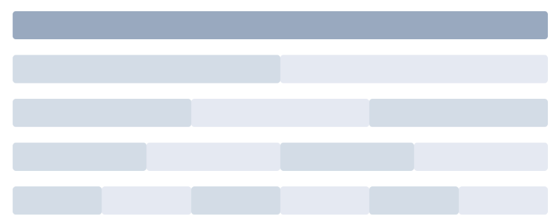
<el-row> <el-col :span="24"><div class="grid-content bg-purple-dark"></div></el-col> </el-row> <el-row> <el-col :span="12"><div class="grid-content bg-purple"></div></el-col> <el-col :span="12"><div class="grid-content bg-purple-light"></div></el-col> </el-row> <el-row> <el-col :span="8"><div class="grid-content bg-purple"></div></el-col> <el-col :span="8"><div class="grid-content bg-purple-light"></div></el-col> <el-col :span="8"><div class="grid-content bg-purple"></div></el-col> </el-row> <el-row> <el-col :span="6"><div class="grid-content bg-purple"></div></el-col> <el-col :span="6"><div class="grid-content bg-purple-light"></div></el-col> <el-col :span="6"><div class="grid-content bg-purple"></div></el-col> <el-col :span="6"><div class="grid-content bg-purple-light"></div></el-col> </el-row> <el-row> <el-col :span="4"><div class="grid-content bg-purple"></div></el-col> <el-col :span="4"><div class="grid-content bg-purple-light"></div></el-col> <el-col :span="4"><div class="grid-content bg-purple"></div></el-col> <el-col :span="4"><div class="grid-content bg-purple-light"></div></el-col> <el-col :span="4"><div class="grid-content bg-purple"></div></el-col> <el-col :span="4"><div class="grid-content bg-purple-light"></div></el-col> </el-row>
.el-row { margin-bottom: 20px; } .el-col { border-radius: 4px; } .bg-purple-dark { background: #99a9bf; } .bg-purple { background: #d3dce6; } .bg-purple-light { background: #e5e9f2; } .grid-content { border-radius: 4px; min-height: 36px; } .row-bg { padding: 10px 0; background-color: #f9fafc; }
注意:设置之后会显示x轴滚动条问题,给容器设置溢出隐藏即可。
element共分为24块,:span="6" 即每个容器占6份
2、分栏间隔
<el-row :gutter="20"> <el-col :span="6"><div class="grid-content bg-purple"></div></el-col> <el-col :span="6"><div class="grid-content bg-purple"></div></el-col> <el-col :span="6"><div class="grid-content bg-purple"></div></el-col> <el-col :span="6"><div class="grid-content bg-purple"></div></el-col> </el-row>
注意: :gutter="20" 每个容器的间隔20像素,这里的间隔指的是容器的左右内边距,如不需要,可以单独设置:padding-left:0
3、分栏偏移
<el-row :gutter="20"> <el-col :span="6"><div class="grid-content bg-purple"></div></el-col> <el-col :span="6" :offset="6"><div class="grid-content bg-purple"></div></el-col> </el-row> <el-row :gutter="20"> <el-col :span="6" :offset="6"><div class="grid-content bg-purple"></div></el-col> <el-col :span="6" :offset="6"><div class="grid-content bg-purple"></div></el-col> </el-row> <el-row :gutter="20"> <el-col :span="12" :offset="6"><div class="grid-content bg-purple"></div></el-col> </el-row>
注意: :offset="6" 指的是容器向右偏移6份
4、对齐方式:
<el-row type="flex" class="row-bg"> <el-col :span="6"><div class="grid-content bg-purple"></div></el-col> <el-col :span="6"><div class="grid-content bg-purple-light"></div></el-col> <el-col :span="6"><div class="grid-content bg-purple"></div></el-col> </el-row> <el-row type="flex" class="row-bg" justify="center"> <el-col :span="6"><div class="grid-content bg-purple"></div></el-col> <el-col :span="6"><div class="grid-content bg-purple-light"></div></el-col> <el-col :span="6"><div class="grid-content bg-purple"></div></el-col> </el-row> <el-row type="flex" class="row-bg" justify="end"> <el-col :span="6"><div class="grid-content bg-purple"></div></el-col> <el-col :span="6"><div class="grid-content bg-purple-light"></div></el-col> <el-col :span="6"><div class="grid-content bg-purple"></div></el-col> </el-row> <el-row type="flex" class="row-bg" justify="space-between"> <el-col :span="6"><div class="grid-content bg-purple"></div></el-col> <el-col :span="6"><div class="grid-content bg-purple-light"></div></el-col> <el-col :span="6"><div class="grid-content bg-purple"></div></el-col> </el-row> <el-row type="flex" class="row-bg" justify="space-around"> <el-col :span="6"><div class="grid-content bg-purple"></div></el-col> <el-col :span="6"><div class="grid-content bg-purple-light"></div></el-col> <el-col :span="6"><div class="grid-content bg-purple"></div></el-col> </el-row>
注意: 利用flex进行灵活布局, 使用前请先确认浏览器是否支持。
容器变成弹性盒子type="flex"
水平对齐方式:justify="center" 居中对齐 left左对齐 right右对齐 space-between两端对齐 space-around等边距
垂直对齐方式align='top' 上对齐 middle 居中对齐 bottom 下对齐
5、响应式布局
<el-row :gutter="10"> <el-col :xs="8" :sm="6" :md="4" :lg="3" :xl="1"><div class="grid-content bg-purple"></div></el-col> <el-col :xs="4" :sm="6" :md="8" :lg="9" :xl="11"><div class="grid-content bg-purple-light"></div></el-col> <el-col :xs="4" :sm="6" :md="8" :lg="9" :xl="11"><div class="grid-content bg-purple"></div></el-col> <el-col :xs="8" :sm="6" :md="4" :lg="3" :xl="1"><div class="grid-content bg-purple-light"></div></el-col> </el-row>
|
xs |
<768px 响应式栅格数或者栅格属性对象 |
number/object (例如: {span: 4, offset: 4}) |
|
sm |
≥768px 响应式栅格数或者栅格属性对象 |
number/object (例如: {span: 4, offset: 4}) |
|
md |
≥992px 响应式栅格数或者栅格属性对象 |
number/object (例如: {span: 4, offset: 4}) |
|
lg |
≥1200px 响应式栅格数或者栅格属性对象 |
number/object (例如: {span: 4, offset: 4}) |
|
xl |
≥1920px 响应式栅格数或者栅格属性对象 |
number/object (例如: {span: 4, offset: 4}) |
6、基于断点的隐藏
先引入以下文件:import 'element-ui/lib/theme-chalk/display.css';
- hidden-xs-only - 当视口在 xs 尺寸时隐藏
- hidden-sm-only - 当视口在 sm 尺寸时隐藏
- hidden-sm-and-down - 当视口在 sm 及以下尺寸时隐藏
- hidden-sm-and-up - 当视口在 sm 及以上尺寸时隐藏
- hidden-md-only - 当视口在 md 尺寸时隐藏
- hidden-md-and-down - 当视口在 md 及以下尺寸时隐藏
- hidden-md-and-up - 当视口在 md 及以上尺寸时隐藏
- hidden-lg-only - 当视口在 lg 尺寸时隐藏
- hidden-lg-and-down - 当视口在 lg 及以下尺寸时隐藏
- hidden-lg-and-up - 当视口在 lg 及以上尺寸时隐藏
- hidden-xl-only - 当视口在 xl 尺寸时隐藏
例如:只在xs下隐藏
<div class="hidden-xs-only"></div>
7、col上的属性:
<el-row :gutter="10"> <el-col :span='8' :push='16'><div class="grid-content bg-purple">123</div></el-col> <el-col :span='8' :pull='8'><div class="grid-content bg-purple-light">456</div></el-col> <el-col :span='8' :pull='8'><div class="grid-content bg-purple">789</div></el-col> </el-row>
注意: :push='16'向右偏移16份 :pull='8' 向左偏移8份
二、布局容器
用于布局的容器组件,方便快速搭建页面的基本结构:
<el-container>:外层容器。当子元素中包含 <el-header> 或 <el-footer> 时,全部子元素会垂直上下排列,否则会水平左右排列。
<el-header>:顶栏容器。
<el-aside>:侧边栏容器。
<el-main>:主要区域容器。
<el-footer>:底栏容器
<el-container> <el-header>Header</el-header> <el-main>Main</el-main> </el-container> <el-container> <el-header>Header</el-header> <el-main>Main</el-main> <el-footer>Footer</el-footer> </el-container> <el-container> <el-aside width="200px">Aside</el-aside> <el-main>Main</el-main> </el-container> <el-container> <el-header>Header</el-header> <el-container> <el-aside width="200px">Aside</el-aside> <el-main>Main</el-main> </el-container> </el-container> <el-container> <el-header>Header</el-header> <el-container> <el-aside width="200px">Aside</el-aside> <el-container> <el-main>Main</el-main> <el-footer>Footer</el-footer> </el-container> </el-container> </el-container> <el-container> <el-aside width="200px">Aside</el-aside> <el-container> <el-header>Header</el-header> <el-main>Main</el-main> </el-container> </el-container> <el-container> <el-aside width="200px">Aside</el-aside> <el-container> <el-header>Header</el-header> <el-main>Main</el-main> <el-footer>Footer</el-footer> </el-container> </el-container>
.el-header, .el-footer { background-color: #B3C0D1; color: #333; text-align: center; line-height: 60px; } .el-aside { background-color: #D3DCE6; color: #333; text-align: center; line-height: 200px; } .el-main { background-color: #E9EEF3; color: #333; text-align: center; line-height: 160px; } .el-container { margin-bottom: 40px; } .el-container:nth-child(5) .el-aside, .el-container:nth-child(6) .el-aside { height: 260px; line-height: 260px; } .el-container:nth-child(7) .el-aside { height: 320px; line-height: 320px; }
container上的属性:
direction子元素的方向,horizontal水平排列,vertical垂直排列
header上的属性:
height高度
aside上的属性
width宽度
footer上的属性:
height高度
三、色彩
<el-tag>标签一</el-tag> <el-tag type="success">标签二</el-tag> <el-tag type="info">标签三</el-tag> <el-tag type="warning">标签四</el-tag> <el-tag type="danger">标签五</el-tag>
四、字体
font-family: "Helvetica Neue",Helvetica,"PingFang SC","Hiragino Sans GB","Microsoft YaHei","微软雅黑",Arial,sans-serif;
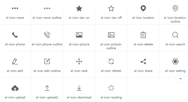
五、ICON图标
<i class="el-icon-edit"></i> <i class="el-icon-share"></i> <i class="el-icon-delete"></i> <el-button type="primary" icon="el-icon-search">搜索</el-button>

六、按钮
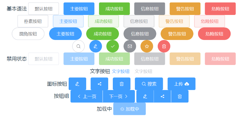
<el-row> 基本语法 <el-button>默认按钮</el-button> <el-button type="primary">主要按钮</el-button> <el-button type="success">成功按钮</el-button> <el-button type="info">信息按钮</el-button> <el-button type="warning">警告按钮</el-button> <el-button type="danger">危险按钮</el-button> </el-row> <el-row> <el-button plain>朴素按钮</el-button> <el-button type="primary" plain>主要按钮</el-button> <el-button type="success" plain>成功按钮</el-button> <el-button type="info" plain>信息按钮</el-button> <el-button type="warning" plain>警告按钮</el-button> <el-button type="danger" plain>危险按钮</el-button> </el-row> <el-row> <el-button round>圆角按钮</el-button> <el-button type="primary" round>主要按钮</el-button> <el-button type="success" round>成功按钮</el-button> <el-button type="info" round>信息按钮</el-button> <el-button type="warning" round>警告按钮</el-button> <el-button type="danger" round>危险按钮</el-button> </el-row> <el-row> <el-button icon="el-icon-search" circle></el-button> <el-button type="primary" icon="el-icon-edit" circle></el-button> <el-button type="success" icon="el-icon-check" circle></el-button> <el-button type="info" icon="el-icon-message" circle></el-button> <el-button type="warning" icon="el-icon-star-off" circle></el-button> <el-button type="danger" icon="el-icon-delete" circle></el-button> </el-row> <el-row> 禁用状态 <el-button disabled>默认按钮</el-button> <el-button type="primary" disabled>主要按钮</el-button> <el-button type="success" disabled>成功按钮</el-button> <el-button type="info" disabled>信息按钮</el-button> <el-button type="warning" disabled>警告按钮</el-button> <el-button type="danger" disabled>危险按钮</el-button> </el-row> <el-row> 文字按钮 <el-button type="text">文字按钮</el-button> <el-button type="text" disabled>文字按钮</el-button> </el-row> <el-row> 图标按钮 <el-button type="primary" icon="el-icon-edit"></el-button> <el-button type="primary" icon="el-icon-share"></el-button> <el-button type="primary" icon="el-icon-delete"></el-button> <el-button type="primary" icon="el-icon-search">搜索</el-button> <el-button type="primary">上传<i class="el-icon-upload el-icon--right"></i></el-button> </el-row> <el-row> 按钮组 <el-button-group> <el-button type="primary" icon="el-icon-arrow-left">上一页</el-button> <el-button type="primary">下一页<i class="el-icon-arrow-right el-icon--right"></i></el-button> </el-button-group> <el-button-group> <el-button type="primary" icon="el-icon-edit"></el-button> <el-button type="primary" icon="el-icon-share"></el-button> <el-button type="primary" icon="el-icon-delete"></el-button> </el-button-group> </el-row> <el-row> 加载中 <el-button type="primary" :loading="true">加载中</el-button> </el-row>
属性:
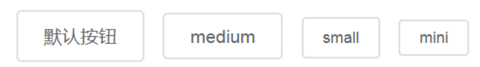
size按钮尺寸,默认最大,medium、small、mini依次变小
<el-button>默认按钮</el-button> <el-button size='medium'>medium</el-button> <el-button size='small'>small</el-button> <el-button size='mini'>mini</el-button>
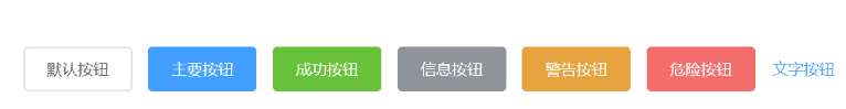
type类型,primary / success / warning / danger / info / text
<el-button>默认按钮</el-button> <el-button type="primary">主要按钮</el-button> <el-button type="success">成功按钮</el-button> <el-button type="info">信息按钮</el-button> <el-button type="warning">警告按钮</el-button> <el-button type="danger">危险按钮</el-button> <el-button type="text">文字按钮</el-button>
plain朴素按钮,round圆角按钮,circle圆形按钮,loading加载中状态,disabled禁用按钮,icon图标类名,autofocus获得焦点,native-type原生type属性,button / submit / reset