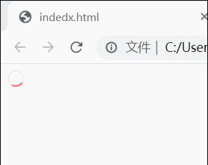
效果图
代码实现
<html>
<head></head>
<style>
  .box{
    display: inline-block;
    margin-right: 12px;
    vertical-align: middle;
     14px;
    height: 14px;
    background: 0 0;
    border-radius: 50%;
    border: 2px solid #e9eaec;
    border-color: #e9eaec #e9eaec #e9eaec #FF5650;
    animation: btn-spin .6s linear 0s infinite;
  }
  @keyframes btn-spin{
    0%{
      transform:rotate(0deg);
    }
    100%{
      transform:rotate(360deg);
    }
  }
</style>
<body>
  <div class='box'></div>
</body>
</html>