一:定位
1.说明
元素的定位属性主要包括定位模式和边偏移两部分。
2.边偏移
属性:
top
bottom
left
right
3.定位模式
选择器 {position: 属性值}
常用值:
static 自动定位,静态定位,默认的定位方式
relative
absolute
fixed 固定定位
4.static用处
作用是取消定位
如果不想用定位的时候,就需要使用这个值
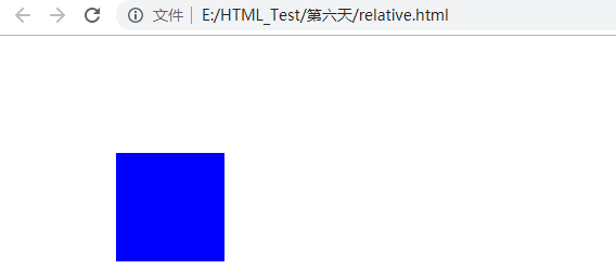
二:relative模式
1.relative
相对。
以当前的左上角为位置进行移动。
案例:
 1 <!DOCTYPE html>
 2 <html lang="en">
 3 <head>
 4     <meta charset="UTF-8">
 5     <title>Document</title>
 6     <style>
 7         div {
 8             width: 100px;
 9             height: 100px;
10             background-color: blue;
11             position: relative;
12             top: 100px;
13             left: 100px;
14
15         }
16     </style>
17 </head>
18 <body>
19     <div></div>
20 </body>
21 </html>
效果:
2.relative的特性
盒子在移动之后,原本的位置还是存在的,继续占有。
案例:
 1 <!DOCTYPE html>
 2 <html lang="en">
 3 <head>
 4     <meta charset="UTF-8">
 5     <title>Document</title>
 6     <style>
 7         div {
 8             width: 200px;
 9             height: 200px;
10             background-color: blue;
11         }
12         .first {
13             position: relative;
14             top: 100px;
15             left: 100px;
16         }
17         .second {
18             background-color: green;
19         }
20     </style>
21 </head>
22 <body>
23     <div class="first"></div>
24     <div class="second"></div>
25 </body>
26 </html>
效果:

三:绝对定位absoute
1.说明
是不占位置的。
以浏览器当前屏幕为准进行对齐【直接写两个div,然后第二个div中加一个】
2.父元素没有定位
没有父亲,与和父亲元素没有定位,absolute都是一样的,以屏幕为准进行对齐
案例:
 1 <!DOCTYPE html>
 2 <html lang="en">
 3 <head>
 4     <meta charset="UTF-8">
 5     <title>Document</title>
 6     <style>
 7         div {
 8             width: 200px;
 9             height: 200px;
10             background-color: blue;
11         }
12         .first {
13             margin: 100px;
14         }
15         .second {
16             background-color: red;
17             position: absolute;
18             top: 50px;
19             left: 50px;
20         }
21     </style>
22 </head>
23 <body>
24     <div class="first">
25         <div class="second"></div>
26     </div>
27 </body>
28 </html>
效果:

3.父亲有定位
将元素依据最近的已经定位的父元素进行定位
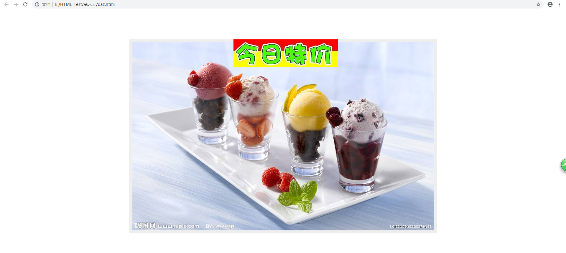
四:子绝父相
1.说明
比较合适的搭配
父级元素是相对位置,子级元素为绝对位置
2.案例
 1 <!DOCTYPE html>
 2 <html lang="en">
 3 <head>
 4     <meta charset="UTF-8">
 5     <title>Document</title>
 6     <style>
 7         div {
 8             width: 1024px;
 9             height: 640px;
10             background-color: #eee;
11             margin: 100px auto;
12             padding: 10px;
13             position: relative;
14         }
15         .tejia {
16             position: absolute;
17             top: 0;
18             left: 354px;
19         }
20
21     </style>
22 </head>
23 <body>
24     <div>
25         <img src="timg.jpg" alt="">
26         <img src="936.png" alt="" class="tejia">
27     </div>
28 </body>
29 </html>
3.效果
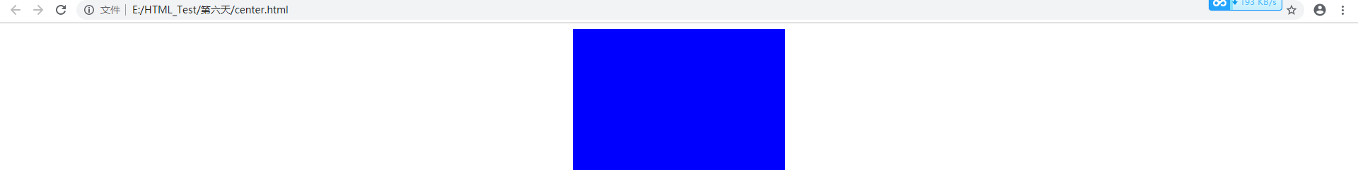
四:盒子居中
1.失效
盒子的magin:0 auto;在加了浮动或者定位之后,盒子就不再居中了。
2.案例
 1 <!DOCTYPE html>
 2 <html lang="en">
 3 <head>
 4     <meta charset="UTF-8">
 5     <title>Document</title>
 6     <style>
 7         div {
 8             width: 300px;
 9             height: 200px;
10             position: absolute;
11             left: 50%;
12             background-color: blue;
13             margin-left: -150px;
14         }
15     </style>
16 </head>
17 <body>
18     <div></div>
19 </body>
20 </html>
3.效果
4.使用场景
做一个这种的效果
5.实践
案例:
 1 <!DOCTYPE html>
 2 <html lang="en">
 3 <head>
 4     <meta charset="UTF-8">
 5     <title>Document</title>
 6     <style>
 7         * {
 8             padding: 0;
 9             margin: 0;
10         }
11         .tb {
12             width: 750px;
13             height: 291px;
14             position: relative;
15             background-color: blue;
16             margin: 50px auto;
17         }
18         .tb a {
19             width: 40px;
20             height: 50px;
21             display: block;
22             position: absolute;
23             top: 50%;
24             margin-top: -25px;
25         }
26         .left {
27             left: 0;
28             background: url(left.png) no-repeat;
29         }
30         .right {
31             right: 0;
32             background: url(right.png) no-repeat;
33         }
34         .tb ul{
35             width: 76px;
36             height: 30px;
37             background-color: rgba(255,255,255,0.6);
38             position: absolute;
39             bottom: 10px;
40             left: 50%;
41             margin-left: -40px;
42             border-radius: 5px;
43         }
44         li {
45             list-style: none;
46             display: inline-block;
47             width: 20px;
48             height: 20px;
49             border-radius:20px;
50             background: pink;
51             text-align: center;
52             margin:5px 1px;
53         }
54     </style>
55 </head>
56 <body>
57     <div class="tb">
58         <img src="b.jpg" alt="">
59         <a href="#" class="left"></a>
60         <a href="#" class="right"></a>
61         <ul>
62             <li>1</li>
63             <li>2</li>
64             <li>3</li>
65         </ul>
66     </div>
67 </body>
68 </html>
效果:

五:fix固定定位
1.使用场景
脱标的
只认浏览器,和父级元素有么有定位都没关系

2.默认转换
存在默认的转换,将块元素变为行内元素,所以,可以将其加一个宽。因为,行内元素是没有宽的。
这里和绝对定位是一样的,都存在默认转换
但是,如果想通栏怎么办?
可以使用100%。
但是这个时候,需要添加left:0; top:0,才能去掉内边距的问题。
六:叠放次序
1.说明
一般是后来者居上
z-index:默认是0
最大,则约往上
只有定位的盒子才有这个属性
不加单位,font-weight也不加单位
2.案例
 1 <!DOCTYPE html>
 2 <html lang="en">
 3 <head>
 4     <meta charset="UTF-8">
 5     <title>Document</title>
 6     <style>
 7         div {
 8             width: 300px;
 9             height: 200px;
10             background-color: red;
11             position: absolute;
12         }
13         .blue {
14             background-color: blue;
15             top: 50px;
16             left: 50px;
17             z-index: 1;
18         }
19         .yellow {
20             background-color: yellow;
21             top: 100px;
22             left: 100px;
23         }
24
27     </style>
28 </head>
29 <body>
30     <div class="red"></div>
31     <div class="blue"></div>
32     <div class="yellow"></div>
33 </body>
34 </html>
效果:

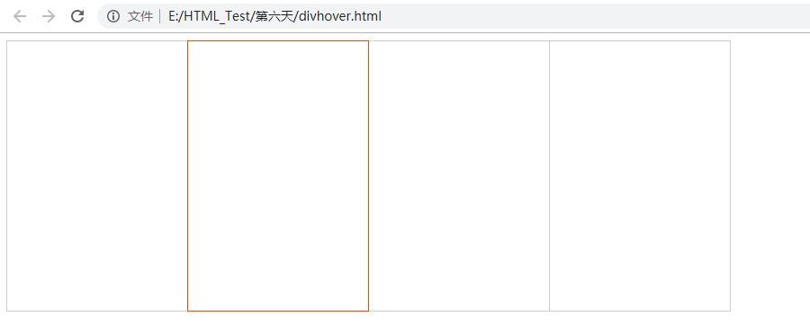
七:一个小案例
1.说明
两个div放在一起,边框不变宽
然后,在变亮的时候,被压住的边框可以变亮
2.案例
 1 <!DOCTYPE html>
 2 <html lang="en">
 3 <head>
 4     <meta charset="UTF-8">
 5     <title>Document</title>
 6     <style>
 7         div {
 8             width: 200px;
 9             height: 300px;
10             border: 1px solid #ccc;
11             float: left;
12             margin-left: -1px; /*将边框叠加起来,看起来只有一个边框*/
13         }
14         div:hover {
15             border: 1px solid #f40;
16             position: relative; /*脱标,所以浮在上面*/
17         }
18     </style>
19 </head>
20 <body>
21     <div></div>
22     <div></div>
23     <div></div>
24     <div></div>
25 </body>
26 </html>
3.效果