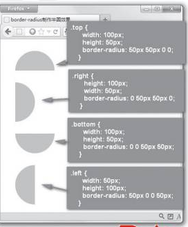
border-radius制作半圆与制作圆形的方法是一样的,只是元素的宽度与圆角方位要配合一致,不同的宽度和高度比例,以及圆角方位,可以制作上半圆、下半圆、左半圆和右半圆效果。例如:
.semicircle {

      margin: 30px;
    }
    .top {
       100px;/*宽度为高度的2倍*/
      height: 50px;
      border-radius: 50px 50px 0 0;/*圆角半径为高度的值*/
    }
    .right {
      height: 100px;/*高度为宽度的2倍*/
       50px;
      border-radius: 0 50px 50px 0;/*圆角半径为宽度的值*/
    }
    .bottom {
       100px;/*宽度为高度的2倍*/
      height: 50px;
      border-radius: 0 0 50px 50px;/*圆角半径为高度的值*/
    }
    .left {
       50px;
      height: 100px;/*高度为宽度的2倍*/
      border-radius: 50px 0 0 50px;/*圆角半径为宽度的值*/
    }
转自:http://www.cnblogs.com/afuge/p/4631173.html
-----------------------------
补充下,需要,我的实际使用, 加了点动画
 .circlebg{
    background-color: #0081EE;
     200px;/*宽度为高度的2倍*/
    height: 100px;
    border-radius: 100px 100px 0 0;/*圆角半径为高度的值*/

    -webkit-transform: rotate(320deg);
    filter:alpha(Opacity=70);
    -moz-opacity:0.7;
    opacity: 0.7;

    //-webkit-animation:gogogo 2s infinite linear ;  // infinite 无限次

    -webkit-animation:gogogo 0.2s linear ;
}
@-webkit-keyframes gogogo {
    0%{
        -webkit-transform: rotate(0deg);
        filter:alpha(Opacity=30);
        -moz-opacity:0.3;
        opacity: 0.3;
    }
    50%{
        -webkit-transform: rotate(160deg);
        filter:alpha(Opacity=50);
        -moz-opacity:0.5;
        opacity: 0.5;
    }
    100%{
        -webkit-transform: rotate(320deg);
        filter:alpha(Opacity=70);
        -moz-opacity:0.7;
        opacity: 0.7;
    }
}
效果就是 一个0.2 会旋转的一个半圆 效果。