1.实现盒子的水平垂直居中
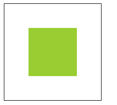
        .parent{
            width:200px;
            height:200px;
            display:flex;
            align-items: center;
            justify-content: center;
            border:1px solid black;
        }
        .child{width:100px;height:100px;background:yellowgreen}
    <div class="parent">
        <div class="child">
        </div>
    </div>
2.子元素水平排列一行,均分父元素宽度(如果采用百分比实现,当子元素个数变化时需要修改样式,用flex布局则不需要)
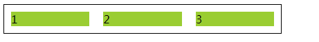
        .box{
            width:400px;
            display:flex;
            border:1px solid black;
        }
        .child{ margin:10px;flex:1;background:yellowgreen}
    <div class="box">
        <div class="child">1</div>
        <div class="child">2</div>
        <div class="child">3</div>
    </div>
3.左侧固定宽度,右侧宽度随父容器宽度变化而变化布局

        .box{
            /* 500px; */
            display:flex;
            border:1px solid black;
        }
        .left{
            width:100px;
            background:blue;
        }
        .right{
            flex:1;
            background:yellowgreen;
        }
        <div class="box">
                <div class="left">1</div>
                <div class="right">2</div>
        </div>