01. Switch
共有XML属性继承自:Text, 私有属性如下:
text_state_on, text_state_off: 开启和关闭时显示的文本;
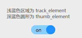
track_element: 轨迹样式;Element类型,可直接配置色值;也可引用color资源或Media/Graphic下的图片资源;
thumb_element: thumb样式;Element类型;
marked:当前状态; boolean类型;
check_element: 状态标志样式;Element类型;
>>> 关于 track_element 和 thumb_element的理解; 这二面内容都有二种样式,即选中/未选中状态的样式;
在Java中,通过代码配置布局如下
 1 //开启状态下滑块的样式
 2 ShapeElement elementThumbOn = new ShapeElement();
 3 elementThumbOn.setShape(ShapeElement.OVAL);
 4 elementThumbOn.setRgbColor(RgbColor.fromArgbInt(0xFF1E90FF));
 5 elementThumbOn.setCornerRadius(50);
 6 // 关闭状态下滑块的样式
 7 ShapeElement elementThumbOff = new ShapeElement();
 8 elementThumbOff.setShape(ShapeElement.OVAL);
 9 elementThumbOff.setRgbColor(RgbColor.fromArgbInt(0xFFFFFFFF));
10 elementThumbOff.setCornerRadius(50);
11 // 开启状态下轨迹样式
12 ShapeElement elementTrackOn = new ShapeElement();
13 elementTrackOn.setShape(ShapeElement.RECTANGLE);
14 elementTrackOn.setRgbColor(RgbColor.fromArgbInt(0xFF87CEFA));
15 elementTrackOn.setCornerRadius(50);
16 // 关闭状态下轨迹样式
17 ShapeElement elementTrackOff = new ShapeElement();
18 elementTrackOff.setShape(ShapeElement.RECTANGLE);
19 elementTrackOff.setRgbColor(RgbColor.fromArgbInt(0xFF808080));
20 elementTrackOff.setCornerRadius(50);
布局处理好以后,配置thumb_element, track_element的样式配置函数;
这个样式是直接容纳了其它已经配置好的样式,但与状态关联
 1 private StateElement trackElementInit(ShapeElement on, ShapeElement off){
 2     StateElement trackElement = new StateElement();
 3     trackElement.addState(new int[]{ComponentState.COMPONENT_STATE_CHECKED}, on);
 4     trackElement.addState(new int[]{ComponentState.COMPONENT_STATE_EMPTY}, off);
 5     return trackElement;
 6 }
 7 private StateElement thumbElementInit(ShapeElement on, ShapeElement off) {
 8     StateElement thumbElement = new StateElement();
 9     thumbElement.addState(new int[]{ComponentState.COMPONENT_STATE_CHECKED}, on);
10     thumbElement.addState(new int[]{ComponentState.COMPONENT_STATE_EMPTY}, off);
11     return thumbElement;
12 }
为Switch配置不同样式;
1 Switch btnSwitch = (Switch) findComponentById(ResourceTable.Id_btn_switch);
2 btnSwitch.setTrackElement(trackElementInit(elementTrackOn, elementTrackOff));
3 btnSwitch.setThumbElement(thumbElementInit(elementThumbOn, elementThumbOff));
02. RadioButton
RadioButton 共有XML属性继承自 Text; 自有的XML属性如下:
marked: 当前状态(选中与否); Boolean类型;
text_color_on, text_color_off: 处于选中/未选中状态下的文本颜色;
check_element: 状态标志样式;Element类型; 可以直接配置色值,也可配置color下的资源或引用 graphic/media下的图片资源;
>>> RadioButton 可独立配置自身的样式
默认情况下为小圆圈标识,可通过 check_element 来指定样样式 (State-container)
 1 <?xml version="1.0" encoding="utf-8"?>
 2 <state-container
 3     xmlns:ohos="http://schemas.huawei.com/res/ohos">
 4     <item
 5         ohos:element="$graphic:background_checkbox_checked"
 6         ohos:state="component_state_checked"/>
 7     <item
 8         ohos:element="$graphic:background_checkbox_empty"
 9         ohos:state="component_state_empty"/>
10 </state-container>
同时需要另外二个不同状态下的配置,来达成最终效果 (选中时状态与非选中时状态)
1 <?xml version="1.0" encoding="UTF-8" ?>
2 <shape xmlns:ohos="http://schemas.huawei.com/res/ohos"
3        ohos:shape="rectangle">
4     <solid
5         ohos:color="#007DFF"/>
6     <corners
7         ohos:radius="4"/>
8 </shape>
1 <?xml version="1.0" encoding="UTF-8" ?>
2 <shape xmlns:ohos="http://schemas.huawei.com/res/ohos"
3        ohos:shape="rectangle">
4     <stroke ohos:width="5"
5             ohos:color="gray"/>
6     <corners
7         ohos:radius="4"/>
8 </shape>
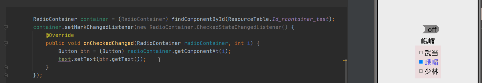
03. RadioContainer; 是RadiioButton的容器,在其包裹下的RadioButton保证只有一个被选中;
RadioContainer的共有XML属性继承自: DirectionalLayout ;
>>> 关联事件
选择变更事件:setMarkChangedListener;
指定项选中: container.mark(0) ; ///索引从 0 开始;
清除选中状态: container.cancelMarks();
取成员数量: container.getChildCount();
取特定序位的成员:(RadioButton)container.getComponentAt(i)
04. CheckBox
CheckBox 与 RadioButton 属性基本一样;
>>> 属性设置
设置是否选中: checkbox.setChecked(true);
选中状态切换: checkbox.toggle();
05. ProgressBar
公有XML属性继承自 Component, 自有属性如下
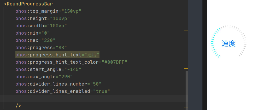
divider_lines_enabled, divider_lines_number : 是否显示分隔线; 以及分成多少份
infinite, infinite_element: 不确定模式,及不确定模式下的内容;(速度很快速)
min, max, progress: 最小值,最大值,当前值;
orientation: 排列方向;
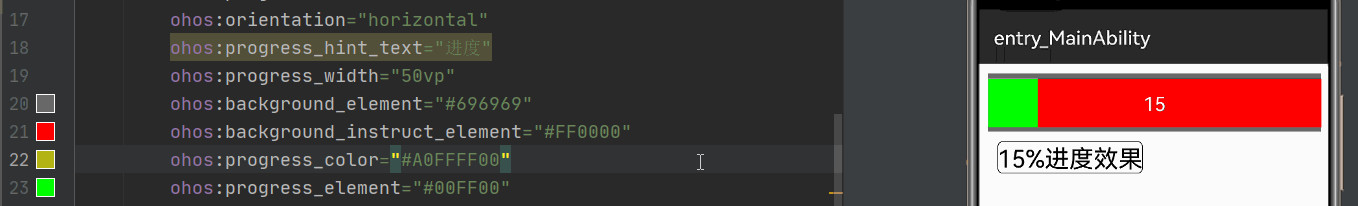
background_instruct_element: 背景 Element; 注意与 Background_element的区别; (此处 progress_width="50vp")

progress_ 进度条的宽度;

progress_color: 进度条的颜色;上图绿色部分;
progress_element: 进度条背景; 若配置上颜色,progress_color基本没了
progress_hint, progress_hit_text_alignment, progress_hint_text-color, progress_hint_text_size: 进度条上文本内容的配置
vice_progress, vice_progress_element: 副进度条配置
step: 进度的步长;
>>> 关于 DividerLineColor的配置: (XML配置中无属性配置)
progressbar.setDividerLineColor(Color.MAGENTA);

>>> 关于进度<15%时的不同效果 (此处标识一下,便于后期了解) 
06. RoundProgressBar
共有属性继承自 ProgressBar; 自有属性如下 :
start_angle, max_angle: 圆形进度条的起始角度及最大角度;