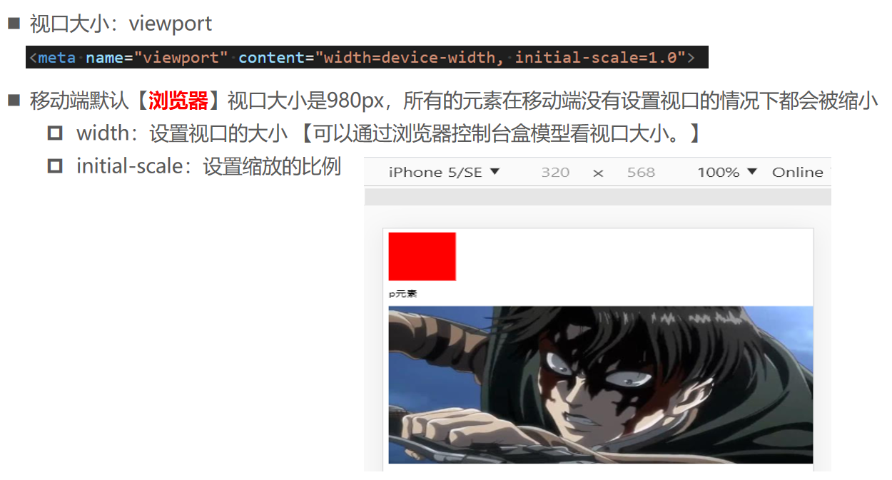
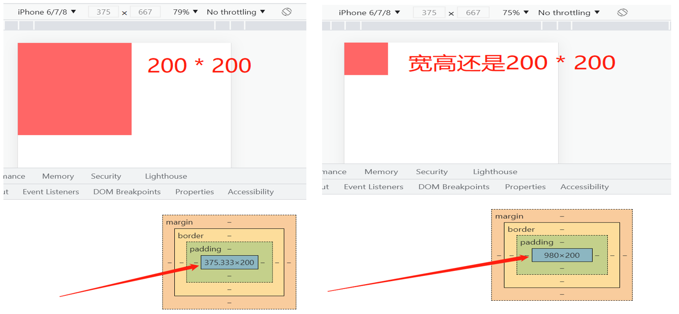
视口大小
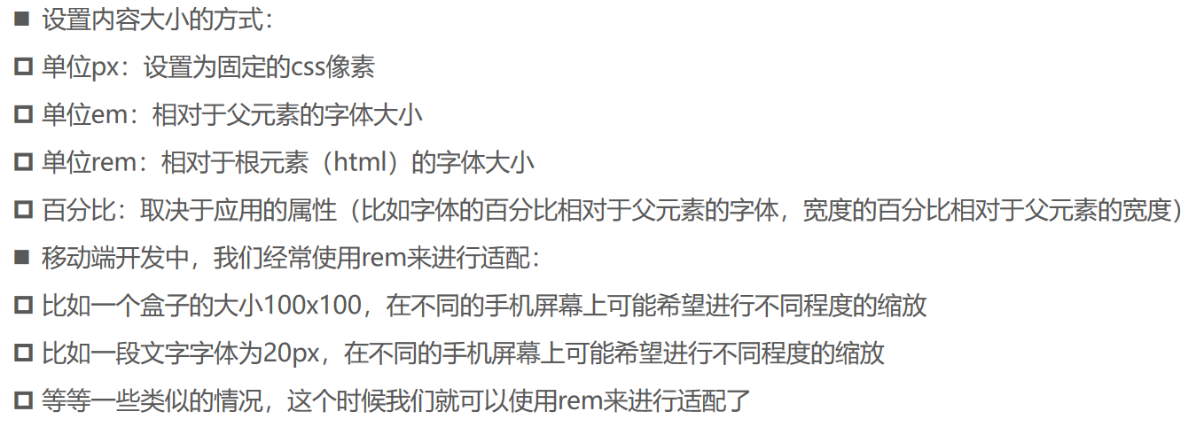
rem适配
问题一:动态设置html的font-size
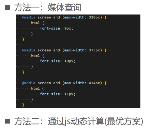
问题二:动态计算rem值
17_视口大小的理解.html
<!DOCTYPE html>
<html lang="en">
  <head>
    <meta charset="UTF-8" />
    <!-- 【content="width=1000px:浏览器视口的大小是1000px。】 -->
    <!-- 【content="width=device-width:视口的大小是device-width。】 -->
    <!-- initial: 初始化 -->
    <meta name="viewport" content="width=device-width, initial-scale=1.0" />
    <meta http-equiv="X-UA-Compatible" content="ie=edge" />
    <title>Document</title>

    <style>
      body {
        margin: 0;
        padding: 0;
      }

      .box {
         320px;
        height: 320px;
        background-color: #f66;
      }
    </style>
  </head>
  <body>
    <div class="box"></div>
  </body>
</html>
18_回顾不同单位的对比.html
<!DOCTYPE html>
<html lang="en">
  <head>
    <meta charset="UTF-8" />
    <meta name="viewport" content="width=device-width, initial-scale=1.0" />
    <meta http-equiv="X-UA-Compatible" content="ie=edge" />
    <title>Document</title>

    <style>
      .container {
        font-size: 20px;
         600px;
        height: 600px;
        background-color: orange;
      }

      .box {
        /*
          设置宽度width的大小:
          1.px: 200px
          2.em:
            * 自己有设置font-size, em相对自己的font-size
                20 * 自己font-size(20*2=40) = 800px
            * 自己没有设置font-size, em相对父元素的font-size
                20 * 父元素的font-size(20px) = 400px
          3.%: 相对于父元素的宽度【块级子元素不设置width,默认就是父元素宽度的100%】。
        */
         50%;
        height: 200px;
        background-color: #f66;
        color: #fff;

        /* 相对于父元素的宽度 【margin的4个值都是相对父元素的宽度】 */
        margin-top: 50%;

        /*
          设置文字大小的单位:
          1.px: 像素
          2.em: 相对于父元素字体的大小
                2em: 父元素(20px * 2 = 40px)
          3.%: 用在不同的场景相对的是不一样的
               在字体中, 相对于父元素的字体
        */
        font-size: 200%;
      }
    </style>
  </head>
  <body>
    <div class="container">
      <div class="box">box的内容</div>
    </div>
  </body>
</html>
19_rem单位的使用.html
<!DOCTYPE html>
<html lang="en">
  <head>
    <meta charset="UTF-8" />
    <meta name="viewport" content="width=device-width, initial-scale=1.0" />
    <meta http-equiv="X-UA-Compatible" content="ie=edge" />
    <title>Document</title>

    <style>
      html {
        font-size: 30px;
      }

      .container {
         500px;
        height: 500px;
        background-color: orange;

        font-size: 12px;
      }

      .box {
        color: #fff;

        /* rem相对的是根元素字体的大小 */
         20rem;
        height: 100px;
        background-color: #f66;

        /* 字体设置 */
        /* rem: root em */
        font-size: 2rem;
      }
    </style>
  </head>
  <body>
    <div class="container">
      <div class="box">我是文本</div>
    </div>
  </body>
</html>
20_不同屏幕设置不同font-size-媒体查询.html
<!DOCTYPE html>
<html lang="en">
  <head>
    <meta charset="UTF-8" />
    <meta name="viewport" content="width=device-width, initial-scale=1.0" />
    <meta http-equiv="X-UA-Compatible" content="ie=edge" />
    <title>Document</title>

    <style>
      /* 1.使用媒体查询 */
      /* iphone5 320px */
      @media screen and (min- 320px) {
        html {
          font-size: 9px;
        }
      }

      /* iphone6 375px */
      @media screen and (min- 375px) {
        html {
          font-size: 10px;
        }
      }

      /* iphone6 plus 414px */
      @media screen and (min- 414px) {
        html {
          font-size: 11px;
        }
      }

      .box {
         10rem;
        height: 10rem;
        background-color: #f66;
        color: #fff;
        /* 18 20 22px */
        font-size: 2rem;
      }
    </style>
  </head>
  <body>
    <div class="box">我是文本</div>
  </body>
</html>
21_不同屏幕设置不同font-size-js动态计算.html
<!DOCTYPE html>
<html lang="en">
  <head>
    <meta charset="UTF-8" />
    <meta name="viewport" content="width=device-width, initial-scale=1.0" />
    <meta http-equiv="X-UA-Compatible" content="ie=edge" />
    <title>Document</title>

    <!-- webpack进行打包 -->
    <script type="text/javascript">
      !(function (N, M) {
        function L() {
          var a = I.getBoundingClientRect().width
          a / F > 540 && (a = 540 * F)
          var d = a / 20
          ;(I.style.fontSize = d + 'px'), (D.rem = N.rem = d)
        }
        var K,
          J = N.document,
          I = J.documentElement,
          H = J.querySelector('meta[name="viewport"]'),
          G = J.querySelector('meta[name="flexible"]'),
          F = 0,
          E = 0,
          D = M.flexible || (M.flexible = {})
        if (H) {
          console.warn('将根据已有的meta标签来设置缩放比例')
          var C = H.getAttribute('content').match(/initial-scale=([d.]+)/)
          C && ((E = parseFloat(C[1])), (F = parseInt(1 / E)))
        } else {
          if (G) {
            var B = G.getAttribute('content')
            if (B) {
              var A = B.match(/initial-dpr=([d.]+)/),
                z = B.match(/maximum-dpr=([d.]+)/)
              A && ((F = parseFloat(A[1])), (E = parseFloat((1 / F).toFixed(2)))),
                z && ((F = parseFloat(z[1])), (E = parseFloat((1 / F).toFixed(2))))
            }
          }
        }
        if (!F && !E) {
          var y = N.navigator.userAgent,
            x = (!!y.match(/android/gi), !!y.match(/iphone/gi)),
            w = x && !!y.match(/OS 9_3/),
            v = N.devicePixelRatio
          ;(F = x && !w ? (v >= 3 && (!F || F >= 3) ? 3 : v >= 2 && (!F || F >= 2) ? 2 : 1) : 1), (E = 1 / F)
        }
        if ((I.setAttribute('data-dpr', F), !H)) {
          if (
            ((H = J.createElement('meta')),
            H.setAttribute('name', 'viewport'),
            H.setAttribute(
              'content',
              'initial-scale=' + E + ', maximum-scale=' + E + ', minimum-scale=' + E + ', user-scalable=no'
            ),
            I.firstElementChild)
          ) {
            I.firstElementChild.appendChild(H)
          } else {
            var u = J.createElement('div')
            u.appendChild(H), J.write(u.innerHTML)
          }
        }
        N.addEventListener(
          'resize',
          function () {
            clearTimeout(K), (K = setTimeout(L, 300))
          },
          !1
        ),
          N.addEventListener(
            'pageshow',
            function (b) {
              b.persisted && (clearTimeout(K), (K = setTimeout(L, 300)))
            },
            !1
          ),
          'complete' === J.readyState
            ? (J.body.style.fontSize = 12 * F + 'px')
            : J.addEventListener(
                'DOMContentLoaded',
                function () {
                  J.body.style.fontSize = 12 * F + 'px'
                },
                !1
              ),
          L(),
          (D.dpr = N.dpr = F),
          (D.refreshRem = L),
          (D.rem2px = function (d) {
            var c = parseFloat(d) * this.rem
            return 'string' == typeof d && d.match(/rem$/) && (c += 'px'), c
          }),
          (D.px2rem = function (d) {
            var c = parseFloat(d) / this.rem
            return 'string' == typeof d && d.match(/px$/) && (c += 'rem'), c
          })
      })(window, window.lib || (window.lib = {}))
    </script>

    <style>
      html {
        font-size: 18px;
      }

      .box {
         100px;
        height: 100px;
        background-color: #f66;
        color: #fff;
        /* 18 20 22px */
        font-size: 20px;
      }
    </style>
  </head>
  <body>
    <div class="box">我是文本</div>
  </body>
</html>