网络字体
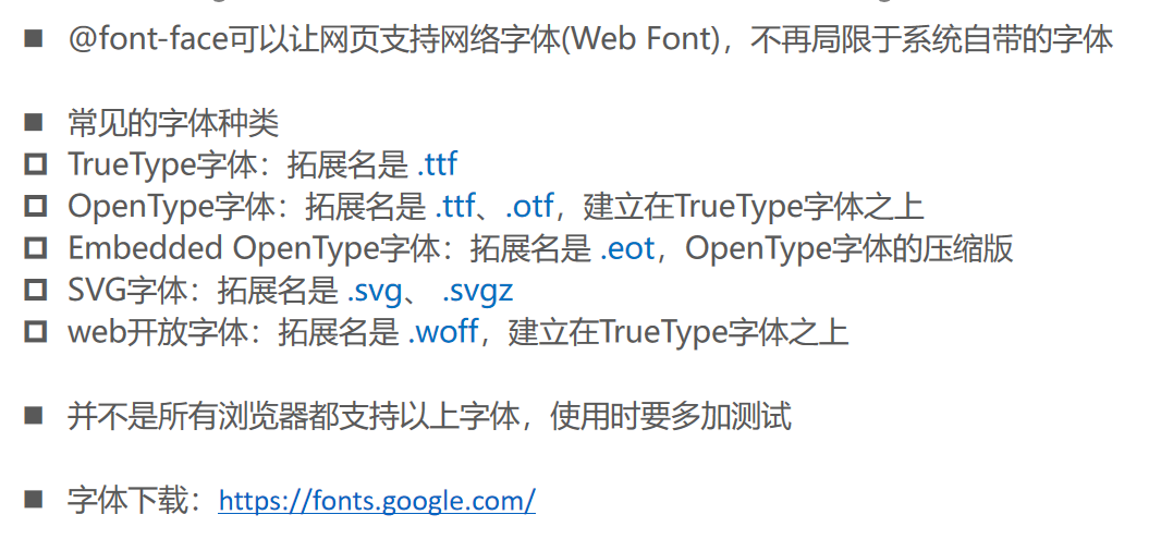
@font-face的使用

字体图标

11_网络字体的使用.html
<!DOCTYPE html>
<html lang="en">
  <head>
    <meta charset="UTF-8" />
    <meta name="viewport" content="width=device-width, initial-scale=1.0" />
    <meta http-equiv="X-UA-Compatible" content="ie=edge" />
    <title>Document</title>
    <style>
      @font-face {
        font-family: 'jie';
        /* URL: 统一资源定位符(资源的所在位置) */
        /* 视频文件: mp4/avi/webm/ogg..... */
        /* 字体文件: ttf */
        src: url('./font/ZhiMangXing-Regular.ttf'),
             url('./font/ZhiMangXing-Regular.otf'),
             url('./font/ZhiMangXing-Regular.otf'),
             url('./font/ZhiMangXing-Regular.otf');
      }

      @font-face {
        font-family: 'test';
        src: url('./font/test01.ttf');
      }

      p {
        /* 看一下可不可使用某一个字体: 系统自带的字体 */
        /* font-family: Helvetica Neue,Helvetica,Arial,Hiragino Sans GB,5FAE8F6F96C59ED1,tahoma,simsun,5b8b4f53; */
        font-family: 'jie';
      }

      strong {
        font-family: 'test';
      }

      span {
        font-weight: 700;
      }
    </style>
  </head>
  <body>
    <p>我是一个段落, 你好啊, 哈哈</p>
    <strong>你好啊, 王小波</strong>
    <span>你好啊, 王小波</span>

    <span>我 > </span>

    <img src="../img/wall.png" alt="" />
  </body>
</html>
12_字体图标的使用.html
<!DOCTYPE html>
<html lang="en">
<head>
<meta charset="UTF-8">
<meta name="viewport" content="width=device-width, initial-scale=1.0">
<meta http-equiv="X-UA-Compatible" content="ie=edge">
<title>Document</title>
<link rel="stylesheet" href="./font/iconfont.css">
<style>
@font-face {
font-family: "iconfont";
src: url("./font/iconfont.ttf"),
url("./font/iconfont.eot"),
url("./font/iconfont.svg"),
url("./font/iconfont.woff"),
url("./font/iconfont.woff2");
}
span.iconfont {
font-family: "iconfont";
font-size: 50px;
color: red;
}
</style>
</head>
<body>
<!-- �bac; -> 图标 -->
<span class="iconfont"></span>
<span class="iconfont"></span>
<span class="iconfont icon-home"></span>
<!-- 伪元素: content: "e636" -->
<!-- 在HTML作为内容:  -->
<!-- 在伪元素中作为内容:e636 -->
<span class="iconfont icon-arrow"></span>
</body>
</html>
关键帧动画
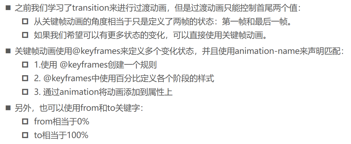
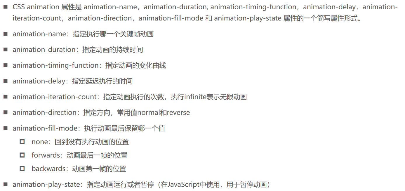
animation属性
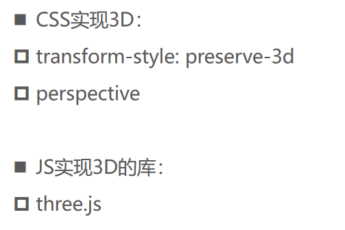
3D动画
13_关键帧动画的使用.html
<!DOCTYPE html>
<html lang="en">
  <head>
    <meta charset="UTF-8" />
    <meta name="viewport" content="width=device-width, initial-scale=1.0" />
    <meta http-equiv="X-UA-Compatible" content="ie=edge" />
    <title>Document</title>
    <style>
      .box {
         150px;
        height: 150px;
        background-color: #f66;
      }

      .box:hover {
        /*
          值1: 使用的关键字镇动画名称
          值2: 动画执行的时间
          值3: 动画的速率
        */
        animation: test1 2s linear;
      }

      @keyframes test1 {
        from {
          transform: translate(0, 0) scale(1, 1);
        }

        25% {
          transform: translate(200px, 0);
        }

        50% {
          transform: translate(200px, 200px);
        }

        75% {
          transform: translate(0, 200px);
        }

        to {
          transform: translate(0, 0) scale(2, 2);
        }
      }

      @keyframes test2 {
        0% {
          opacity: 1;
        }

        50% {
          opacity: 0.5;
        }

        75% {
          opacity: 1;
        }
      }
    </style>
  </head>
  <body>
    <div class="box"></div>
  </body>
</html>
14_CSS3D动画的实现.html
<!DOCTYPE html>
<html lang="en">
  <head>
    <meta charset="UTF-8" />
    <meta name="viewport" content="width=device-width, initial-scale=1.0" />
    <meta http-equiv="X-UA-Compatible" content="ie=edge" />
    <title>Document</title>

    <style>
      body {
        /* 视距: 1000px */
        perspective: 1000px;
      }

      /* .box {
             200px;
            height: 200px;
            margin: 0 auto;
            background-color: #f66;

            transform: translateZ(200px);
        } */

      .container {
        position: relative;
         200px;
        height: 200px;
        margin: 0 auto;

        transform-style: preserve-3d;
        transform: rotateY(70deg);
        background-color: #0ff;
      }

      .container .item {
        position: absolute;
        left: 0;
        top: 0;
         200px;
        height: 200px;
      }

      .container .item1 {
        background-color: #f66;
        transform: translateZ(-60px);
      }

      .container .item2 {
        background-color: #0f0;
        transform: translateZ(-120px);
      }

      .container .item3 {
        background-color: #00f;
        transform: translateZ(-180px);
      }

      .container .item4 {
        background-color: #ff0;
        transform: translateZ(-240px);
      }
    </style>
  </head>
  <body>
    <div class="box"></div>

    <div class="container">
      <div class="item item1"></div>
      <div class="item item2"></div>
      <div class="item item3"></div>
      <div class="item item4"></div>
    </div>
  </body>
</html>
<!DOCTYPE html>
<html lang="en">
  <head>
    <meta charset="UTF-8" />
    <meta name="viewport" content="width=device-width, initial-scale=1.0" />
    <meta http-equiv="X-UA-Compatible" content="ie=edge" />
    <title>Document</title>

    <style>
      .box {
         100px;
        height: 100px;
        background-color: #f66;
        margin: 100px auto;
      }

      .box:hover {
        box-shadow: 0 0 2px 2px blue, 0 0 2px 2px blue;
        transform: scale(2, 2) translate(100px, 100px) rotate(45deg);
      }
    </style>
  </head>
  <body>
    <div class="box"></div>
  </body>
</html>
浏览器私有前缀

CSS属性 - text-overflow、省略号
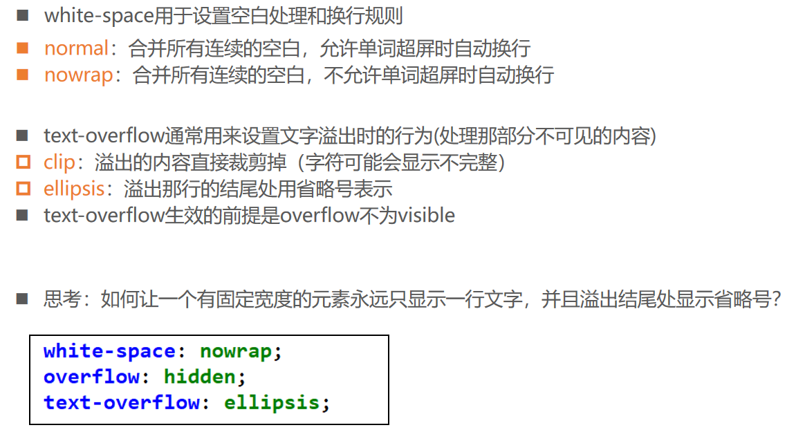
16_文字换行的处理.html
<!DOCTYPE html>
<html lang="en">
  <head>
    <meta charset="UTF-8" />
    <meta name="viewport" content="width=device-width, initial-scale=1.0" />
    <meta http-equiv="X-UA-Compatible" content="ie=edge" />
    <title>Document</title>

    <style>
      p {
        background-color: #f66;
        color: #fff;
         100px;
        margin: 0 auto;

        /* 显示2行文本并且显示省略号的方法 */
        display: -webkit-box;
        -webkit-line-clamp: 2;
        -webkit-box-orient: vertical;
        text-overflow: ellipsis;
        overflow: hidden;

        /* 显示1行文本并且显示省略号的方法 */
        /* 文字超出后是否自动换行 */
        white-space: nowrap;
        text-overflow: ellipsis;
        overflow: hidden;
      }
    </style>
  </head>
  <body>
    <p>我是一个段落p元素的内容, 哈哈哈哈哈哈哈哈</p>
  </body>
</html>