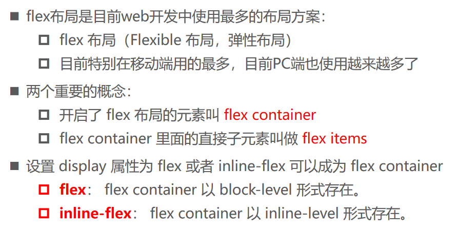
认识flex布局
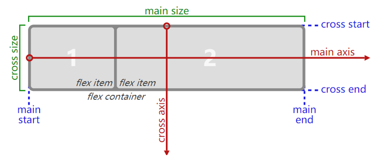
flex布局模型
flex相关的属性
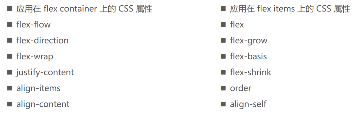
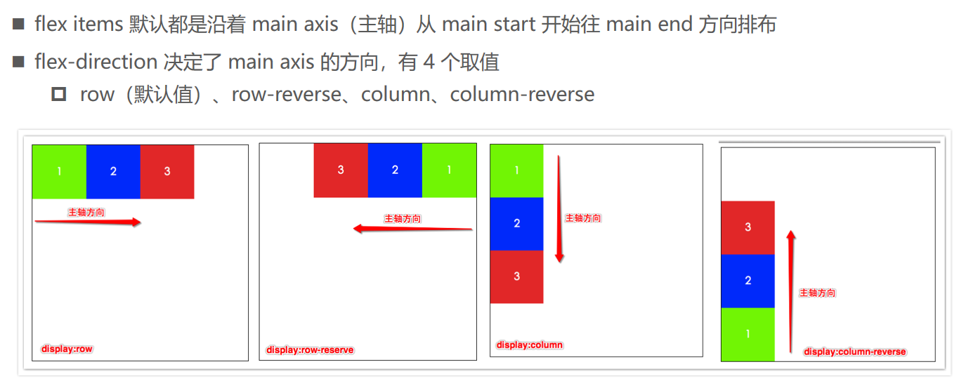
Flex-direction
Justify-content

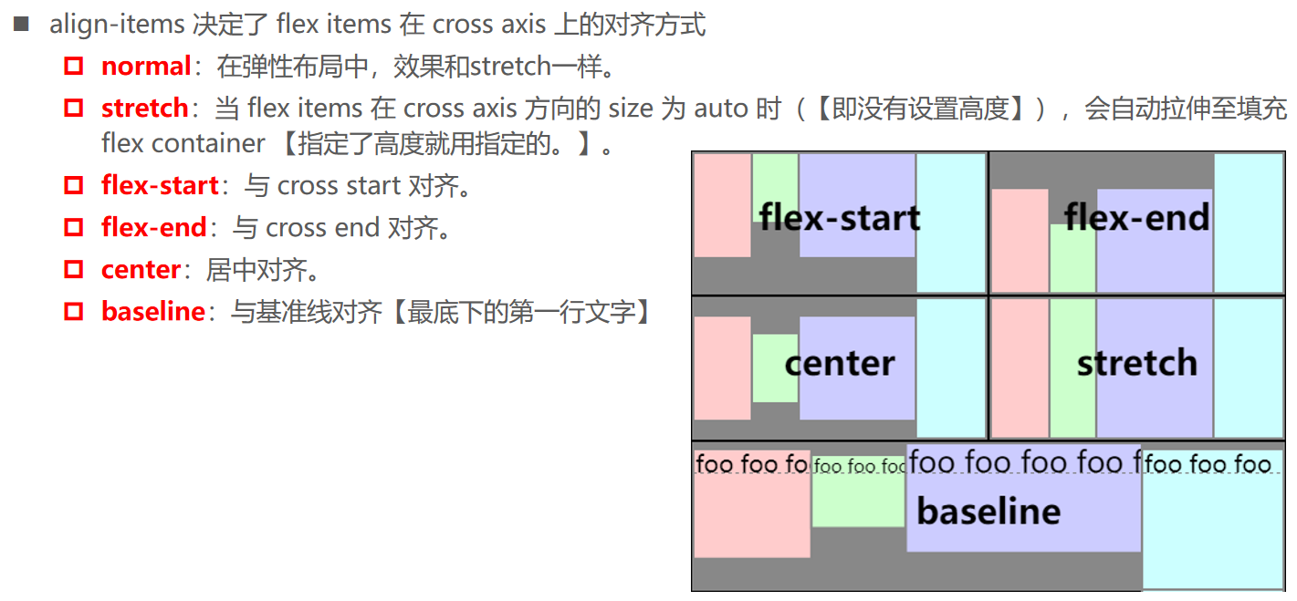
align-items
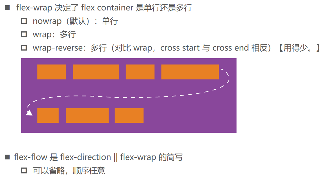
flex-wrap、flex-flow
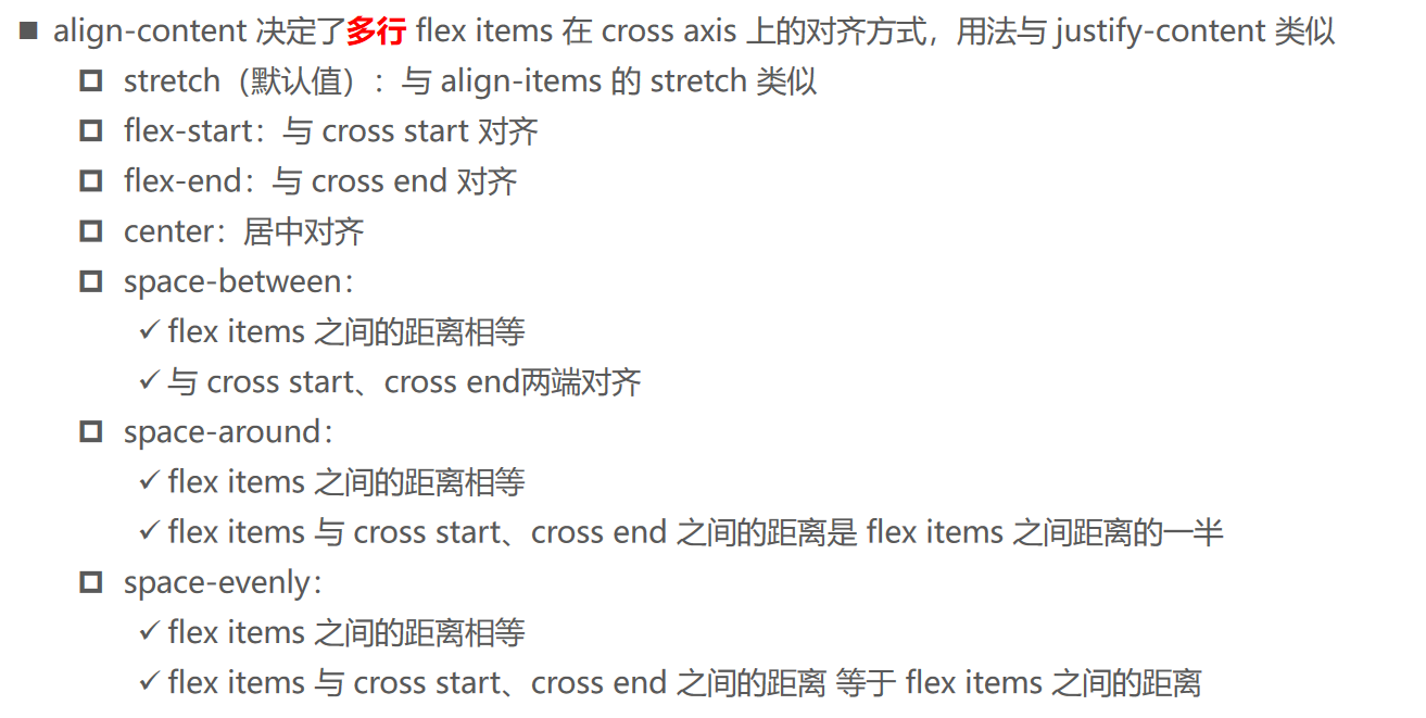
align-content
order
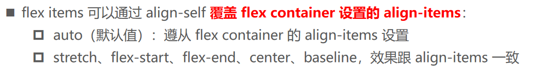
align-self
flex-grow

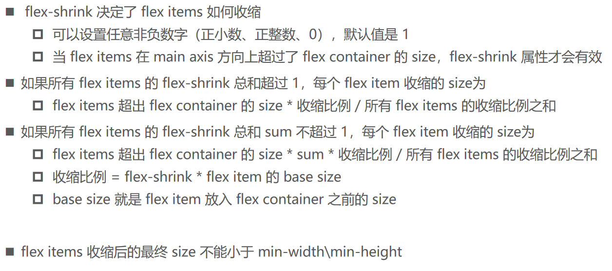
flex-shrink
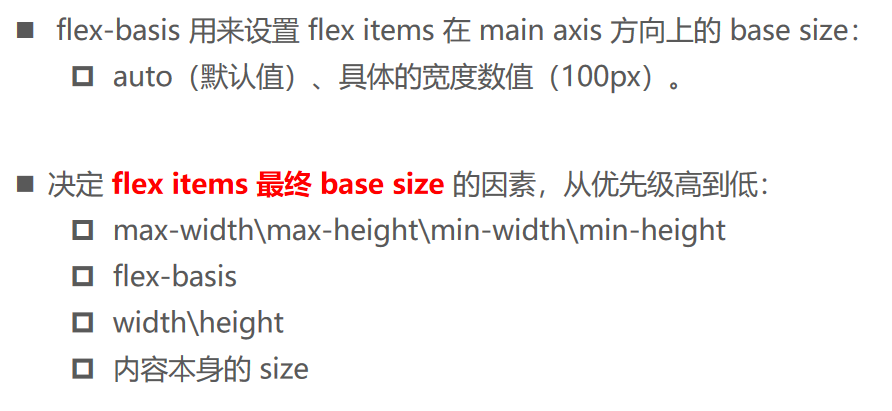
flex-basis
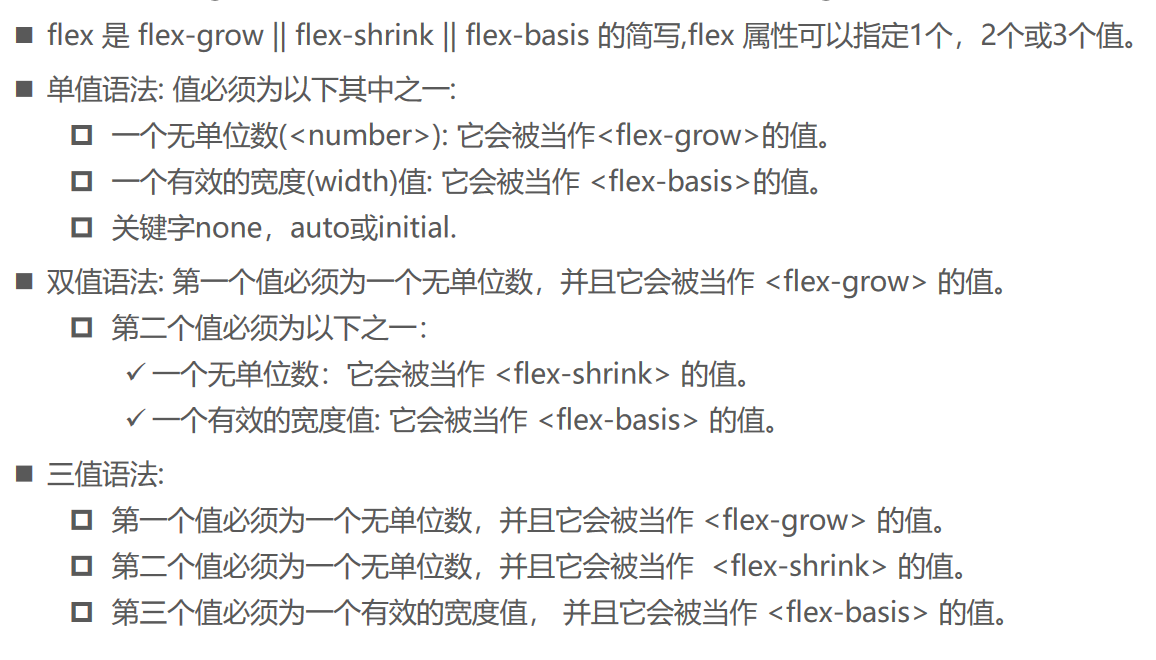
flex
09_flex布局的使用01.html
<!DOCTYPE html>
<html lang="en">
  <head>
    <meta charset="UTF-8" />
    <meta name="viewport" content="width=device-width, initial-scale=1.0" />
    <meta http-equiv="X-UA-Compatible" content="ie=edge" />
    <title>Document</title>

    <style>
      .box {
         550px;
        height: 400px;
        background-color: pink;
        margin: 0 auto;

        /*
          1.开启flex布局:
            flex: 块级元素
            inline-flex: 行内元素
        */
        display: flex;

        /* 2.flex-direction: 决定主轴的方向 */
        /* row: 主轴从左到右 */
        /* row-reverse: 主轴从右到左 */
        /* column: 主轴从上到下 */
        /* column-reverse: 主轴从下到上 */
        /* flex-direction: column-reverse; */

        /* 3.justify-content: 决定flex items主轴的对齐方式 */
        /* justify-content: space-around; */

        /* 4.align-items: 绝定flex items在交叉轴的对齐方式 */
        /* align-items: baseline; */

        /* 5.结论: 默认情况下, 所有的flex items都会在同一行显示 */
        /* flex-wrap: nowrap */
        /* nowrap: 不换行 */
        /* flex-wrap: wrap-reverse; */

        /* 6.flex-flow: 缩写属性 -> flex-direction || flex-wrap */
        flex-flow: row wrap;
        justify-content: space-evenly;

        /* 7.align-content: 决定多行的flex items在交叉轴上的对齐方式 */
        align-content: space-around;
      }

      .item {
         100px;
        height: 100px;
        color: #fff;
        text-align: center;
      }

      .item1 {
        background-color: #f66;
        /* height: 60px; */
        /* font-size: 50px; */
      }

      .item2 {
        background-color: yellowgreen;
        /* height: 150px; */
      }

      .item3 {
        background-color: skyblue;
        /* height: 120px; */
      }
    </style>
  </head>
  <body>
    <div class="box">
      <div class="item item1">item1</div>
      <div class="item item2">item2</div>
      <div class="item item3">item3</div>
      <div class="item item1">item4</div>
      <div class="item item2">item5</div>
      <div class="item item3">item6</div>
      <div class="item item1">item7</div>
      <div class="item item2">item8</div>
      <div class="item item3">item9</div>
    </div>

    <strong>strong元素</strong>
  </body>
</html>
10_flex布局的使用02.html
<!DOCTYPE html>
<html lang="en">
  <head>
    <meta charset="UTF-8" />
    <meta name="viewport" content="width=device-width, initial-scale=1.0" />
    <meta http-equiv="X-UA-Compatible" content="ie=edge" />
    <title>Document</title>

    <style>
      .box {
         550px;
        height: 400px;
        background-color: orange;
        margin: 0 auto;

        /* 1.开启flex布局*/
        display: flex;

        /* align-items: center; */
        /* flex-wrap: wrap; */
      }

      /*
         750px - 550px = 200px
         200 / 3 = 66.66666px
         250 - 66 =
        */

      /*
        200 / 5 = 40

         */

      .item {
         100px;
        height: 100px;
        color: #fff;
        text-align: center;

        /* 1: flex-grow */
        flex: 1;
      }

      .item1 {
        background-color: #f66;
        /* order: 10; */
        /* flex-grow: .2;  */
        /* flex-shrink: .2; */

        /* flex-basis: 200px; */
      }

      .item2 {
        background-color: #0f0;
        /* height: 150px; */
        /* order: 6; */
        /* flex-grow: .2;  */
        /* flex-shrink: .2; */
      }

      .item3 {
        background-color: #00f;
        /* align-self: flex-end; */
        /* order: 100; */
        /* flex-grow: .3; */
        /* flex-shrink: .2; */
      }
    </style>
  </head>
  <body>
    <div class="box">
      <div class="item item1">item1</div>
      <div class="item item2">item2</div>
      <div class="item item3">item3</div>
    </div>

    <strong>strong元素</strong>
  </body>
</html>