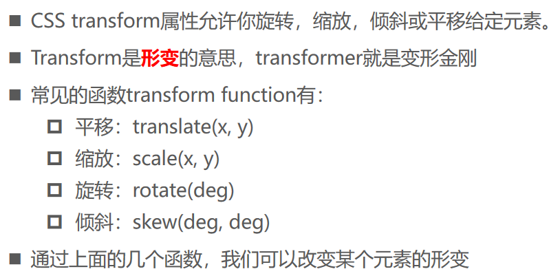
位移 - translate
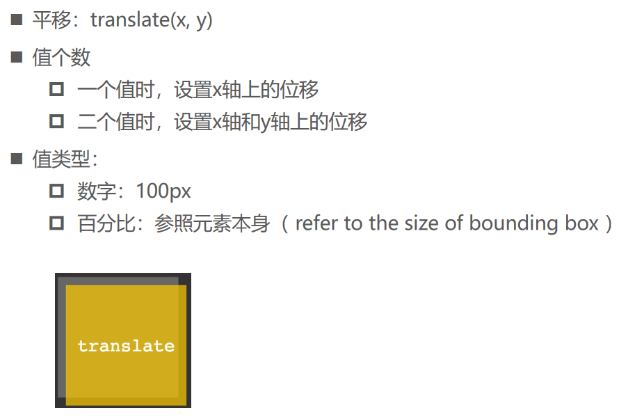
缩放 - scale

缩放 - rotate

倾斜 - skew

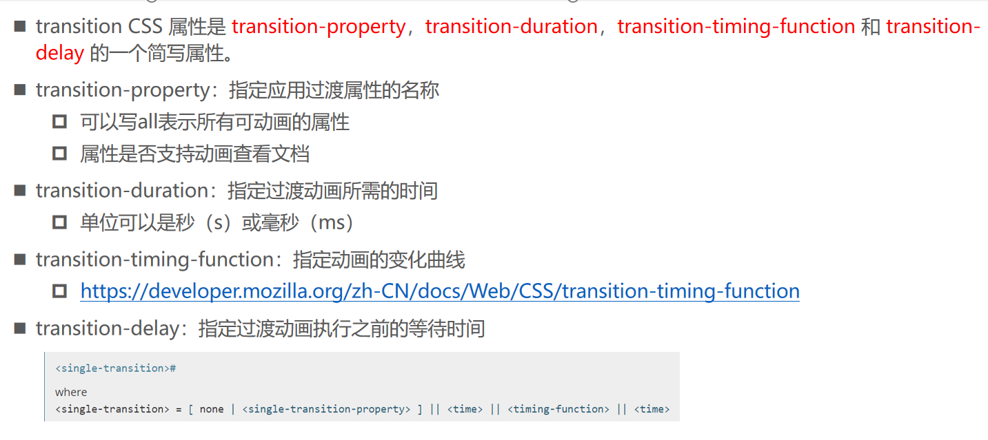
过渡动画 - transition
<!DOCTYPE html>
<html lang="en">
  <head>
    <meta charset="UTF-8" />
    <meta name="viewport" content="width=device-width, initial-scale=1.0" />
    <meta http-equiv="X-UA-Compatible" content="ie=edge" />
    <title>Document</title>

    <style>
      .box {
         180px;
        height: 100px;
        background-color: #f66;
      }

      .box:hover {
        /* transform: translate(30px); */
        /* 90px */
        transform: translate(50%);
      }

      .box1 {
        transform: translate(90px);
      }
    </style>
  </head>
  <body>
    <div class="box"></div>
    <div class="box box1"></div>
  </body>
</html>
<!DOCTYPE html>
<html lang="en">
  <head>
    <meta charset="UTF-8" />
    <meta name="viewport" content="width=device-width, initial-scale=1.0" />
    <meta http-equiv="X-UA-Compatible" content="ie=edge" />
    <title>Document</title>

    <style>
      .box {
         100px;
        height: 100px;
        background-color: #f66;

        margin: 100px auto 0;
      }

      .box:hover {
        transform: scale(2);
      }
    </style>
  </head>
  <body>
    <div class="box"></div>
  </body>
</html>
<!DOCTYPE html>
<html lang="en">
  <head>
    <meta charset="UTF-8" />
    <meta name="viewport" content="width=device-width, initial-scale=1.0" />
    <meta http-equiv="X-UA-Compatible" content="ie=edge" />
    <title>Document</title>

    <style>
      .box {
         100px;
        height: 100px;
        background-color: #f66;

        margin: 100px auto 0;
        transform-origin: 10px top;
      }

      .box:hover {
        transform: scale(2);
      }
    </style>
  </head>
  <body>
    <div class="box"></div>
  </body>
</html>
<!DOCTYPE html>
<html lang="en">
  <head>
    <meta charset="UTF-8" />
    <meta name="viewport" content="width=device-width, initial-scale=1.0" />
    <meta http-equiv="X-UA-Compatible" content="ie=edge" />
    <title>Document</title>

    <style>
      .box {
         100px;
        height: 100px;
        background-color: #f66;

        margin: 100px auto 0;
      }

      .box:hover {
        /* deg: degree */
        transform: rotate(-90deg);
      }
    </style>
  </head>
  <body>
    <div class="box">哈哈哈</div>
  </body>
</html>
<!DOCTYPE html>
<html lang="en">
  <head>
    <meta charset="UTF-8" />
    <meta name="viewport" content="width=device-width, initial-scale=1.0" />
    <meta http-equiv="X-UA-Compatible" content="ie=edge" />
    <title>Document</title>

    <style>
      .box {
         100px;
        height: 100px;
        background-color: #f66;

        margin: 100px auto 0;
      }

      .box:hover {
        transform: skew(50deg, 50deg);
      }
    </style>
  </head>
  <body>
    <div class="box">哈哈哈</div>
  </body>
</html>
06_transition的过渡动画.html
<!DOCTYPE html>
<html lang="en">
  <head>
    <meta charset="UTF-8" />
    <meta name="viewport" content="width=device-width, initial-scale=1.0" />
    <meta http-equiv="X-UA-Compatible" content="ie=edge" />
    <title>Document</title>

    <style>
      .box {
         100px;
        height: 100px;
        background-color: #f66;

        margin: 100px auto 0;

        /* transition: 值1 transition-property:transform/width/height/all
                        值2 transition-duration: 100ms(毫秒)/1s(秒)
                        值3 transition-timing-function: 动画的变化速度: ease/ease-in
                        值4 transition-delay: 延迟/等待多久再执行这个动画; */
        transition: all 300ms linear;
      }

      .box:hover {
        /*  200px;
            height: 200px; */
        /* transform: scale(2) */
        transform: rotate(180deg);
      }
    </style>
  </head>
  <body>
    <div class="box"></div>
  </body>
</html>