ECharts 入门
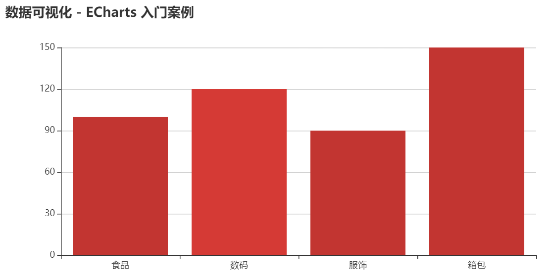
入门案例:销售柱状图
https://book.youbaobao.xyz/datav-res/examples/test-echarts.html
::: details
<!DOCTYPE html>
<html>

<head>
  <script src="https://cdn.jsdelivr.net/npm/echarts@4.7.0/dist/echarts.min.js"></script>
  <style>
    #chart {
       800px;
      height: 400px;
    }
  </style>
</head>

<body>
  <div id="chart"></div>
  <script>
    const chartDom = document.getElementById('chart')
    const chart = echarts.init(chartDom)
    // 不是setOptions,没有s
    chart.setOption({
      title: {
        text: '快速入门ECharts开发'
      },
      // x轴
      xAxis: {
        data: ['食品', '数码', '服饰', '箱包']
      },
      // y轴,没有数据,也要写上
      yAxis: {},
      // 数据、图表类型
      series: {
        type: 'bar', // 柱状图,不可选中,因为是canvas渲染的
        data: [100, 120, 90, 150] // xAxis.data对的数据
      }
    })
  </script>
</body>

</html>
:::
思考:ECharts 的绘图流程是怎样的?
::: details
- 引入 js 库
- 编写渲染容器 DOM,添加 width 和 height 样式属性
- 获取渲染 DOM 对象
- 初始化 ECharts 对象
- 编写 option 参数
- 调用 setOption 完成渲染
:::
进阶案例:多 ECharts 实例
https://book.youbaobao.xyz/datav-res/examples/test-echarts-multi.html
::: details
<!DOCTYPE html>
<html>
<head>
<meta charset="utf-8">
<script src="https://cdn.jsdelivr.net/npm/echarts@4.7.0/dist/echarts.min.js"></script>
<style>
#chart {
800px;
height: 300px;
}
#chart2 {
800px;
height: 300px;
}
</style>
</head>
<body>
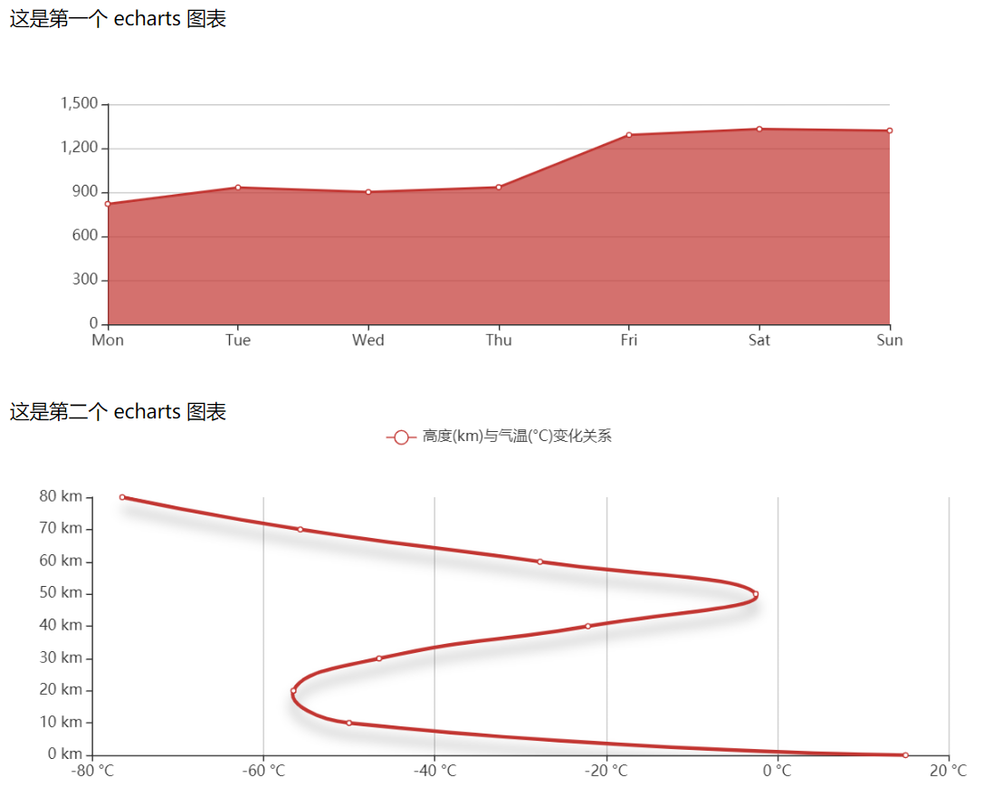
<div>这是第一个 echarts 图表</div>
<div id="chart"></div>
<div>这是第二个 echarts 图表</div>
<div id="chart2"></div>
<script>
const chartDom = document.getElementById('chart')
const chartDom2 = document.getElementById('chart2')
const chart = echarts.init(chartDom)
const chart2 = echarts.init(chartDom2)
const option1 = {
xAxis: {
type: 'category',
boundaryGap: false,
data: ['Mon', 'Tue', 'Wed', 'Thu', 'Fri', 'Sat', 'Sun']
},
yAxis: {
type: 'value'
},
series: [{
data: [820, 932, 901, 934, 1290, 1330, 1320],
type: 'line',
areaStyle: {}
}]
};
const option2 = {
legend: {
data: ['高度(km)与气温(°C)变化关系']
},
tooltip: {
trigger: 'axis',
formatter: 'Temperature : <br/>{b}km : {c}°C'
},
grid: {
left: '3%',
right: '4%',
bottom: '3%',
containLabel: true
},
xAxis: {
type: 'value',
axisLabel: {
formatter: '{value} °C'
}
},
yAxis: {
type: 'category',
axisLine: {onZero: false},
axisLabel: {
formatter: '{value} km'
},
boundaryGap: false,
data: ['0', '10', '20', '30', '40', '50', '60', '70', '80']
},
series: [{
name: '高度(km)与气温(°C)变化关系',
type: 'line',
smooth: true,
lineStyle: {
3,
shadowColor: 'rgba(0,0,0,0.4)',
shadowBlur: 10,
shadowOffsetY: 10
},
data:[15, -50, -56.5, -46.5, -22.1, -2.5, -27.7, -55.7, -76.5]
}]
}
chart.setOption(option1)
chart2.setOption(option2)
</script>
</body>
</html>
:::