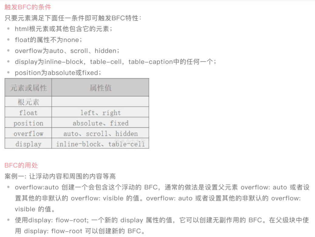
其实BFC是上⾯三种布局⽅式中的普通流,BFC会产⽣⼀个独⽴的容器,该容器内部的元素不会在布局上影响到外部的元素,在外部的普通流看来它和其他普通流元素⽆差别,⽂档最终会按照上⾯说的普通流计算布局。


<!DOCTYPE html>
<html lang="en">
<head>
<meta charset="UTF-8">
<meta name="viewport" content="width=device-width, initial-scale=1.0">
<title>案例1 - 让浮动内容和周围的内容等高</title>
<style>
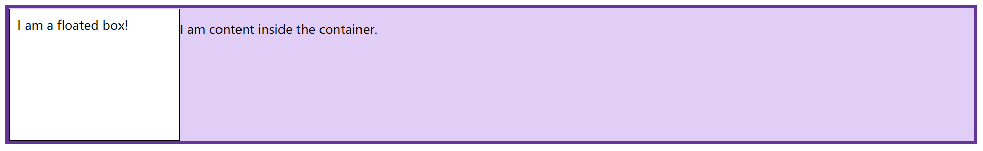
.box {
background-color: rgb(224, 206, 247);
border: 5px solid rebeccapurple;
overflow: hidden;
}
.float {
float: left;
200px;
height: 150px;
background-color: white;
border: 1px solid black;
padding: 10px;
}
</style>
</head>
<body>
<div class="box">
<div class="float">I am a floated box!</div>
<p>I am content inside the container.</p>
</div>
</body>
</html>
<!DOCTYPE html>
<html lang="en">
<head>
<meta charset="UTF-8">
<meta name="viewport" content="width=device-width, initial-scale=1.0">
<title>案例2 - 外边距折叠</title>
<style>
/* overflow: hidden;
1.溢出隐藏
2.margin的折叠问题
3.清除浮动
*/
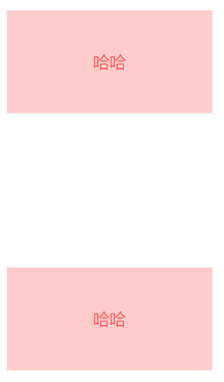
p {
color: #f55;
background: #fcc;
200px;
line-height: 100px;
text-align: center;
}
.p1 {
margin-bottom: 50px;
}
.p2 {
margin-top: 100px;
}
/* 相加150px */
.parent {
overflow: hidden;
}
</style>
</head>
<body>
<p class="p1">哈哈</p>
<!-- 解决办法 -->
<div class="parent">
<p class="p2">哈哈</p>
</div>
</body>
</html>
<!DOCTYPE html>
<html lang="en">
<head>
<meta charset="UTF-8">
<meta name="viewport" content="width=device-width, initial-scale=1.0">
<title>案例3 - 清除浮动</title>
<style>
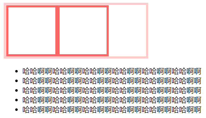
/* 清除浮动有多少种方法? 越多越好 */
.container {
300px;
border: 5px solid #fcc;
/* 清除浮动 */
overflow: auto;
}
.box {
100px;
height: 100px;
float: left;
border: 5px solid #f66;
}
</style>
</head>
<body>
<div class="container">
<div class="box"></div>
<div class="box"></div>
</div>
<ul>
<li>哈哈啊啊哈哈啊啊哈哈啊啊哈哈啊啊哈哈啊啊哈哈啊啊</li>
<li>哈哈啊啊哈哈啊啊哈哈啊啊哈哈啊啊哈哈啊啊哈哈啊啊</li>
<li>哈哈啊啊哈哈啊啊哈哈啊啊哈哈啊啊哈哈啊啊哈哈啊啊</li>
<li>哈哈啊啊哈哈啊啊哈哈啊啊哈哈啊啊哈哈啊啊哈哈啊啊</li>
<li>哈哈啊啊哈哈啊啊哈哈啊啊哈哈啊啊哈哈啊啊哈哈啊啊</li>
</ul>
</body>
</html>
<!DOCTYPE html>
<html lang="en">
<head>
<meta charset="UTF-8">
<meta name="viewport" content="width=device-width, initial-scale=1.0">
<title>案例4 - 自适应两栏布局</title>
<style>
/*
原理1: 层叠上下文 - html层叠上下文元素里面
特性: 层叠顺序:背景或边框 < z-index负值 < 块级元素 < 浮动元素 < 行内块 < position < z-index正值
aside浮动元素,main块级元素,所以aside层叠在main上面
原理2: BFC规则
BFC元素不会与float容器重叠
BFC是一个独立的容器,和外面的元素互不影响
*/
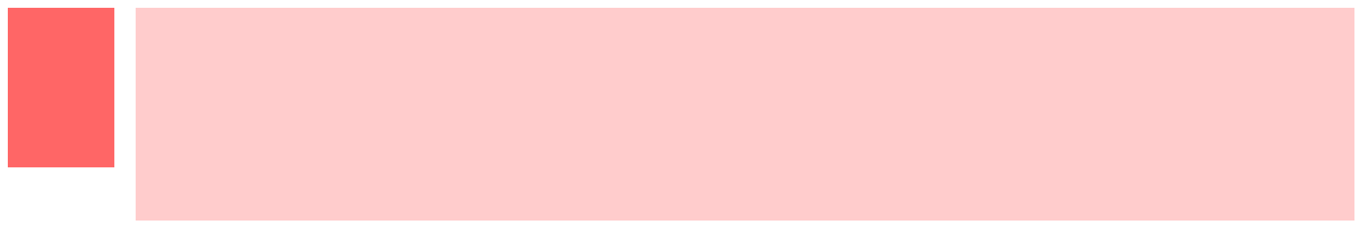
.aside {
100px;
height: 150px;
float: left;
background: #f66;
}
.main {
height: 200px;
background: #fcc;
overflow: hidden;
/* 要比aside 的宽度大,才会有距离 */
margin-left: 120px;
}
</style>
</head>
<body>
<div class="aside"></div>
<div class="main"></div>
</body>
</html>