<!DOCTYPE html>
<html lang="en">
<head>
<meta charset="UTF-8">
<meta name="viewport" content="width=device-width, initial-scale=1.0">
<meta http-equiv="X-UA-Compatible" content="ie=edge">
<title>居中布局解决方案1 - table + margin-auto</title>
<style>
* {
margin: 0;
padding: 0;
}
/* table-cell 单元表格td 对齐 vertical-align 内容垂直对齐 */
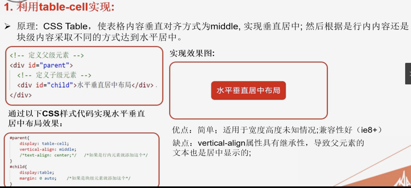
#parent {
1000px;
height: 600px;
background: #ccc;
/* 标签 td */
display: table-cell;
/* 垂直居中 */
vertical-align: middle;
}
#child {
200px;
height: 200px;
background: #c9394a;
/* 水平居中 块级元素 */
margin: 0 auto;
}
</style>
</head>
<body>
<!-- 定义父级元素 -->
<div id="parent">
<!-- 定义子级元素 -->
<div id="child"></div>
</div>
</body>
</html>
<!DOCTYPE html>
<html lang="en">

<head>
  <meta charset="UTF-8">
  <meta name="viewport" content="width=device-width, initial-scale=1.0">
  <meta http-equiv="X-UA-Compatible" content="ie=edge">
  <title>居中布局解决方案2 - position定位</title>
  <style>
    * {
      margin: 0;
      padding: 0;
    }

    /* 定位方法: 三种
    方法1
    left: 50%;
    top: 50%;
    margin: -100px 0 0 -100px (上右下左 顺时针方向) // 简写
    margin-left: -100px;
    margin-top: -100px;

    方法2
    top: 50%;
    left: 50%;
    transform: translate(-50%, -50%);

    方法3
    top: 0;
    bottom: 0;
    left: 0;
    right: 0;
    margin: auto;
    */


    #parent {
      /* 定位开启  作为子元素的参照物  */
      position: relative;
       1000px;
      height: 600px;
      background: #ccc;
    }

    #child {
      position: absolute;
      /* 方位,这种方法用于移动端,PC端不兼容 */
      top: 0;
      bottom: 0;
      left: 0;
      right: 0;
      margin: auto;

       200px;
      height: 200px;
      background: #c9394a;

    }
  </style>
</head>

<body>
  <!-- 定义父级元素 -->
  <div id="parent">
    <!-- 定义子级元素 -->
    <div id="child"></div>
  </div>
</body>

</html>
<!DOCTYPE html>
<html lang="en">
<head>
<meta charset="UTF-8">
<meta name="viewport" content="width=device-width, initial-scale=1.0">
<meta http-equiv="X-UA-Compatible" content="ie=edge">
<title>居中布局解决方案3- flex + justify-content + align-items</title>
<style>
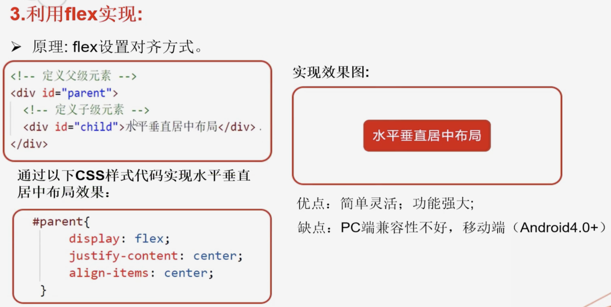
*{margin: 0;padding: 0;}
/* flex 用来控制子元素的排列方式 - 水平排列
flex布局 - 控制子元素整体的排列 功能比较强大
*/
#parent {
1000px;
height: 600px;
background: #ccc;
display: flex;
/* 水平居中 */
justify-content: center;
/* 垂直居中 */
align-items:center
}
#child {
200px;
height: 200px;
background: #c9394a;
margin:0 10px;
}
</style>
</head>
<body>
<!-- 定义父级元素 -->
<div id="parent">
<!-- 定义子级元素 -->
<div id="child"></div>
<div id="child"></div>
<div id="child"></div>
</div>
</body>
</html>