水平居中布局

水平居中布局解决方案1-text-align
<!DOCTYPE html>
<html lang="en">

<head>
  <meta charset="UTF-8">
  <meta name="viewport" content="width=device-width, initial-scale=1.0">
  <meta http-equiv="X-UA-Compatible" content="ie=edge">
  <title>水平居中布局解决方案1-text-align</title>
  <style>
    /* 文字元素、行内、行内块元素  => 文本   text-align: 控制文本的对齐方式 */
    * {
      margin: 0;
      padding: 0;
    }

    #parent {
       100%;
      height: 200px;
      background: #ccc;

      /*文本对齐  left  居左  center 居中  right 居右 */
      text-align: center
    }

    #child {
       200px;
      height: 200px;
      background: #c9394a;
    }
  </style>
</head>

<body>
  <!-- 定义父级元素 -->
  <div id="parent">
    <!-- 定义子级元素 -->
    <div id="child">居中布局</div>
  </div>
</body>

</html>
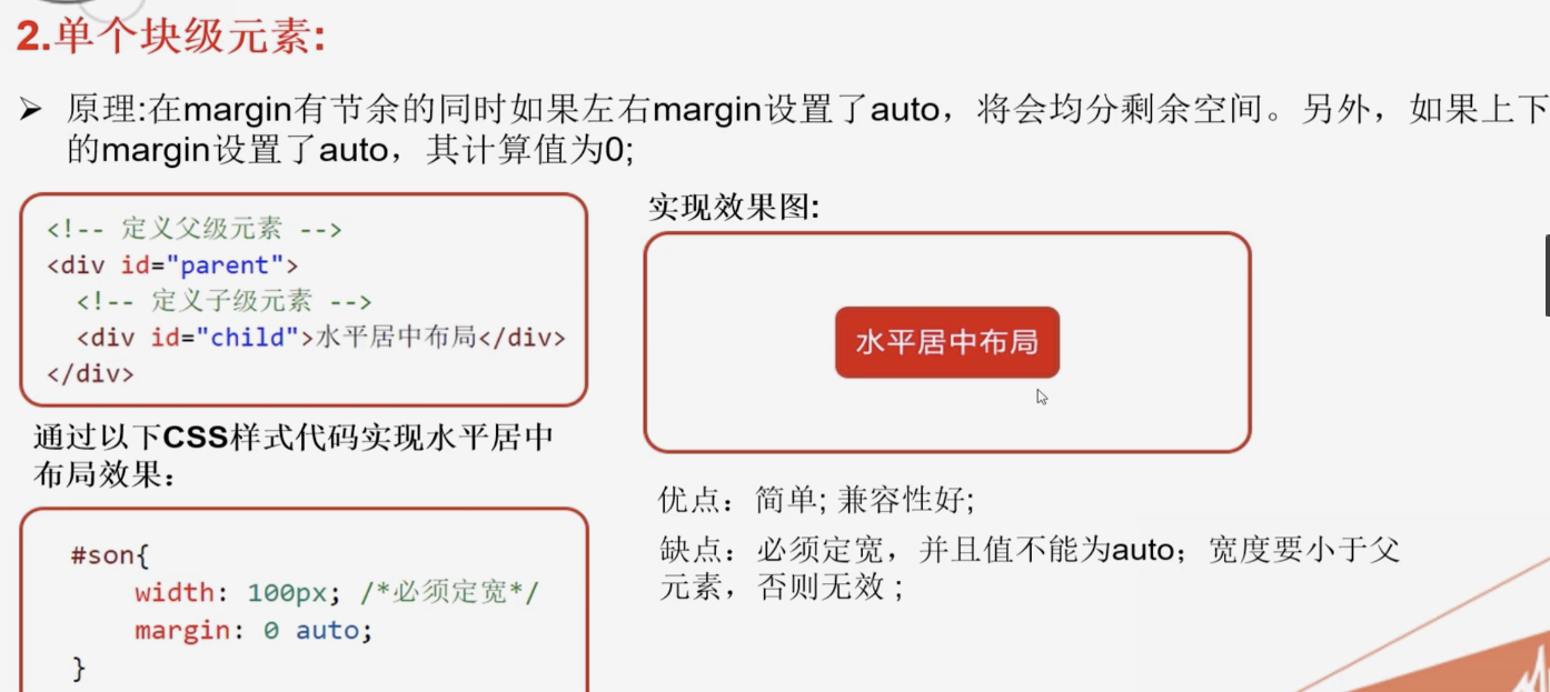
水平居中布局解决方案2-margin-auto
<!DOCTYPE html>
<html lang="en">

<head>
  <meta charset="UTF-8">
  <meta name="viewport" content="width=device-width, initial-scale=1.0">
  <meta http-equiv="X-UA-Compatible" content="ie=edge">
  <title>水平居中布局解决方案2-margin-auto</title>
  <style>
    * {
      margin: 0;
      padding: 0;
    }

    /*  块级元素 div
      1.定宽
      2.margin: 上下0  左右 auto(左右自动平分);
    */
    #parent {
       100%;
      height: 200px;
      background: #ccc;

    }

    #child {
       200px;
      height: 200px;
      background: #c9394a;
      margin: 0 auto;
    }
  </style>
</head>

<body>
  <!-- 定义父级元素 -->
  <div id="parent">
    <!-- 定义子级元素 -->
    <div id="child"></div>
  </div>
</body>

</html>
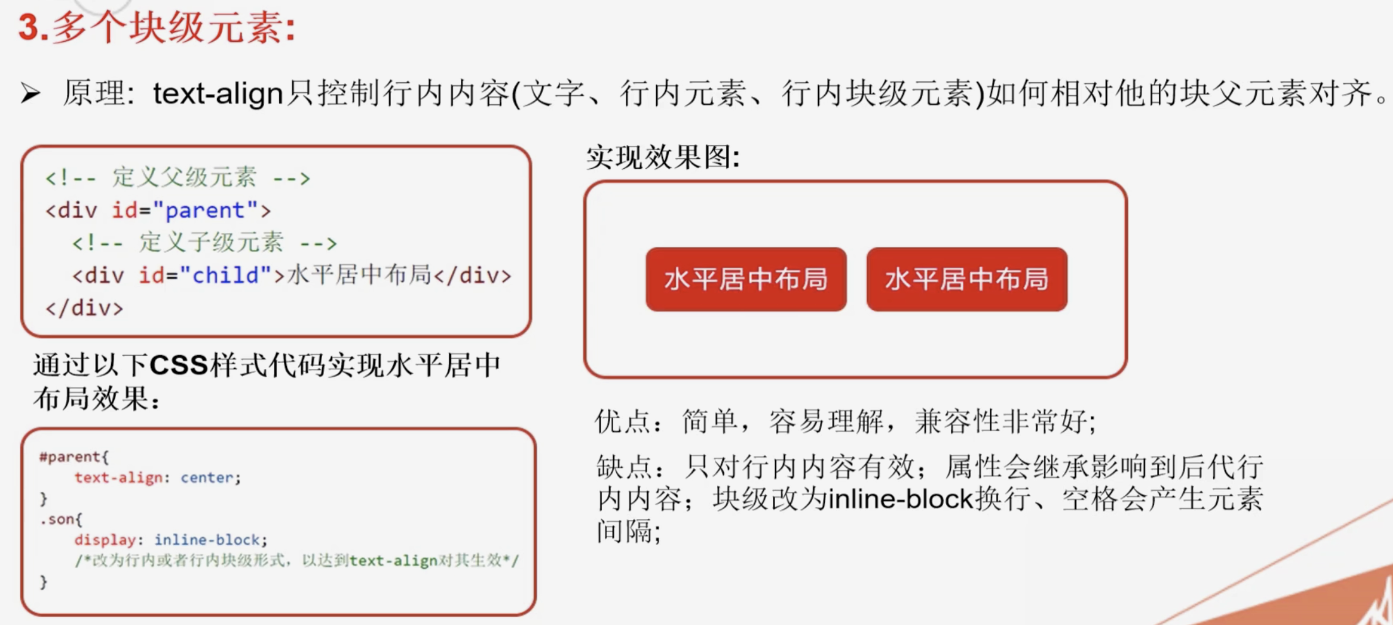
水平居中布局解决方案3-text-algin + inline-block
<!DOCTYPE html>
<html lang="en">

<head>
  <meta charset="UTF-8">
  <meta name="viewport" content="width=device-width, initial-scale=1.0">
  <meta http-equiv="X-UA-Compatible" content="ie=edge">
  <title>水平居中布局解决方案3-text-algin + inline-block</title>
  <style>
    * {
      margin: 0;
      padding: 0;
    }

    /* 水平居中 - 多个块级元素  */
    #parent {
       100%;
      height: 200px;
      background: #ccc;
      /* 文字 + 行内元素 + 行内块元素 对齐方式   */
      text-align: center;
      font-size: 0;
    }

    #child {
      /* 缺点: 受换行符的影响产生默认的间距
      解决办法: 给父元素添加属性font-size:0;  =  去间距
      */
      display: inline-block;
       300px;
      height: 200px;
      background: #c9394a;
    }
  </style>
</head>

<body>
  <!-- 定义父级元素 -->
  <div id="parent">
    <!-- 定义子级元素 -->
    <div id="child"></div>
    <div id="child" style="background-color: rebeccapurple;"></div>
  </div>
</body>

</html>
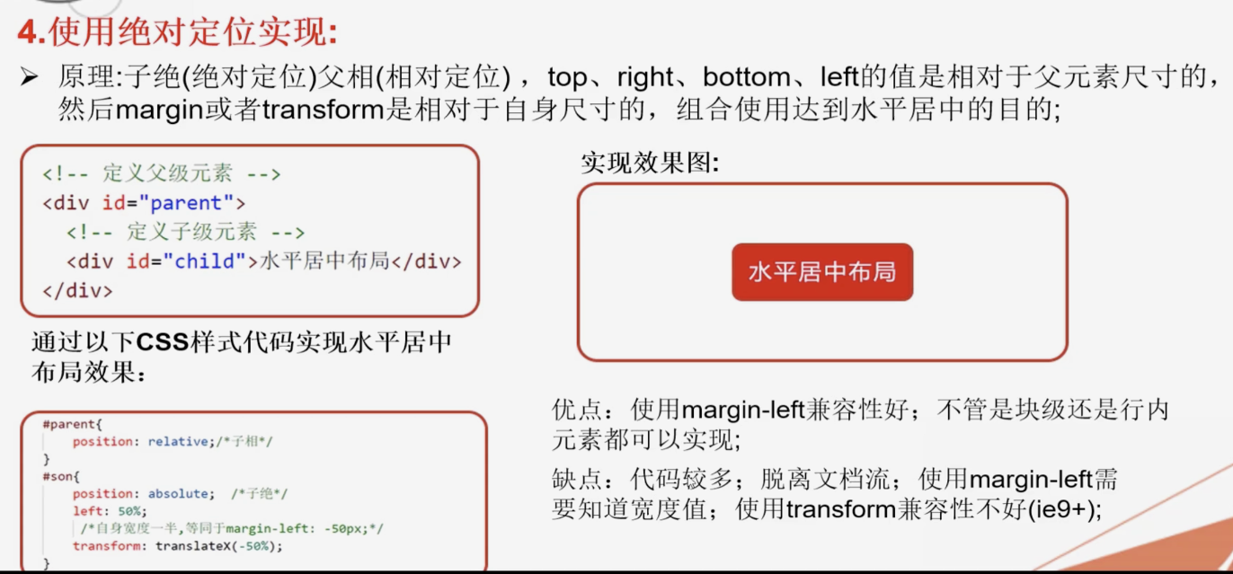
水平居中布局解决方案4 - 绝对定位position
<!DOCTYPE html>
<html lang="en">

<head>
  <meta charset="UTF-8">
  <meta name="viewport" content="width=device-width, initial-scale=1.0">
  <meta http-equiv="X-UA-Compatible" content="ie=edge">
  <title>水平居中布局解决方案4 - 绝对定位position</title>
  <style>
    * {
      margin: 0;
      padding: 0;
    }

    #parent {
       100%;
      height: 200px;
      background: #ccc;
      /* 作为子元素的参照物 */
      position: relative;
    }

    #child {
      /* 绝对定位 -  参照物  方位 */
      position: absolute;
      left: 50%;
      /* 反向移动子元素宽度的一半  transform: translateX(-50%);  子元素宽度未知*/
      margin-left: -150px;
       300px;
      height: 200px;
      background: #c9394a;
    }
  </style>
</head>

<body>
  <!-- 定义父级元素 -->
  <div id="parent">
    <!-- 定义子级元素 -->
    <div id="child"></div>
  </div>
</body>

</html>
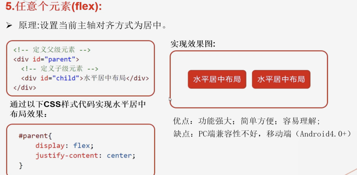
水平居中布局解决方案5-flex+justify-content
<!DOCTYPE html>
<html lang="en">

<head>
  <meta charset="UTF-8">
  <meta name="viewport" content="width=device-width, initial-scale=1.0">
  <meta http-equiv="X-UA-Compatible" content="ie=edge">
  <title>水平居中布局解决方案5-flex+justify-content</title>
  <style>
    * {
      margin: 0;
      padding: 0;
    }

    #parent {
      display: flex;
       100%;
      height: 200px;
      background: #ccc;
      /* 水平居中 */
      justify-content: center;
    }

    #child {
       300px;
      height: 200px;
      background: #c9394a;
      margin: 0 10px;
    }
  </style>
</head>

<body>
  <!-- 定义父级元素 -->
  <div id="parent">
    <!-- 定义子级元素 -->
    <div id="child"></div>
    <div id="child"></div>
    <div id="child"></div>
  </div>
</body>

</html>