 div {

 	 0;

    height: 0;
    line-height:0;
    font-size: 0;
	border-top: 10px solid red;

	border-right: 10px solid green;

	border-bottom: 10px solid blue;

	border-left: 10px solid #000;

 }
一张图, 你就知道 css 三角是怎么来的了, 做法如下:
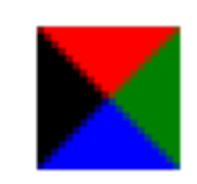
- 我们用css 边框可以模拟三角效果
- 宽度高度为0
- 我们4个边框都要写, 只保留需要的边框颜色,其余的不能省略,都改为 transparent 透明就好了
- 为了照顾兼容性 低版本的浏览器,加上 font-size: 0; line-height: 0;
<!DOCTYPE html>
<html lang="en">
<head>
	<meta charset="UTF-8">
	<title>Document</title>
	<style>
		div {
			position: relative;
			 200px;
			height: 100px;
			background-color: pink;
			margin: 100px auto;
		}
		p {
			position: absolute;
			top: -40px;
			left: 50%;
			margin-left: -20px;
			 0;
			height: 0;
			border-style: solid;
			border- 20px;
			border-color: transparent transparent pink transparent;
			font-size: 0;
			line-height: 0;
		}
	</style>
</head>
<body>
	<div>
		<p></p>
	</div>
</body>
</html>
