DET曲线
DET曲线即Detection error tradeoff (DET) curve,检测误差权衡曲线。功能类似于ROC曲线,但有时DET曲线更容易判断分类器的性能。
参考sklearn中的介绍:
DET curves are commonly plotted in normal deviate scale. (DET曲线通常以正常偏差尺度绘制。)
To achieve this plot_det_curve transforms the error rates as returned by the det_curve and the axis scale using scipy.stats.norm.
The point of this example is to demonstrate two properties of DET curves, namely:
-
It might be easier to visually assess the overall performance of different classification algorithms using DET curves over ROC curves. Due to the linear scale used for plotting ROC curves, different classifiers usually only differ in the top left corner of the graph and appear similar for a large part of the plot. On the other hand, because DET curves represent straight lines in normal deviate scale. As such, they tend to be distinguishable as a whole and the area of interest spans a large part of the plot.
-
DET curves give the user direct feedback of the detection error tradeoff to aid in operating point analysis. The user can deduct directly from the DET-curve plot at which rate false-negative error rate will improve when willing to accept an increase in false-positive error rate (or vice-versa)

ROC曲线和DET曲线的对比
关于DET曲线更详细的论述参考论文:
Martin, A., Doddington, G., Kamm, T., Ordowski, M., & Przybocki, M. (1997). The DET curve in assessment of detection task performance. National Inst of Standards and Technology Gaithersburg MD.
DET曲线的绘制
(1)sklearn
sklearn中提供DET曲线的绘制接口。
fpr_det, fnr_det, thresholds_det = metrics.det_curve(label_test, test_scores, pos_label=1)

# plot DET curve (in normal deviate scale)
display = metrics.DetCurveDisplay(fpr=fpr_det, fnr=fnr_det)
display.plot()
plt.show()
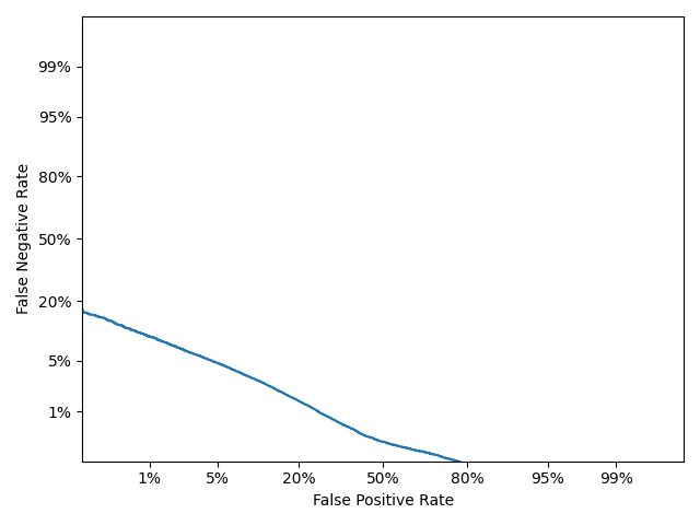
DET曲线
(2)matlab
绘制DET曲线通常是在正态偏差尺度下绘制的,因此绘制之前需要进行数据尺度变换。
参考sklearn中metrics.DetCurveDisplay(fpr=fpr_det, fnr=fnr_det)的实现,可以看到几个关键的变换步骤如下:
sp.stats.norm.ppf(self.fpr)
sp.stats.norm.ppf(self.fnr)

ticks = [0.001, 0.01, 0.05, 0.20, 0.5, 0.80, 0.95, 0.99, 0.999]
tick_locations = sp.stats.norm.ppf(ticks)

tick_labels = [
            '{:.0%}'.format(s) if (100*s).is_integer() else '{:.1%}'.format(s)
            for s in ticks
        ]


ax.set_xlim(-3, 3)
ax.set_ylim(-3, 3)
这里sp.stats.norm.ppf()返回CDF中的x,即累计分布函数的逆函数(分位点函数,给出分位点返回对应的x值)。
这等价于matlab中的norminv(x, mu, sigma),因此matlab中通过以下方式绘制DET曲线:
DET_test = load('DET.txt');

fnr = norminv(DET_test(:, 1), 0, 1);  % 转换为正态偏差尺度Normal deviation scale
fpr = norminv(DET_test(:, 2), 0, 1);  % 转换为正态偏差尺度Normal deviation scale

figure
plot(fnr, fpr, 'linewidth', 2)
xlabel('False negative rate')
ylabel('False positive rate')

% 坐标轴尺度转换(转换为正态偏差尺度Normal deviation scale)
ticks = norminv([0.001, 0.01, 0.05, 0.20, 0.5, 0.80, 0.95, 0.99, 0.999]);
ticklabels = {'0.1%', '1%', '5%', '20%', '50%', '80%', '95%', '99%', '99.9%'};
xticks(ticks)
yticks(ticks)
xticklabels(ticklabels)
yticklabels(ticklabels)
xlim([-3, 3]) % [-3sigma, +3sigma]
ylim([-3, 3])
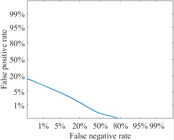
DET曲线
可以看出,结果与sklearn的结果一致。
线性尺度下的DET曲线:
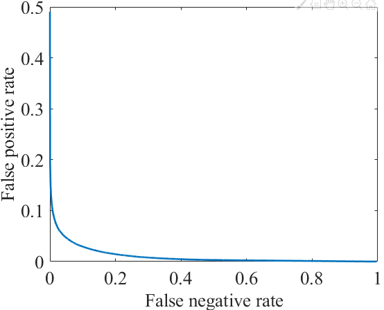
DET曲线(线性尺度)
https://juliahub.com/docs/ROCAnalysis/GJ3BH/0.3.3/
https://nbviewer.jupyter.org/github/davidavdav/ROCAnalysis.jl/blob/master/ROCAnalysis.ipynb
A Detection Error Trade-off plot (DET plot) shows the same information as the ROC plot above---but the scales are warped according to the inverse of the cumulative normal distribution. This way of plotting has many advantages:
-
If the distributions of target and non-target scores are both Normal, then the DET-curve is a straight line. In practice, many detection problems give rise to more-or-less straight DET curves, and this suggests that there exists a strictly increasing warping function that can make the score distributions (more) Normal.
-
Towards better performance (lower error rates), the resolution of the graph is higher. This makes it more easy to have multiple systems / performance characteristics over a smaller or wider range of performance in the same graph, and still be able to tell these apart.
-
Conventionally, the ranges of the axes are chosen 0.1%--50%---and the plot area should really be square. This makes it possible to immediately assess the overall performance based on the absolute position of the line in the graph if you have seen more DET plots in your life.
-
The slope of the (straight) line corresponds to the ratio of the
σparameters of the underlying Normal score distributions, namely that of the non-target scores divided by that of the target scores. Often, highly discriminative classifiers show very flat curves, indicating that that target scores have a much larger variance than the non-target scores. -
The origin of this type of plot lies in psychophysics, where graph paper with lines according to this warping was referred to as double probability paper. The diagonal y=xy=x in a DET plot corresponds linearly to a quantity known as d′d′ (d-prime) from psychophysics, ranging from 0 at 50% error to about 6 at 0.1% error.