---恢复内容开始---
1.盒子
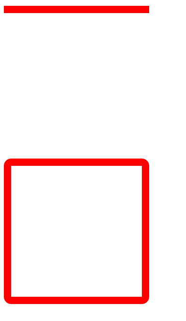
边框
border-top- 10px; 宽度
border-top-style: solid/dashed/dotted; 实线 虚线 点线
border-top-color: red; 颜色
border-top: 10px solid red; 宽 线 色 上边框
border-right:/border-bottom:/border-left: 右 下 左 边框
border:10px solid red; 宽 线 色 所有边框
border-radius:10px; 圆角边框
border-collapse:collapse; 合并表格边框
box-sizing: border-box; 边框为盒子尺寸(边框大小不变 内容会变小)
<head>
<meta charset="utf-8">
<style>
    .cla1{
        width:200px;
        height:200px;
        border-top: 10px solid red;
    }
    .cla2{
        width:200px;
        height:200px;
        border:10px solid red;
        border-radius:10px;
        box-sizing: border-box;
    }
</style>
</head>
<body>
    <div class="cla1"></div>
    <div class="cla2"></div>
</body>
内间距
padding-top:10px;
padding-right:
padding-bottom:
padding-left:
padding: 上右下左 上(左右)下 (上下)(左右) 内间距
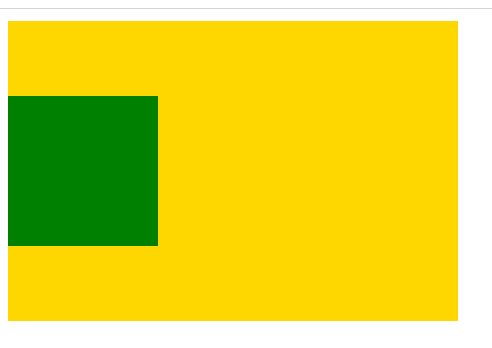
外间距
margin-top:10px;
margin-right:
margin-bottom:
margin-left:
margin:50px auto; 上下50 左右居中
margin-top 塌陷 解决方法
border: 1px solid gold;
overflow: hidden;
.clearfix:before{content:"";display:table;}
<style>
    .con{
        width: 300px;
        height:200px;
        background-color: gold;
        /*border: 1px solid gold;*/ /*方法一*/
        /*overflow: hidden;*/       /*方法二*/
    }
    .box{
        width: 100px;
        height:100px;
        background-color: green;
        margin-top: 50px;
    }
    .clearfix:before{           /*margin-top塌陷*/
        content:"";
        display:table;
    }
</style>
</head>
<body>
    <div class="con clearfix">
        <div class="box"></div>
    </div>
</body>

2.显示
;height: ;background-color: ;
display:block/inline/inline-block/none; 块 行 行内块 隐藏
visibility:hidden; 隐藏(占位)
块元素:独占一行 可设宽高
行元素:同一行排列 不设宽高 由字体大小决定 父元素用 text-align:center;设置字体水平居中
行内块:同一行排列 可设宽高 多个行内块父不设高 自动 line-height:高度; 设置字体垂直居中
font-size:0; 同一行 无间隔
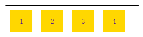
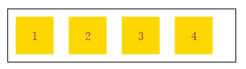
3.浮动 (定义一个宽高确定的区域 不影响整体布局)
;height: ;background-color: ;
float:left/top; 覆盖下一个元素 下一个元素的文字绕图 下一个元素margin:图字间距
margin:50px
scroll 滚动条 scroll-y y轴滚动条
清除浮动(父边框不设高时)解决方法
overflow: hidden; 浮动隐藏
<div style="clear: both"></div> 加一个div清除浮动
.clearfix:after{content:"";display:table;clear: both;}
<head>
<style>
    .con{
        width: 300px;
        /*height:300px;*/
        border: 1px solid #000;
        margin: 100px auto 0;
        font-size: 0;
        /*overflow: hidden;*/  /*方法一*/
    }
    .con a{
        width: 50px;
        height: 50px;
        background-color: gold;
        font-size: 16px;
        margin: 10px;
        text-align: center;
        line-height: 50px;
        text-decoration: none;
        float:left;
    }
    .clearfix:after{  /*方法三*/
        content:"";
        display:table;
        clear: both;
    }
</style>
</head>

<body>
<div class="con clearfix">
    <a href="">1</a>
    <a href="">2</a>
    <a href="">3</a>
    <a href="">4</a>
    <!--<div style="clear: both"></div>-->  <!-- 方法二-->
</div>
</body>
4.层级:z-index:10; 大的在上面(可以为负)
5.定位:
position:relative / absolute / fixed;
相对自身 相对上层定位元素 相对浏览器窗口
不影响 加定位浮动 后面上移 加定位浮动 后面上移 (注意:margin)
微调 不跟随滚动而移动
top/left/right/bottom: div框设置宽度 里面用百分比 宽度auto 内容多大宽度多大