1、两个div在一行排列
<div>
    <div class="fl">左</div>
    <div class="fr">右</div>
</div>

.fl {float: left;}
.fr {float: right;}
2、设置版心,margin: 0 auto;上下外边距为0,左右自动,加上宽,则可以居中显示
.w {
     1190px;
    margin: 0 auto;
}
3、清除默认边距
* {
    margin: 0;
    padding: 0;
}

blockquote,body,button,dd,dl,dt,fieldset,form,h1,h2,h3,h4,h5,h6,hr,
input,legend,li,ol,p,pre,td,textarea,th,ul {
    margin: 0;
    padding: 0;
}
有默认边距的元素:body,ul,body,h1-h6... ...
4、ul去除前面的点,并且使元素横着排列
<ul>
    <li>aaaaa</li>
    <li>bbbbb</li>
    <li>ccccc</li>
    <li>ddddd</li>
</ul>

ul {
     list-style-type: none;
}

li{
   float: left;
}
5、去掉a标签的下划线
a {text-decoration: none;}
6、居中,文字在div中水平居中、竖直居中
<div>你好</div>

div {
     200px;
    height: 50px;
    line-height: 50px;
    text-align: center;
    background-color: skyblue;
}
水平居中:text-align: center。竖直居中:height与line-height设置一样
7、小竖线可以用li来代替,如下宽为1,高位10的竖线
.space {
     1px;
    height: 10px;
    background-color: #cccccc;
    margin: 10px 12px;
}
8、点击图标跳转<a href="#"><img src=""></img></a>
9、相对定位(relative)与绝对定位(absolute)
父元素:relative
子元素:absolute
子元素的位置相对于父元素,而不是浏览器左上角,子元素不占用空间,仿佛浮动
<div class="p">父元素
    <div class="c">子元素</div>
</div>

.p {
     300px;
    height: 200px;
    background-color: skyblue;
    position: relative;
}

.c {
     100px;
    height: 100px;
    background-color: slateblue;
    position: absolute;
    bottom: 0;
    right: 0;
}
</style>
效果如图:

10、去掉点击input、button时默认出现的边框
input,button {
    border: 0;
    outline: none;/*去掉鼠标点击的边框*/
}
11、鼠标经过,改变背景色
ul li:hover {
    background-color: #5e5959;
}
ul a:hover {
    color: #e2231a;
}
12、透明度
rgba(red, green, blue, alpha)
alpha 参数是介于 0.0(完全透明)和 1.0(完全不透明)之间的数字。
13、鼠标经过变成手的形状
cursor: pointer;
14、设置圆形:宽高一样、border-radius设置为50%
 300px;
height: 300px;
border-radius: 50%;
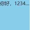
15、文字不换行、溢出部分隐藏、超出部分显示省略号
<div class="p">
    你好,123456789
</div>
.p {
     100px;
    height: 100px;
    background-color: skyblue;
    white-space: nowrap; /*强制不换行*/
    overflow: hidden; /*溢出部分隐藏*/
    text-overflow: ellipsis; /*超出的部分显示省略号*/
}
16、使div居页面中间
<body>
  <div class="box"></div>
</body>
<style>
  .box{
    width: 100px;
    height: 100px;
    position: absolute;
    top: 50%;
    left: 50%;
    transform: translate(-50%,-50%);
    background-color: skyblue;
  }
</style>
如果没有transform: translate(-50%,-50%);则只是让div的左上角居页面中间,translate属性分别是水平移动、垂直移动,负号是相反方向。
18、:nth-child、:nth-last-child选择器
.box :nth-child(1) {/*选择.box下第一个子元素*/
    background-color: yellow;
}
.box :nth-last-child(2) {/*选择.box下倒数第二个子元素*/
     background-color: yellow;
}
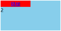
19、使a标签有宽度、文字居中,span标签换行。display: block 行元素转块级元素


<!DOCTYPE html>
<html lang="en">
<head>
    <meta charset="UTF-8">
    <meta http-equiv="X-UA-Compatible" content="IE=edge">
    <meta name="viewport" content="width=device-width, initial-scale=1.0">
    <title>测试</title>
</head>
<body>
  <div class="box">
    <a href="#">链接</a>
    <span>2</span>
  </div>
</body>
<style>
    .box {
        width: 200px;
        height: 100px;
        position: absolute;
        top: 50%;
        left: 50%;
        transform: translate(-50%,-50%);
        background-color: skyblue;
    }

    a {
        width: 100px;
        display: block;
        background-color: red;
        text-align: center;
    }

    span {
        display: block;
    }
</style>
</html>
20、div与img之间有缝隙的问题
<!DOCTYPE html>
<html lang="en">
<head>
    <meta charset="UTF-8">
    <meta http-equiv="X-UA-Compatible" content="IE=edge">
    <meta name="viewport" content="width=device-width, initial-scale=1.0">
    <title>测试</title>
</head>
<body>
  <div class="box">
    <img src="1.png" alt="">
  </div>
</body>
<style>
    .box {
        background-color: skyblue;
    }
</style>
</html>
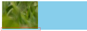
/*去掉img与div间的缝隙*/
img {display: block;}
或
img {vertical-align: top;}
21、元素的两种隐藏方式
<!DOCTYPE html>
<html lang="en">
<head>
    <meta charset="UTF-8">
    <meta http-equiv="X-UA-Compatible" content="IE=edge">
    <meta name="viewport" content="width=device-width, initial-scale=1.0">
    <title>测试</title>
</head>
<body>
  <div>这是div</div>
  <span>这是span</span>
</body>
<style>
    div {
      width: 200px;
      height: 100px;
      background-color: skyblue;
      display: none;/*隐藏方式一,不占据页面位置*/
      display: block;/*取消隐藏方式一*/
      visibility: hidden;/*隐藏方式二,占据页面位置*/
      visibility: visible;/*取消隐藏方式二*/
    }
    span {
      width: 100px;
      height: 50px;
      background-color: aqua;
    }
</style>
</html>
22、外边距合并
<!DOCTYPE html>
<html lang="en">
<head>
    <meta charset="UTF-8">
    <meta http-equiv="X-UA-Compatible" content="IE=edge">
    <meta name="viewport" content="width=device-width, initial-scale=1.0">
    <title>测试</title>
</head>
<body>
  <div id="father">
    <div id="son"></div>
  </div>
</body>
<style>
    #father {
      width: 300px;
      height: 100px;
      background-color: skyblue;
    }
    #son {
      width: 200px;
      height: 50px;
      background-color: aqua;
      margin-top: 50px;
    }
</style>
</html>
整个外部div也向下移动了,并不是子div距离外边框移动,如下:

产生原因就是父div与子div的外边距合并了,所以都向下移动了,解决办法是给父div加边框
<!DOCTYPE html>
<html lang="en">
<head>
    <meta charset="UTF-8">
    <meta http-equiv="X-UA-Compatible" content="IE=edge">
    <meta name="viewport" content="width=device-width, initial-scale=1.0">
    <title>测试</title>
</head>
<body>
  <div id="father">
    <div id="son"></div>
  </div>
</body>
<style>
    #father {
      width: 300px;
      height: 100px;
      background-color: skyblue;
      border: 1px solid skyblue;
    }
    #son {
      width: 200px;
      height: 50px;
      background-color: aqua;
      margin-top: 50px;
    }
</style>
</html>

23、使div不因增加了padding而增加宽高
box-sizing: border-box