Vant 中的样式默认使用 px 作为单位,如果需要使用 rem 单位,推荐使用以下两个工具:
- postcss-pxtorem 是一款 postcss 插件,用于将 px 单位转化为 rem
- lib-flexible 用于设置 rem 基准值
(1)使用 lib-flexible 动态设置 REM 基准值(html 标签的字体大小)
安装依赖:
# yarn add amfe-flexible npm i amfe-flexible
然后在main.js中加载执行该模块:
import 'amfe-flexible'
(2)使用 postcss-pxtorem 将 px 转为 rem
安装依赖:
# yarn add -D postcss-pxtorem # -D 是 --save-dev 的简写 npm install postcss-pxtorem -D
然后在项目根目录中创建postcss.config.js文件:
module.exports = {
  plugins: {
    'autoprefixer': {
      browsers: ['Android >= 4.0', 'iOS >= 8']
    },
    'postcss-pxtorem': {
      rootValue: 37.5,
      propList: ['*']
    }
  }
}
配置完毕,重新启动服务。
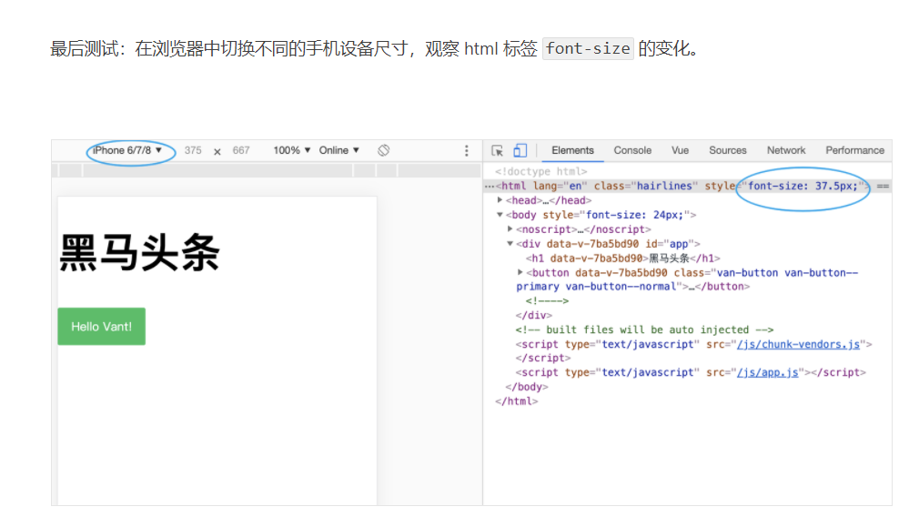
最后测试:刷新页面,审查元素样式查看是否已将 px 转换为 rem。
